
Digby Warde-Aldam maps out the London art scene…
If wasting good ideas were a capital offence, the curators of Tate Britain’s ‘Fighting History’ (until 13 September) would be in serious trouble. The thinking behind the show is flawless: we British are borderline infatuated with looking at our national identity, so a show exploring the ways British artists have rendered the past from the 18th century to the present day should be a guaranteed success – one in the eye for Tate Britain’s critics. In a year packed with centennial commemorations – Ypres, Waterloo, the Magna Carta – you’d think it would be impossible to mess this up.
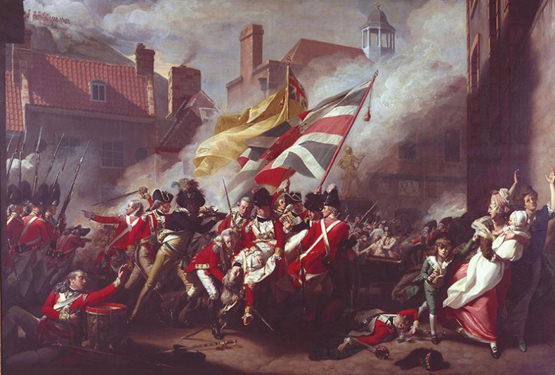
The Death of Major Pierson, 6 January 1781 (1783), John Singleton Copley © Tate
Yet it fails on almost every level. Unlike a lot of people, I’m not allergic to the ‘thematic’ approach favoured by Tate. But to arrange a show predicated on history painting in a non-chronological order smacks of wilful perversity. Revisionism is all well and good, but its argument must be coherent and convincing: this isn’t. Worse still, it doesn’t really have an argument. What it has instead is a lot of works by Dexter Dalwood and Jeremy Deller.
What went so wrong? I blame the usual suspects: a lack of time and money. Even so, Tate could’ve put together a brilliant show without sourcing a single painting from outside its collection. Instead, we get an exhibition that is actively embarrassed by its own premise. The art is weak, the thesis is spurious and the theme is paid only lip service. In any case, the gallery has squandered a fascinating opportunity.

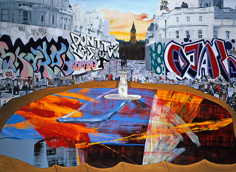
The Poll Tax Riots (2005), Dexter Dalwood © The Artist and Simon Lee Gallery, London & Hong Kong
◎
If you want proper history, go and see the late Ian Hamilton Finlay’s show at Victoria Miro (until 31 July). Even at his most throwaway, Finlay was never less than brilliant. Think of his tribute to the art critic Waldemar Januszczak: ‘Within this thicket there lurks a name’… if you can spell his surname without recourse to the internet, I salute you.
I actually own one of those ‘throwaway’ works, which is hanging above me as I write this. It’s a facsimile of the cover of that most parochial of British magazines, The People’s Friend. It claims its contents will teach the reader how to ‘Knit a Smart Sweater’ and cook ‘Delicious Mexican Meals’. Then you look at the masthead: it is not The People’s Friend but L’Ami du Peuple, the title of Marat’s insurgent newspaper during the French Revolution.
, Ian Hamilton Finlay. Courtesy the Artist's Estate and Victoria Miro, London © The Estate of Ian Hamilton Finlay")
Finlay was obsessed by the Revolution, and with his unique wit, depth of knowledge and eye for classical beauty, his art was fired by his interests. The Victoria Miro show concentrates on the historical side of his work, featuring neons, sculptures, paintings and prints that make explicit reference to the turmoil that gripped France between 1789 and 1794. I was unfamiliar with most of them, and I’m very glad this is no longer the case. My favourite, I think, is Translation of a Line from Chénier: a Line of Thin Pale Red, a neon that riffs on Mallarmé to morbid effect. This show is a testament to his cantankerous sense of humour, his unparalleled aesthetic judgement and, yes, his genius.
◎
Elsewhere, I was very taken by the Roni Horn drawings on show at Hauser & Wirth on Savile Row (until 25 July). I run hot and cold about her work, but the good stuff here is sufficient to win over the hardest of cynics. Her OR series resemble gigantic Parisian street plans, their blocks of interrupted colour reminding me of Charles Booth’s 1889 London ‘Poverty Map’. The drawings are peppered with scrawled words and phrases, lines of dialogue from films, band names and quotations from poets including Mallarmé – yes, him again. They are like A-Z atlases for the artist’s own wandering thought patterns.
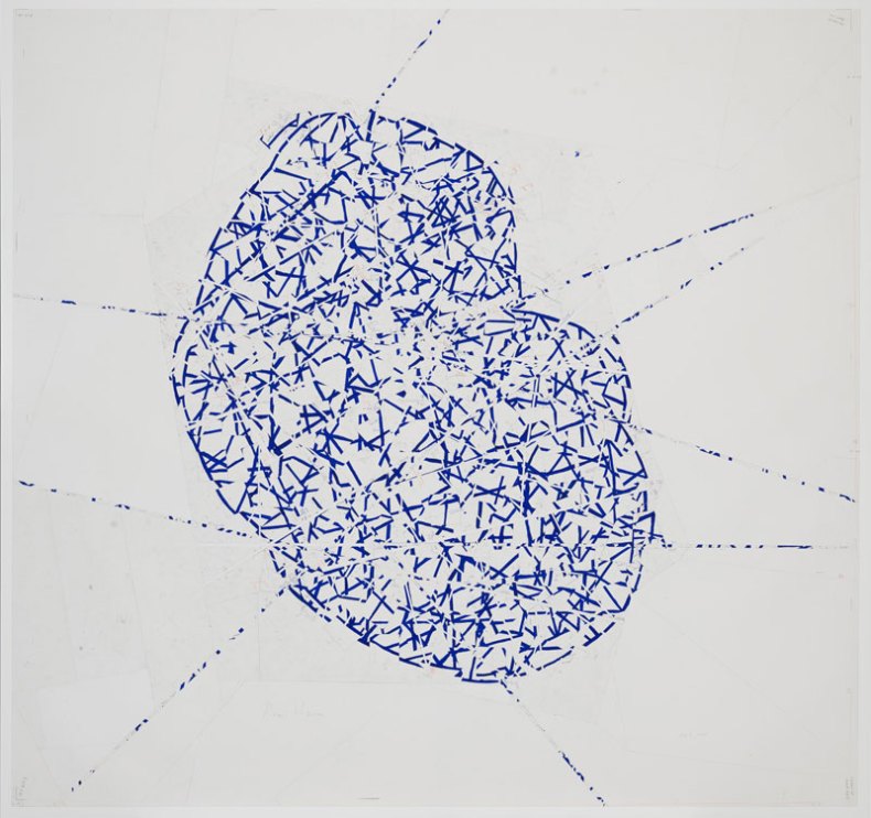
Or 1 (2014), Roni Horn © Roni Horn. Courtesy the artist and Hauser & Wirth. Photo: Genevieve Hanson
◎
Speaking of cartography, Transport for London have just issued their new version of Harry Beck’s classic 1931 Tube map. It is, frankly, a bit confused. Unlike Beck’s beautifully simple ‘circuit-board’ design, it is nigh-on impossible to read. In recognition of this, various clever people have stepped forward with alternative designs, some of which differ radically from the classic modernist layout.
The geeky – but to my mind, very entertaining – wrangling over the new map got me thinking about Simon Patterson’s iconic 1992 work The Great Bear. Inspired by the Paris Métro’s litany of lieux de mémoire, Patterson drew up an alternative nomenclature for London, and as in Horn’s drawings, substituted familiar station names for whatever historical figures cropped up in his mind as he planned it. Thus, Euston Square became ‘Karl Marx’ and, brilliantly, West Hampstead – once home to Sigmund Freud – was christened in honour of footballer Paul Gascoigne.
In my dreams, Patterson’s idea has been institutionalised, with modifications. Just imagine: if we re-named every station on the network after an artist, writer, thinker or, yes, footballer associated with the respective area, our commuter conversations would be enlivened no end: ‘I went up to Joshua Reynolds for a meeting this morning. God! Don’t ever try to change for the Piccadilly Line at Francis Bacon’.
Related Articles
Tate Britain: A Poisoned Chalice?
The greatest hits of London cartography: ‘Mapping London’ at Oxo Tower Wharf
Unlimited access from just $16 every 3 months
Subscribe to get unlimited and exclusive access to the top art stories, interviews and exhibition reviews.


![Masterpiece [Re]discovery 2022. Photo: Ben Fisher Photography, courtesy of Masterpiece London](http://www.apollo-magazine.com/wp-content/uploads/2022/07/MPL2022_4263.jpg)
Has the Fitzwilliam got its rehang right?