Why would one of the most painterly of contemporary painters decide to start issuing screenprints?
This was Harland Miller’s starting point in his talk ‘An Artist’s View of Printmaking’ at the London Original Print Fair last Friday evening. Inside the fair (which ran from 23–26 April), Edinburgh’s Ingleby Gallery dedicated a whole stall to Miller’s recent prints, which take his distinctive large-scale oil paintings of classic Penguin paperbacks with the texts pointedly modified, and reduce them in size for reproduction in an edition of 50.
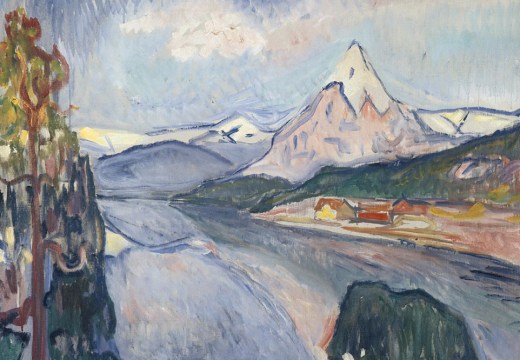
The new print that was launched at the fair, Overcoming Optimism (2014) shows where Miller is at with his Penguin series. A text of pithy, miserablist Northern wit stands out against bands of shimmering, Rothko-like colour. The dog-eared corner and tattered spine of the book seem almost photorealistic, except that they abut areas of the picture scuffed up with brush strokes, paint drips and scrapes.
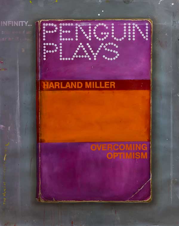
Overcoming Optimism (2014), Harland Miller © Harland Miller. Courtesy of Ingleby Gallery
For novelist Hari Kunzru, the physical substance of Miller’s canvases underwrites their dark nostalgia for recent cultural history. Addressing Miller in the second person, Kunzru writes: ‘That’s where you seem to put all your painterliness, all the care that’s so evident in your work – into rendering distance in time, a melancholy personal distance, your memories as dog-eared as paperbacks found in charity shops’.
Miller says he distrusts the word ‘painterly’ because ‘it sounds like doing something that’s like painting, but isn’t really painting’. Nonetheless it is an apt word for his gestural, materially substantial art. ‘I’m doing something very physical, very sleeves-rolled-up’, he says. ‘I’m spending a long time putting layers on, running up and down ladders. If one of these pictures had any self-awareness, it would probably think, “I must be a colour field painting”. It would probably also think, “That guy who’s painting me should stop looking at all those Rothko books he’s got”, and it would probably be right about that’.
So why do them as screenprints? Partly because prints can reach so many more people than original paintings can. There is some irony in repurposing the stylish modernist design of paperbacks intended for cheap mass circulation, to make one-off artefacts which sell for more than most people’s annual income. Miller fills this gap by issuing his works as prints, catalogues or even deckchairs. If your paintings adapt matter from other media – ‘starting with something which is a small graphic object, a book, and blowing it up into a big painterly object’, as Miller puts it – then interesting things happen when the paintings themselves get adapted as graphic works or works on paper.
And Miller values the screenprinting process. A questioner in the audience pointed out that it would be less trouble to use digital giclée printing (which is really just a fancy name for inkjet), to make a print of a high-resolution photograph of an oil painting. For Miller, the laboriousness of building each print up layer by layer, carrying the heavy screens across the studio, mixing the colours by hand, is part of the point. It means that the people who help him produce the prints experience something like the same gestural, physical relationship to them as he does to the paintings, and that minor distortions of the image result from the process of production, making each individual print in the edition unique.
Perhaps we should think of screenprints as ‘painterly’ objects, then, in Miller’s sceptical sense of the word: ‘something that’s like painting, but isn’t really painting’.
![Masterpiece [Re]discovery 2022. Photo: Ben Fisher Photography, courtesy of Masterpiece London](http://www.apollo-magazine.com/wp-content/uploads/2022/07/MPL2022_4263.jpg)

Prints and the ‘painterly’ object: Harland Miller’s limited editions
Overcoming Optimism (detail; 2014), Harland Miller © Harland Miller. Courtesy Ingleby Gallery
Share
Why would one of the most painterly of contemporary painters decide to start issuing screenprints?
This was Harland Miller’s starting point in his talk ‘An Artist’s View of Printmaking’ at the London Original Print Fair last Friday evening. Inside the fair (which ran from 23–26 April), Edinburgh’s Ingleby Gallery dedicated a whole stall to Miller’s recent prints, which take his distinctive large-scale oil paintings of classic Penguin paperbacks with the texts pointedly modified, and reduce them in size for reproduction in an edition of 50.
The new print that was launched at the fair, Overcoming Optimism (2014) shows where Miller is at with his Penguin series. A text of pithy, miserablist Northern wit stands out against bands of shimmering, Rothko-like colour. The dog-eared corner and tattered spine of the book seem almost photorealistic, except that they abut areas of the picture scuffed up with brush strokes, paint drips and scrapes.
Overcoming Optimism (2014), Harland Miller © Harland Miller. Courtesy of Ingleby Gallery
For novelist Hari Kunzru, the physical substance of Miller’s canvases underwrites their dark nostalgia for recent cultural history. Addressing Miller in the second person, Kunzru writes: ‘That’s where you seem to put all your painterliness, all the care that’s so evident in your work – into rendering distance in time, a melancholy personal distance, your memories as dog-eared as paperbacks found in charity shops’.
Miller says he distrusts the word ‘painterly’ because ‘it sounds like doing something that’s like painting, but isn’t really painting’. Nonetheless it is an apt word for his gestural, materially substantial art. ‘I’m doing something very physical, very sleeves-rolled-up’, he says. ‘I’m spending a long time putting layers on, running up and down ladders. If one of these pictures had any self-awareness, it would probably think, “I must be a colour field painting”. It would probably also think, “That guy who’s painting me should stop looking at all those Rothko books he’s got”, and it would probably be right about that’.
So why do them as screenprints? Partly because prints can reach so many more people than original paintings can. There is some irony in repurposing the stylish modernist design of paperbacks intended for cheap mass circulation, to make one-off artefacts which sell for more than most people’s annual income. Miller fills this gap by issuing his works as prints, catalogues or even deckchairs. If your paintings adapt matter from other media – ‘starting with something which is a small graphic object, a book, and blowing it up into a big painterly object’, as Miller puts it – then interesting things happen when the paintings themselves get adapted as graphic works or works on paper.
And Miller values the screenprinting process. A questioner in the audience pointed out that it would be less trouble to use digital giclée printing (which is really just a fancy name for inkjet), to make a print of a high-resolution photograph of an oil painting. For Miller, the laboriousness of building each print up layer by layer, carrying the heavy screens across the studio, mixing the colours by hand, is part of the point. It means that the people who help him produce the prints experience something like the same gestural, physical relationship to them as he does to the paintings, and that minor distortions of the image result from the process of production, making each individual print in the edition unique.
Perhaps we should think of screenprints as ‘painterly’ objects, then, in Miller’s sceptical sense of the word: ‘something that’s like painting, but isn’t really painting’.
Unlimited access from just $16 every 3 months
Subscribe to get unlimited and exclusive access to the top art stories, interviews and exhibition reviews.
Share
Recommended for you
Review: Lost Kingdoms: Hindu-Buddhist Sculpture at the Metropolitan Museum
Packed with treasures, this exhibition will be hard to top
Pointless exercise: Alain de Botton’s ‘Art is Therapy’
Start off with some light Vermeer. Ten reps. Feel you can manage more? Consider moving on to the Dürer
Museums Association director Mark Taylor steps down after 23 years
We asked him to sum up the challenges and opportunities facing the sector today