
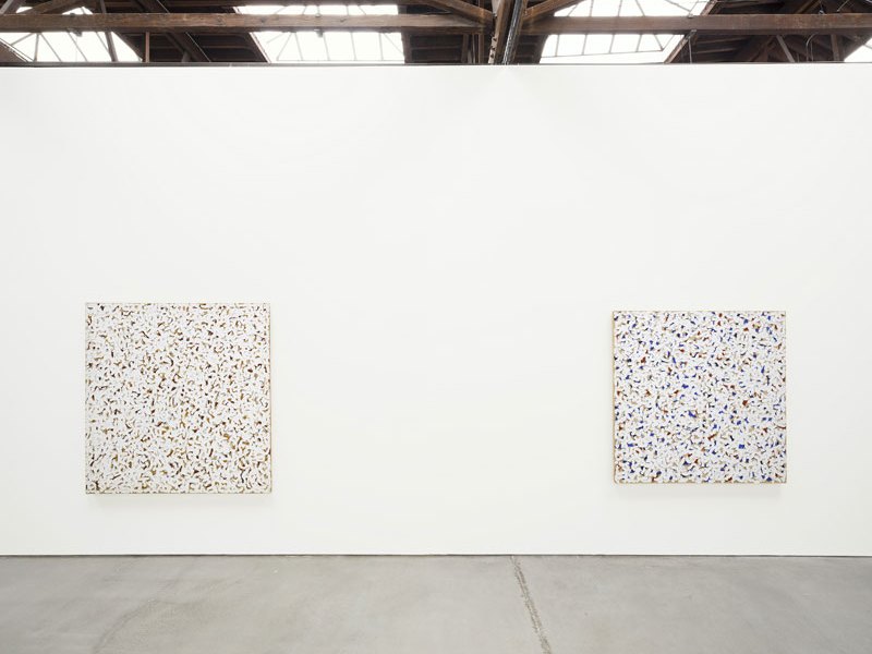
One of the first paintings you see as you walk into this Robert Ryman show, which presents works from the late 1950s to the mid ’80s, rarely shown in the US, is Untitled [Background Music] from c. 1962. A large square of linen is dominated by white strokes like big curving thumbprints dragged through paint, with deep reds, purples, and yellows showing through in between. It’s odd to look at this one, and at the untitled 1962 work next to it, with electric-blue patches jazzing through the white (along with more red and bits of unpainted background). It reminds you how crucial colour is to Ryman even, or especially, when his whites prevail more fully, as they do in many of the other pieces on show here.
Untitled (c. 1960) Rob Ryman. 2016 Robert Ryman /Artists Rights Society (ARS), New York. Photo: Bill Jacobson, courtesy The Greenwich Collection, Ltd.
You could guess, if you didn’t know, that Ryman had spent the early part of his time as a guard at MoMA, starting in 1953, examining the colour palettes of Cézanne and Matisse. That was the year 23-year-old Ryman, who had originally wanted to be a jazz musician, began to paint, enrolling in one of MoMA’s adult education courses and eventually selling his first piece in 1958 via a staff exhibition. His commitment to shades of white was firmly established by the turn of that decade and, while he did not have a solo show until 1967, in 1974 there was the first of several retrospectives. Though Ryman remains most closely identified with minimalism, his experimental autodidacticism – dedicated to discovering the possibilities of the materials on one hand and eliciting the viewer’s delight on the other – makes his work hard to confine to any one school.
The reference to background music in the 1962 work could be read as an appealing joke about the decorative prettiness sometimes risked by colourful abstraction, and about what’s in the background of so many Ryman works, deepening and complicating his apparent whites, drawing the eye to something beyond them. The play of light on these works gives them an eerie, immaterial quality that’s only enhanced by the viewer’s awareness of them as made objects; the whiteness of the paint acquires a new intensity as your eye takes in the darker and brighter elements that contradict it even as they make it up.
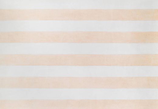
Roll (1989), Rob Ryman. © 2016 Robert Ryman / Artists Rights Society (ARS) New York. Photo: Bill Jacobson, courtesy The Greenwich Collection, Ltd.
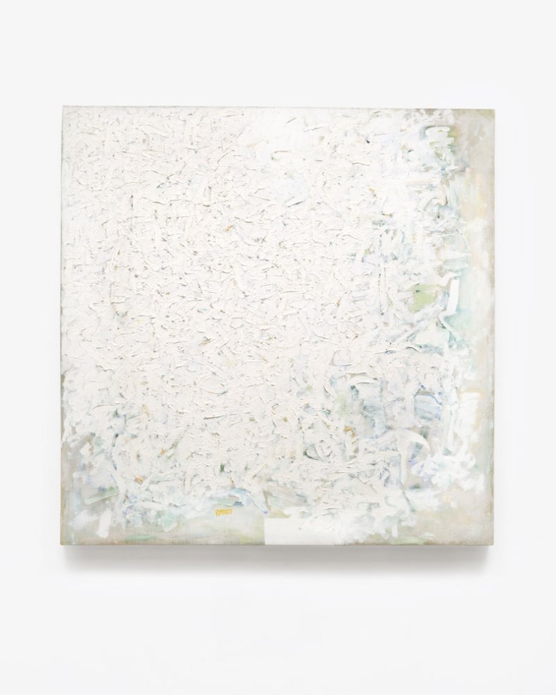
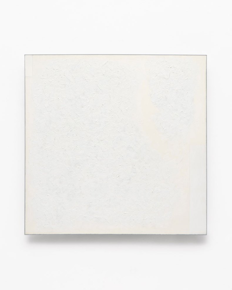
I visited the show on a dull grey afternoon, unusual for New York, and the light crawling through some glass panels in the ceiling seemed to have to work hard to illuminate the paintings – which are so clearly designed to invite and set off different qualities and movements of light. You can look for a long time at the surface of some of the oils made around 1960 and still make new discoveries: a shift in colour and texture at the right-hand edge of a work; a tiny, at times invisible, splash of bright green, pink, or turquoise; or a sharp white rectangle at the very bottom, half obscured by thicker ice-cream folds of paint.
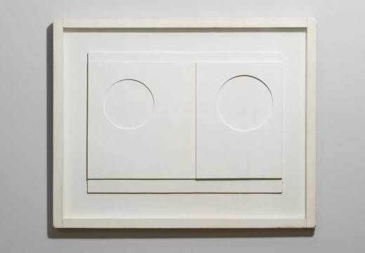
Untitled (1964), Rob Ryman. © 2016 Robert Ryman /Artists Rights Society (ARS), New York. Photo: Bill Jacobson, courtesy The Greenwich Collection, Ltd.
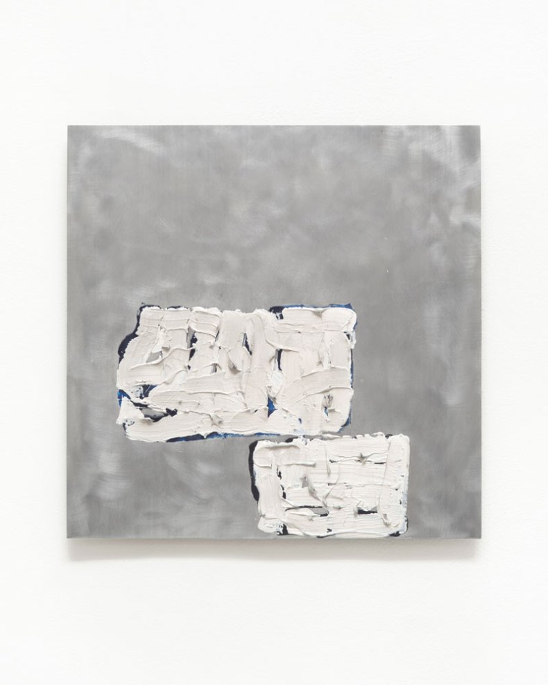
Some of the later works by contrast look achingly simple: Accord (1985) is a clean, vertical rectangle of aluminium, bolted to the wall at its four corners, with one part of it, near the top, projecting towards you into a Malevich-like white, oil-painted square. From the same decade are Factor (1983) and Pair Navigation (1984) – the first a white rectangle projected out from the wall with rods and fasteners, the second a very similar arrangement, but placed as a platform on the floor. In all three, Ryman seems to achieve through the manipulation of space what he achieves in earlier pieces mostly through colour. These later works feel like gentle jokes as well as experiments: is it a painting or a frame, or a podium on which an artwork will be presented to you? There are similar moves, but in the other direction nearby: Arista (1968) has its background linen stapled to the wall with blue chalk lines sketched in around it; on the opposite wall, in an untitled work from 1964, two rough rectangles constrain some dense daubing in vinyl polymer (shades of white again, with darker and bluer notes showing through and around them) against a much larger dappled aluminium surface.
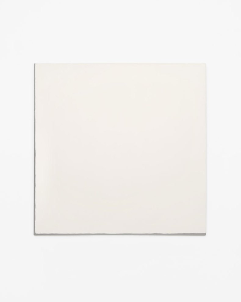
Untitled (1973), Robert Ryman. © 2016 Robert Ryman /Artists Rights Society (ARS), New York. Photo: Bill Jacobson, courtesy The Greenwich Collection, Ltd.
At about five o’clock, an hour before closing time, the gallery lighting began to switch on – a hot orange that seemed to spring off the more industrial surfaces of the later works. Some of those I’d been most drawn to appeared reduced, hardened and flattened, a little too obvious: the 1973 expanse of white Enamelac on an aluminium base that shows in a thin line down the left-hand side and along the bottom; a row of square pieces from the same year, their fat L-shapes of black (oxidised copper, apparently) set off by smaller white baked-enamel squares; and 1985’s Catalyst III, with its steel bolts and thin, intermittent lines of black enamel seeming to divide the aluminium base and contain it in a pointedly incomplete frame. Instead I went back to the oils, whose surfaces now attracted a very different play of light that brought out, or obscured, other colours. The subtle texturings of paint looked suddenly more dramatic, every tiny splodge and dip casting its shadow, as if the background had receded, or the surface had been turned up just a little louder.
‘Robert Ryman’ is at Dia:Chelsea, New York until 29 July.
Unlimited access from just $16 every 3 months
Subscribe to get unlimited and exclusive access to the top art stories, interviews and exhibition reviews.
![Masterpiece [Re]discovery 2022. Photo: Ben Fisher Photography, courtesy of Masterpiece London](http://www.apollo-magazine.com/wp-content/uploads/2022/07/MPL2022_4263.jpg)
Why are fathers so absent from art history?