
One of the very first things I learnt at university, and one of the only useful ones, was that the recent past cannot be fully understood until it is, well, no longer recent. Clearing up a pile of old CDs the other day, I stumbled on a greatest hits CD by the band Supergrass. The ‘Grass, as nobody I knew called them, wrote jokey, referential and supremely catchy songs that were, alas, largely perceived as lightweight. They were, as one critic wrote at the time, Britpop’s ‘court jesters’: likeable, but ultimately forgettable. But listening again to those old songs, what I heard was not a novelty proposition: while many of their ‘serious’ contemporaries are now pretty much unlistenable, the winning simplicity of Supergrass’s music had given it real staying power.
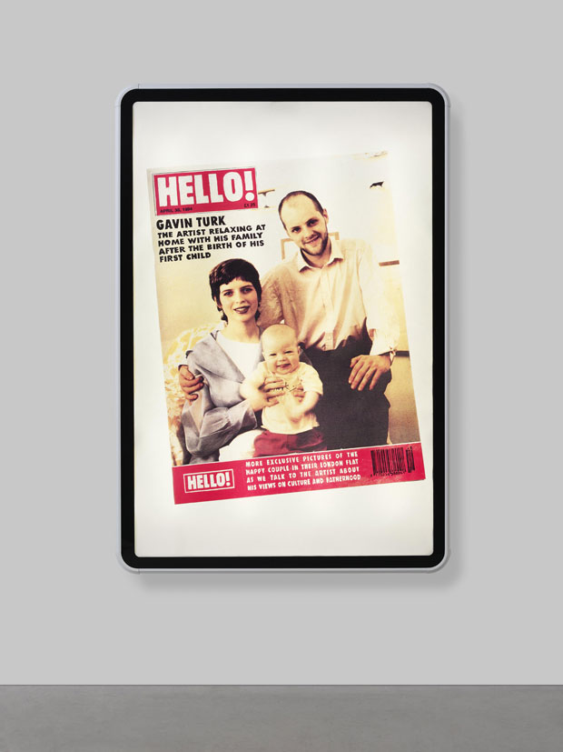
Identity Crisis (1994), Gavin Turk
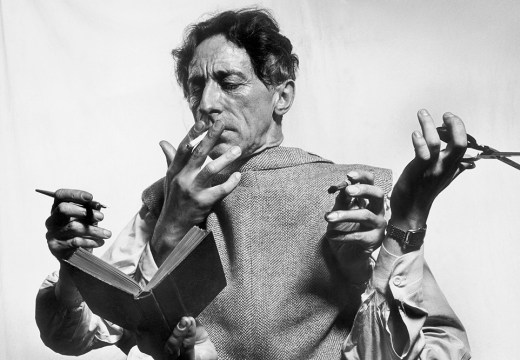
The next day, I headed to Damien Hirst’s Newport Street Gallery to see a show by Gavin Turk (until 13 March 2017). If, to stretch an analogy, Hirst was the YBA movement’s Oasis, then Turk was most definitely its Supergrass. Turk, who famously failed to graduate from the RCA after submitting a Blue Plaque with his own name on it for his final degree show, has been written off as a one trick pony over and over again, chiefly for giving the impression that he didn’t take anything he made too seriously. He made waxworks of himself posing as Sid Vicious, posing as Warhol’s Elvis. He inserted his own face into a mock-up of a Hello! magazine cover, and then into Korda’s black and red image of Che Guevara, which he then printed onto a T-shirt as an edition. Its title? Che GAVara. Haha.
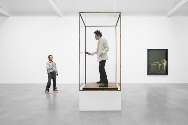
‘Gavin Turk: Who What When Where How and Why’ at the Newport Street Gallery, London, 2016. © Victor Mara Ltd. Photo: Prudence Cuming Associates
But looking over this partial retrospective, it’s now clear that while many of us were busy laughing at his semi-serious attempts to cement his own image into art history, Turk was quietly crafting what can only be described as a major body of work. All of these exhibits – the Sid waxwork, the bronze rubbish bags, the Pollock knock-offs, and yes, even that Hello! cover – may have initially looked like stunts. But seen together, they ask big questions about what it means to be an artist. That it does so in such straightforward, and yes, likeable style may just be its strongest hand.
*
Turk isn’t the only ’90s oddball currently on show in London. Over at Sadie Coles’s new space in Mayfair, the dependably weird American painter John Currin is exhibiting his new works (until 21 January 2017). When he first arrived on the New York art scene at the beginning of the decade, Currin became known as something of an enfant terrible, chiefly for his – there’s no other way of putting it – apparent obsession with painting well-endowed women in scenes that owed more than a little to softcore pornography. In a review of Currin’s 1992 solo exhibition at Andrea Rosen, Village Voice critic Kim Levin quoted the press release briefly, before adding: ‘Apart from that, they’re awful paintings. Boycott this show.’
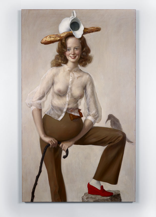
Red Shoe (2016), John Currin. © The artist. Courtesy Sadie Coles HQ, London
Fortunately, the art world at large did not. Despite (and in no small part because of) his eccentricities, Currin is a truly singular painter. Drawing from any number of traditions – American folk art, German expressionism, Mannerism and in particular the Rococo – he mastered a signature style early on that sailed just inches from pastiche, but remained resolutely his own. He has been described as embodying the ‘American Grotesque’, but I think this is too strong a phrase. Sure, his weakness for the seedier side of things and his penchant for hobbling his ostensibly jolly figures with physical deformities would seem to conform to the term. But though his paintings are unsettling, there is also something strangely tender about them. Just as Dickens supposedly suffered severe remorse at killing off characters, John Currin, I think, dearly loves his freakish creations.
For the five new paintings on show at Sadie Coles, Currin has dropped the obvious pornographic references for something altogether more intangible. In one, a heavily pregnant woman with a face that could have been lifted straight from Mad magazine perches one leg on a rock. On her head, she inexplicably balances a baguette and a porcelain jug. In another, an elderly man sits guffawing at a newspaper as his wife beams down at him over his shoulder. It could almost be Norman Rockwell if he didn’t have a boot, an apple and a bunch of grapes sitting atop his bald pate. These, like the other works here, make you feel like you’re intruding on a private ritual – one in which Currin himself is as much a participant as his figures. Don’t boycott this show.
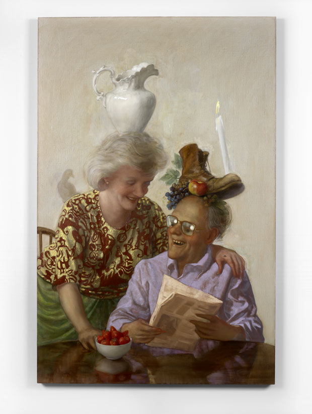
Newspaper Couple (2016), John Currin. © The artist. Courtesy Sadie Coles HQ, London
*
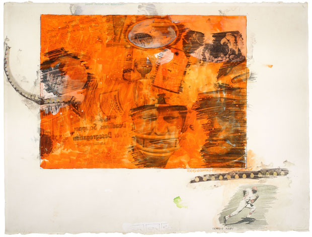
I haven’t had time to see Tate Modern’s impressive sounding Rauschenberg show yet, but an exhibition of his transfer drawings at Mayfair’s Offer Waterman has set the stakes stratospherically high. Comprising of more than 30 works, some of which represent the groundwork for his screen prints, it is an absolutely first class display.
You could easily write his transfer drawings off as addenda to Rauschenberg’s more showy output, but to my mind, they are among the most satisfying works of his long, uncategorisable career. Most of the examples here were produced between 1961 and 1969 and feature headlines and illustrations culled from news magazines. Of particular interest is a set from 1968, which judging by the repeated subject matter of the text appropriated into them, were produced in a short blast of just a couple of weeks, possibly even days. Many artists – Rauschenberg included – have produced similar works, but the delirious energy that seems to shout from each example here will leave you giddy.
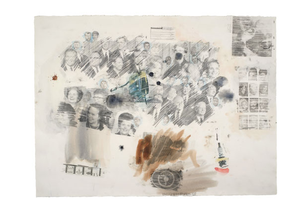
Untitled (1968), Robert Rauschenberg. © DACS
Unlimited access from just $16 every 3 months
Subscribe to get unlimited and exclusive access to the top art stories, interviews and exhibition reviews.
![Masterpiece [Re]discovery 2022. Photo: Ben Fisher Photography, courtesy of Masterpiece London](http://www.apollo-magazine.com/wp-content/uploads/2022/07/MPL2022_4263.jpg)
Why are fathers so absent from art history?