
What is Agnes Martin trying to say? If you really want to know you will have to go see for yourself, because rarely does art lose quite so much in a photograph. Even once you are there the Tate Modern retrospective of the American artist demands a certain commitment. As Agnes Martin once said: ‘Beauty is the mystery of life. It is not just in the eye. It is in the mind.’
At first glance the surfaces are plain – beige, grey, muddy yellow – and the titles (I love the whole world is one, another is Happy holiday) seem to mock our instinct to look for clues. But take a moment to slow your breath and much will be revealed in her work’s soft geometry. This is the mellowest company you will keep in a gallery.
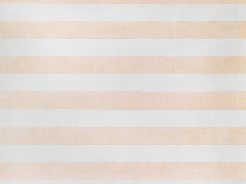
On a Clear Day (1973), Agnes Martin. Parasol Press, Ltd. © 2015 Agnes Martin / Artists Rights Society (ARS), New York
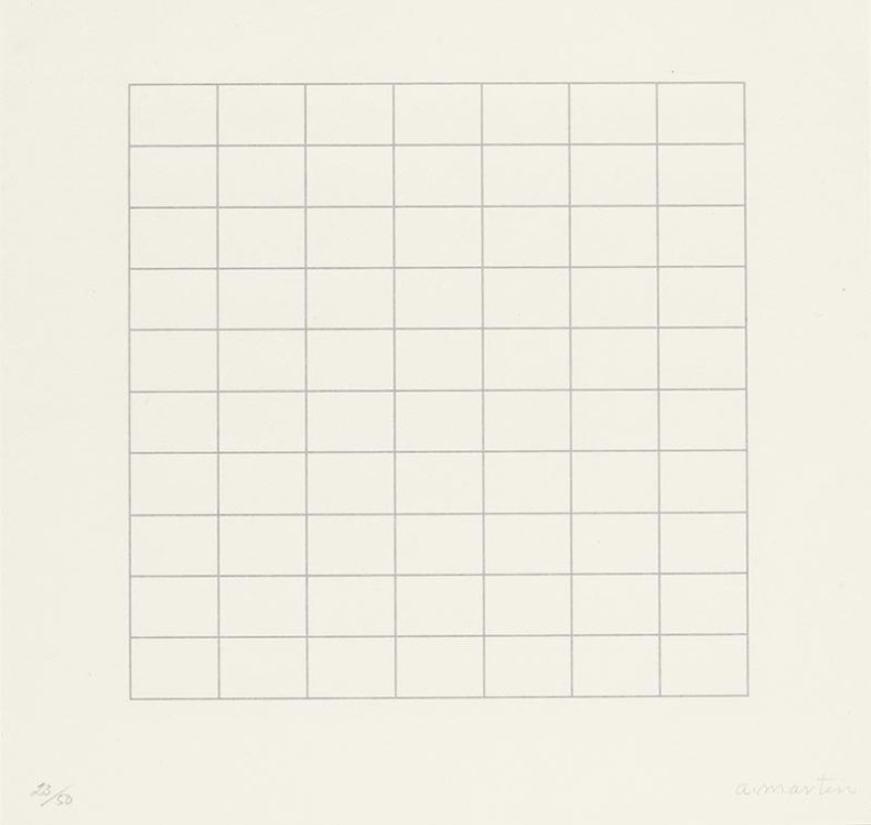
The exhibition runs chronologically, from Martin’s initial shapes in muted colours to her signature grids, which she started in the 1960s and stuck to for the rest of her life. For a body of work that is so meditative, Martin’s art also has a distinctly obsessive streak: she used a ruler to create her lines and blocks, always trying to get them straighter, more exact. Many of the grid paintings have tiny repetitive patterns – it is as if you can feel her there, straining to get it just the way she wants it.
Martin’s extreme desire for order on the canvas can possibly be traced back to her schizophrenia, from which she suffered throughout her adult life. Sometimes this struggle can be felt on the canvas, but at other times the same process created results that were nothing short of magical. Friendship is a large-scale canvas covered in gold foil, laid out in bright and deliciously dirty rectangles. It is still subtle, like everything Martin does, but the effect sends a shiver down one’s spine. A grey stone is another wonderful experience: the closely detailed grey surface is gently thrilling.
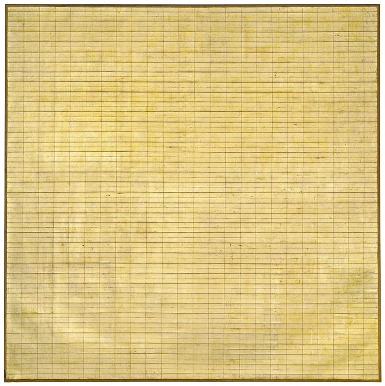
Friendship (1963), Agnes Martin. Museum of Modern Art, New York © 2015 Agnes Martin / Artists Rights Society (ARS), New York
More blocks of would-be dull colours follow in the next room, then a whole section of graphite grey. Eventually her obsession turns into a sort of worship, in a series called The Islands. These canvases are all white, over and over, surrounding you, and the effect is nothing short of elating. The paintings glow on the slightly darkened walls, and it feels like the problem Martin has been working so hard on has finally reached some sort of resolution. The answer, it feels like she is saying, is in the light.
Martin’s journey brings to mind another Tate Modern retrospective: Mark Rothko’s from 2008–09. But while Martin’s journey of simplification culminates in bright white, Rothko ventured in the opposite direction: his exhibition moved through colour towards a room of intense black canvases. What both shows have in common is a feeling of reaching answers to inner turmoil. ‘We favor the simple expression of the complex thought’, Rothko wrote in his New York Times manifesto, co-signed by Adolph Gottlieb. ‘We wish to reassert the picture plane. We are for flat forms because they destroy illusion and reveal truth.’
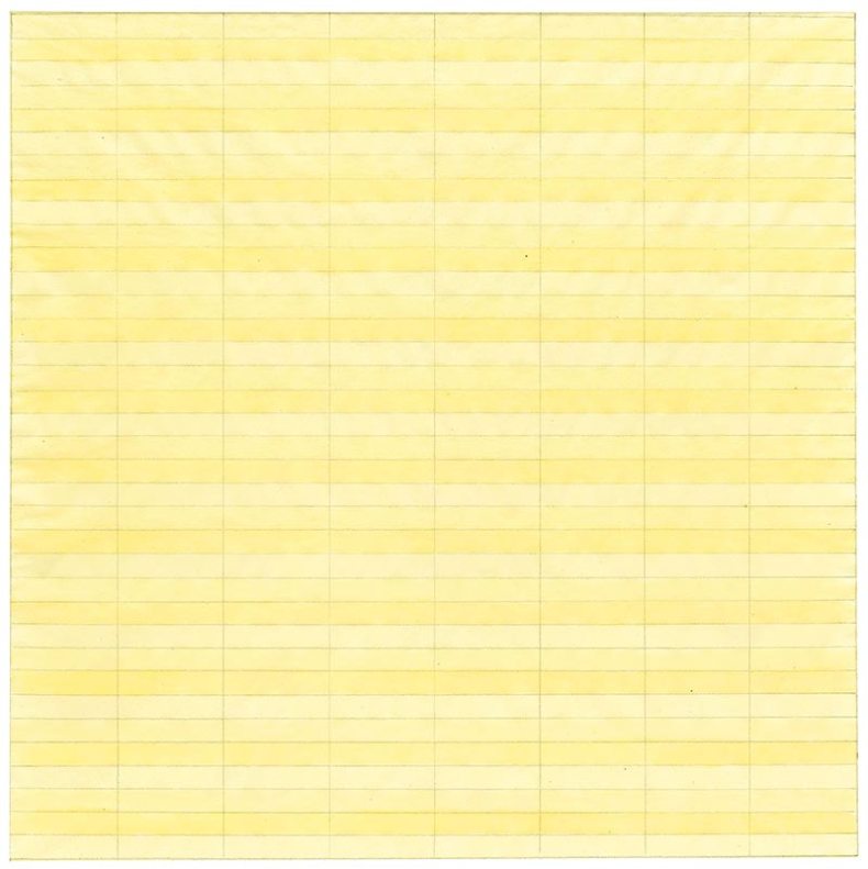
Untitled (1977), Agnes Martin. Private collection. Photograph courtesy of Pace Gallery © 2015 Agnes Martin / Artists Rights Society (ARS), New York
Rothko’s personal journey ended differently than Martin’s: he committed suicide at 66, while Martin kept painting into old age, passing away of natural causes in 2004, at the age of 92. In both retrospectives, Tate presented one additional room after their singular colour series. Rothko reintroduced light: subtle panes of silvery grey started creeping into his black canvases. Martin broke with her typically strict geometry in favour of bold blocks of purple, defiant lines of red, cheeky tips of acidic yellow. It is still precise and exact, but it feels less obsessed and more playful. It feels like the work of someone with nothing to prove and nothing to lose.
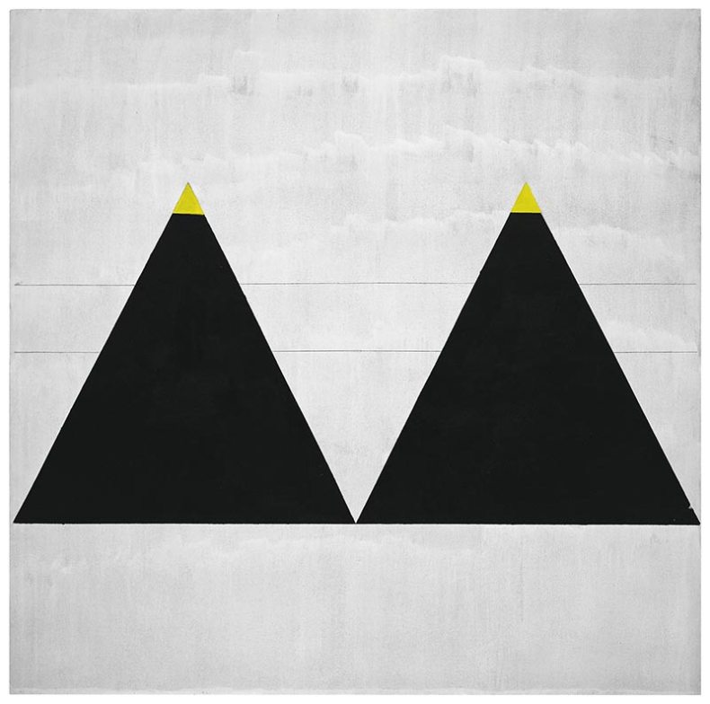
Untitled #1 (2003), Agnes Martin. Fondation Louis Vuitton, Paris © 2015 Agnes Martin / Artists Rights Society (ARS), New York
Agnes Martin is at Tate Modern, London, until 11 October.
Related Articles
Rothko colours in the US east coast (Louise Nicholson)
Unlimited access from just $16 every 3 months
Subscribe to get unlimited and exclusive access to the top art stories, interviews and exhibition reviews.
![Masterpiece [Re]discovery 2022. Photo: Ben Fisher Photography, courtesy of Masterpiece London](http://www.apollo-magazine.com/wp-content/uploads/2022/07/MPL2022_4263.jpg)
Has the Fitzwilliam got its rehang right?