
Alphonse Mucha (1860–1939) may not be a household name but his style is certainly recognisable. The Czech painter and decorative artist rose to fame at the turn of the 20th century, creating designs for posters, biscuit wrappers and decorative panels that came to epitomise the Art Nouveau movement. Even today, Mucha’s distinct style is much imitated. Reproductions of his posters are often found on the walls of student houses or in coffee shops eager to recreate the glamour of La Belle Époque.
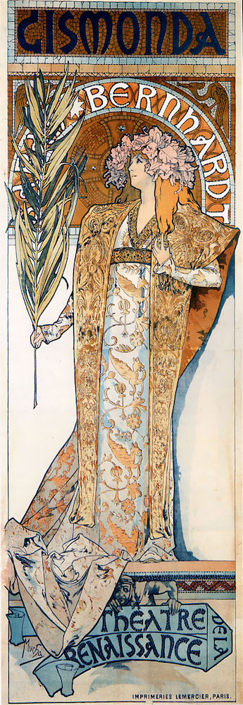
Poster for Gismonda (1894), Alphonse Mucha. © Mucha Trust 2016
Kelvingrove Museum’s exhibition, ‘Alphonse Mucha: In Quest of Beauty’, aims to go beyond the familiar by reminding us how Mucha’s designs originally caught the attention of Parisians in the 1890s. The show’s curators also probe the aesthetic philosophy behind Mucha’s work by examining his concern with the importance of beauty in people’s everyday lives. The show (part of a wider touring exhibition) is a collaboration with the Mucha Foundation in Prague; it features 80 works from the foundation alongside 13 pieces from Glasgow’s own collection, including works by Charles Rennie Mackintosh and George Logan.
The show opens with the posters Mucha designed for the Parisian actor Sarah Bernhardt to advertise the plays she was starring in. These were his first designs and brought him to wider public attention; they make a good case for why Mucha’s work was originally so eye-catching. Not only does their unusually tall format distinguish them from the posters of his Parisian contemporaries – such as Henri Toulouse-Lautrec and Jules Chéret – but they also reveal how Mucha had already developed his distinctive style. In the earliest of these, Gismonda (1894), many of the features of Mucha’s style are already present: his limited palette, flat images, trademark font and his incorporation of the female figure with floral motifs.
Package labelling for ‘Biscuits Boudoir Lefèvre-Utile’ (1901), Alphonse Mucha. © Mucha Trust 2016
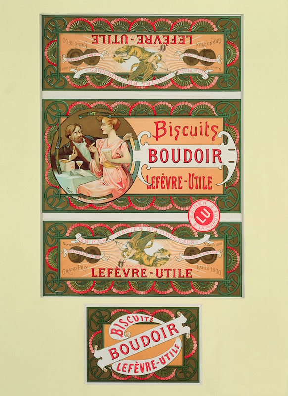
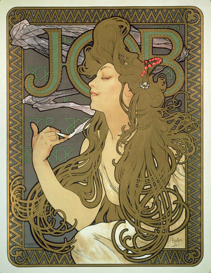
Mucha’s style was particularly suited to advertising, as demonstrated by the perfume bottles and biscuit wrappers he designed. Though his designs are now constantly imitated on a variety of household goods, from soap to tea, seeing them here allows viewers to consider their original skill. Mucha’s design for Lefevre-Utile’s Boudoir biscuits, for example, combines images, patterns and writing while cleverly incorporating the company’s initials into the background. But Mucha is at his best when he is at his most extravagant. One of his designs for the cigarette paper brand JOB shows an enticing female figure whose long flowing hair stands out against a sumptuous dark background (1896). Her image is so alluring that it is easy to forget that its aim is to sell cigarette papers.
Reproduction of the poster Job (1896), 1900, Alphonse Mucha. © Mucha Trust 2016
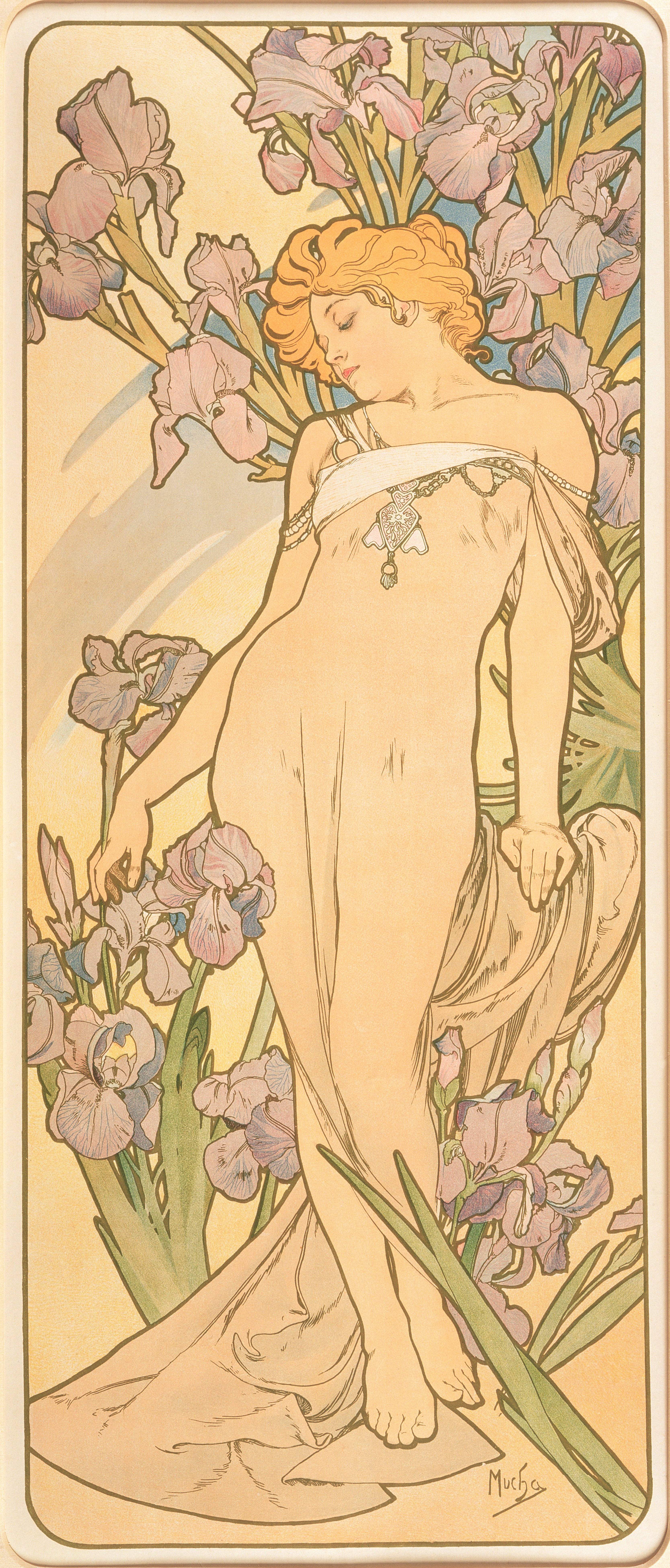
It is not surprising that Mucha relied so heavily on female figures in order to sell products (advertising still insists on doing that today), but they are also central to his works that do not market anything specific. In 1896, Mucha embarked on a new project creating decorative panels, which his publisher F. Champenois reproduced in large quantities. Their intention was to make ‘works of art’ affordable, as Mucha believed that beautiful works elevated people’s morals and improved the quality of their lives. The female figure is a central feature of his panels, but now that they are no longer selling anything his dependence on them is discomforting. This is most obvious in Mucha’s set of four lithographs, The Flowers (1898), where he combines the female form with floral motifs. In making the female figures synonymous with the flowers, they too become purely decorative. These are not real women; their only purpose is to look beautiful and provide instant gratification for the viewer.
The Flowers: Iris (1898), Alphonse Mucha. © Mucha Trust 2016
Kelvingrove Museum’s exhibition is dominated by Mucha’s Art Nouveau designs, yet it also alludes to the overlooked nationalist projects that he concentrated on in the latter half of his career. The Slav Epic (1911–26), a series of 20 canvases – the largest of which measures over six by four metres – depicts the history of the Slavic people, but is sadly missing here. To compensate, the exhibition includes a film of the canvases, although, of course, it is nothing like seeing the monumental work for real. A number of Mucha’s patriotic posters are also on display. His elaborately styled Poster for the 8th Sokol Festival Prague 1926 (1925) is made strange through its juxtaposition of muscular men and Mucha’s trademark floral motifs. The poster advertises the gymnastics festival organised by the Sokol movement, a youth sports organisation which played a significant part in the development of Czech nationalism. The exhibition leaves some unanswered questions here: how was Mucha’s nationalism received in his homeland given that he had been absent for nearly 25 years?
Poster for the 8th Sokol Festival, Prague, 1926 (1925), Alphonse Mucha. © Mucha Trust 2016

In neglecting to scrutinise the importance of Czech nationalism in the later stages of Mucha’s career, this exhibition is unable to give a complete overview of the artist’s life and work. Furthermore, although it includes Henri Toulouse-Lautrec’s poster, Jane Avril au Jardin de Paris (1893), and several by Mackintosh, more comparisons between his designs and those of his contemporaries would have been enlightening. Encouraging us to rethink a style that we are overly familiar with, this monographic exhibition is to be welcomed. But it is a shame that Mucha’s Art Nouveau style dominates at the expense of interrogating his nationalist tendencies, preventing the exhibition from perhaps being as revelatory as it could have been.
‘Alphonse Mucha: In Quest of Beauty’ is at the Kelvingrove Museum, Glasgow until 19 February 2017.


