
The story may be apocryphal, nevertheless it is often repeated that when Orson Welles learned of businessman Ted Turner’s plans to colourise his black-and-white masterpiece Citizen Kane (1941), he implored his friend the film-maker Henry Jaglom not to let Turner ‘deface my movie with his crayons’. Turner, whose Turner Broadcasting System bought the MGM/UA back catalogue in 1986, and with it the library of RKO Radio Pictures, the studio that produced Citizen Kane, had obtained the rights to thousands of historic films, and was seeking innovative ways to market them. Black-and-white movies might have been great back in the day but contemporary audiences, Turner felt, found them fusty and unrelatable. To give them new life, he decided to re-release them in colour.
Welles died in October 1985, months before Turner secured the rights to begin the process. Ultimately, he abandoned the effort – Welles’s wishes aside, the newly rebranded Turner Entertainment found specific language in the original RKO contract that prohibited colourisation. At least that was the public justification. In reality, to proceed would have been damaging. The idea of colourising such a seminal work had elicited howls of protest from across the film industry and caused audiences to question whether such reworking of a historic masterpiece was ethical, or even desirable.
In the decades since, the howls of protest have turned to whimpers as increasing numbers of films, photographs and even prints and drawings have routinely received colourisation treatment. With still photography in particular, colourisation has become both a popular hobby and a commercial enterprise, driven by free and open-source Artificial Intelligence (AI) software, and easy downloads of vast archives of public domain imagery. Software is now capable of recognising skin, earth, water and sky and adding flesh tones, greens and blues of various values and intensities based on predicted outcomes.
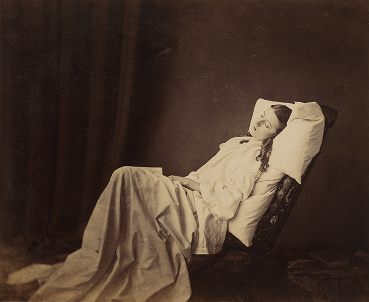
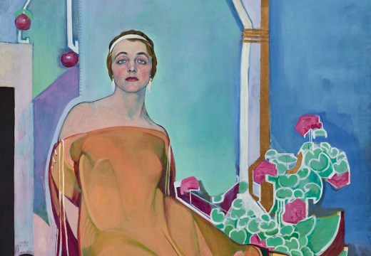
She Never Told Her Love (1857), Henry Peach Robinson. National Gallery of Art, Washington, D.C.
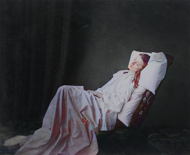
Hotpot-copy_CMYK Colourised version of Henry Peach Robinson’s She Never Told Her Love, produced using Hotpot.ai
In a matter of seconds, websites such as Hotpot.ai can inject colour into an image where none previously existed. The Hotpot algorithm interprets the deep chiaroscuro in Henry Peach Robinson’s She Never Told Her Love (1857), for example, as indicative of a night scene, transforming the sepia darkness into an uncanny blue green. The woman’s face and hands are coloured peach (ethnic sensitivity is not an AI strong suit) while her hair ranges from brown to cherry red in the shadows – echoed in the crenulations of her bed sheet and presumably representing colour shift under low light conditions. The sheet itself is tinged with blue and violet, poetic licence on the part of the algorithm perhaps, or a case of the system confusing the folds of cloth with waves of water.
As algorithms improve, such colourisations will undoubtedly become more convincing. Yet they can never be wholly accurate. It is impossible to know the precise colour of the woman’s skin, blouse, hair, bed linen, or the velvet curtain emerging from darkness behind her. This is a problem endemic to colourisation – certain colours may be inferred from context, but in the absence of written accounts, sketches, or corroborating colour photographs, others will never be more than educated guesses.
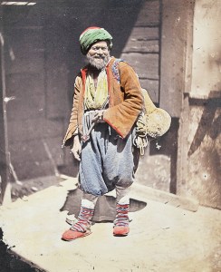
The Itinerant Tradesman, Constantinople (1852), James Robertson. Serge Kakou Collection, Paris
Such uncertainty is not unique to digital colourisations. Period treatments, even those personally overseen by the maker, are equally suspect. James Robertson’s Itinerant Tradesman, Constantinople (1852), for example, is a salt print expertly over-painted in watercolour by the photographer’s studio (after their invention later that decade, aniline dyes were often used). The subject’s banded socks are rendered in vibrant stripes of red and blue, echoing the strap on the figure’s left shoulder. The russet of his jacket complements the denim blue of his trousers and the yellow of his shirt, while the red top of his turban matches the jacket’s lining. These colours would have been chosen and applied by a colour specialist sometime after exposure of the negative. It is unclear whether Robertson, who presumably witnessed the scene, told the technician which colours to use or, if he did, whether he would have attempted to replicate what he saw or instead called for a new arrangement designed to catch the eye and sell more pictures. Colourisation was a premium process for which consumers paid a surcharge. Notably in this example the background was left uncoloured, so that the figure separates dramatically from the building behind him.
Robertson’s colourisations marked the beginning of an extensive tradition in photography. Shortly after this photograph was made, he teamed up with the renowned Anglo-Italian photographer Felice Beato, who travelled across Asia and eventually set up shop in Yokohama in 1863. Beato, his successor Baron Raimund von Stillfried and their assistant Kusakabe Kimbei would go on to produce large volumes of hand-coloured photographs in Japan, using woodblock printers as colourists – casualties of an enterprise photography had replaced. In Britain, many colourists were women, trained specifically for the job or brought in from related industries such as wood engraving, lithography or decorative arts. Their contributions to the colourising industry were fundamental to its success; their anonymity is a source of enduring frustration.
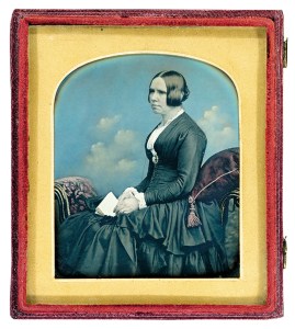
Seated Woman (c. 1859), William Edward Kilburn. Solander Collection, Pasadena
At times, colourists have been responsible for extraordinary acts of invention. Working from premises on Regent Street in London, William Edward Kilburn became one of the most successful daguerreotypists of the late 1840s and ’50s, known for his signature arrangement, setting his figures against cerulean skies animated with puffy clouds. A similar effect might have been obtained using studio backdrops, but Kilburn evidently preferred to position the clouds according to the pose and, one might imagine, the sitter’s personality, since no two Kilburn backgrounds are alike. Instead, each was meticulously rendered using powder colours applied to the surface of the plate and then heated to bind them.
As with still photography, hand-colourisation in cinema dates to the medium’s early days – the Edison Company, Georges Méliès and many others used dyes to colour their productions. The techniques available to Ted Turner in the 1980s blended hands-on and digital techniques. Operators were required to identify and tag zones of colour in an image manually, which a computer would later fill in. Software tracked the identified zones from frame to frame, even as sections moved or changed shape, carrying the colour along automatically. If a technician tagged a face as flesh tone in one frame, the computer would ‘remember’ that face and apply the same colour to it as the film progressed, even if the figure spoke, turned their head, or proceeded out of the frame. This was much more efficient than previous colourisation techniques which had required painting every element of each frame manually.
It was not the use of computers per se that alarmed Turner’s critics, but the spectre of swathes of cultural history being colourised thoughtlessly at a keystroke. While that was not actually possible given the computational power and memory limitations of the time, the relative ease of colourisation raised the question of artistic agency in the production of black-and-white photographic materials, and whether it was ever appropriate to ‘correct’ monochrome content.
In Welles’s case the matter was reasonably straightforward. Budgetary considerations aside, had he chosen to do so, Welles could have shot Kane in Technicolor or a rival process, such as the British Kinemacolor; three-colour film technology had been in existence in various forms since the 1910s and enjoyed considerable vogue when Kane was made. Moreover, Welles made no effort to colourise the picture after the fact. That he later went out of his way to signal his opposition to colourisation made his artistic intention abundantly clear. As a work of art, Kane was a grisaille; one would no more apply colour to it than to Giotto’s frescoes of the vices and virtues in the Scrovegni Chapel.
Film noir and Expressionist cinema are virtually unimaginable in colour. Deep inky shadows, unsettling, otherworldly perspectives and the resolute neutrality of the silver screen are integral to their understanding and enjoyment. And while AI technology is capable of reinventing photographs such as She Never Told Her Love in colour, should it? Robinson knew the limitations of wet plate collodion photography and used them to his advantage. The pallid complexion of the woman, presumably on her deathbed, is echoed in the impenetrable bleakness of the background; her upper torso, seemingly blasted with light, underscores her loss. The aim of the artist was to move and inspire, not to mimic reality. Indeed, colour photography was looked down on for much of the 20th century precisely because of its verisimilitude. The colourised version may more closely approach what the eye sees, but it is no more powerful for that.
It may seem churlish to note in this context that black and white are colours, except that true ‘black’ and ‘white’ are rare in the 19th-century photographic palette. Salted paper, albumen and collodion papers typically range in hue from purple-red to sepia, which could be altered or intensified to convey mood. Many early photographic materials, including daguerreotypes, were toned after fixing in chemical baths of gold and other metals to improve image fixity and give the picture a certain cast. Papers, too, were chosen for visual effect and even stained with tea and other substances to lend them warmth. Under the influence of Symbolist painters, fin-de-siècle Pictorial photographers experimented with a wide range of so-called monochrome materials, from Prussian blue cyanotype to the full range of artist pigments that could be applied using carbon paper or gum bichromate.
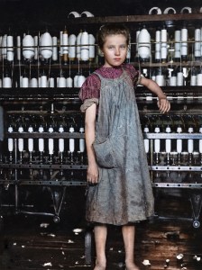
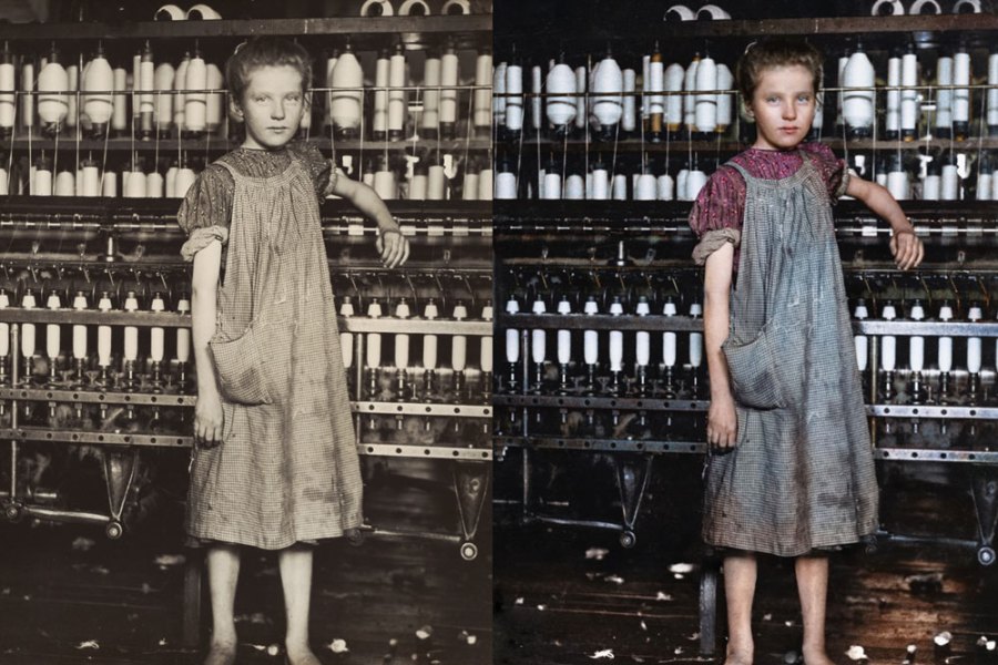
Digital colourisation of Lewis Hine’s photograph
of Addie Card by Marina Amaral. Photo: © Marina Amaral
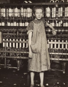
Addie Card, 12 Years Old, Spinner in cotton mill, North Pownal, Vermont (1910), Lewis Hine. National Gallery of Art, Washington, D.C.
What if the artist’s intentions were not so clear? Much of the still photography now in the public domain predates the invention of the Lumière Autochrome, the first commercially viable full colour process, around 1904–06. Moreover, speedy colour films suitable for indoor photography or reportage would not be available until decades later. One might argue that many 19th- and early 20th-century practitioners would have photographed in colour had they only had a practical means to do so; colourisation merely remedies this unintended defect.
Whatever the merits of this argument, it is hard to deny the impressive results contemporary retro-colourists are able to achieve. The Brazilian artist Marina Amaral, for example, has returned to early 20th-century photographs, such as Lewis Hines’s Addie Card, 12 Years Old (1910), colourising them for contemporary audiences. Using digital techniques to add colour and also sharpen and balance contrast, Amaral has created a revised portrait of extraordinary visual sensitivity. Faced with such virtuosity, objections to colourisation quickly dissipate. The treatment may be anachronistic, but it is undeniably transporting. And while Hine may not have approved, the picture is being seen, considered, and enjoyed by new audiences. This, after all, is surely the whole point of art. Besides, Hine isn’t around any more to object, is he?
Phillip Prodger is Executive Director of Curatorial Exhibitions, Pasadena, California. He was formerly Head of Photographs at the National Portrait Gallery, London.
From the March 2021 issue of Apollo. Preview and subscribe here.
Unlimited access from just $16 every 3 months
Subscribe to get unlimited and exclusive access to the top art stories, interviews and exhibition reviews.

![Masterpiece [Re]discovery 2022. Photo: Ben Fisher Photography, courtesy of Masterpiece London](http://www.apollo-magazine.com/wp-content/uploads/2022/07/MPL2022_4263.jpg)
Why are fathers so absent from art history?