
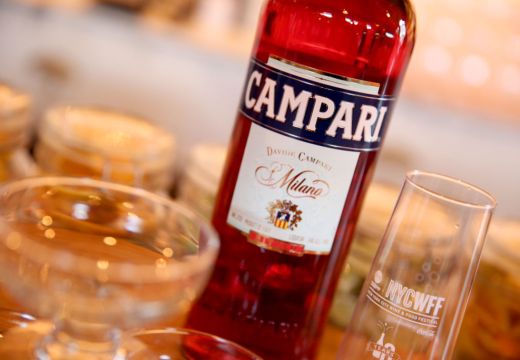
I hope it doesn’t sound too cynical to say that Campari’s exhibition at the Estorick Collection in North London is a branding exercise before anything else. Two galleries filled with the logos, posters and advertising material of a single brand can’t really be anything but. The exhibition, which focuses on the period from 1900 to the ’60s, offers little context for this material with regards to what was happening in Italy and the rest of the world during this time. Still, the works, all of which come from The Galleria Campari (the company museum) in Milan, give a good reflection of the changing tastes of the 20th century and a company that maintained its brand by continually embracing the currents of the art world.
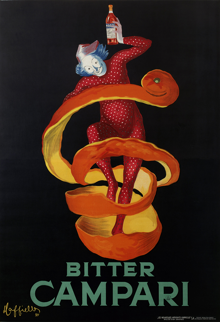
Bitter Campari (Lo Spiritello) (1921), Leonetto Cappiello. Courtesy Archivio Galleria Campari, Milan
The first gallery sums up where the brand stood at the beginning of the 1900s. The posters are what you’d expect from the time, showing the influence of Jules Chéret, Toulouse-Lautrec and the Belle Époque. This is illustrated particularly well by Leonetto Cappiello’s posters from the 1920s. His black expanses recall Toulouse-Lautrec’s large areas of negative space, while his Campari sprite, a round-bellied man in a red leotard who leaps around clutching a bottle of Campari, could be a washed-up version of one of Chéret’s clowns, past his gymnastic prime and spending more time in the crowd at the Moulin Rouge than on the stage. They’re striking compositions, although this stage of design history is one which today usually occupies a similar space to period dramas on ITV: pleasant, nostalgic and safe.
The second room starts with work produced just a few years later, although the style is drastically different. These are by Fortunato Depero, who wrote the ‘Futurist Reconstruction of the Universe’ manifesto with Giacomo Balla in Rome in 1915. His designs are unsettling and striking, with their strong contrast of black and white irregular shapes. His figures are characterful and charming, like children’s cartoons, lacking the aspirational air of the bourgeois couples relaxing in cafes of some of the brand’s earlier advertisements. And neither the images or words are easy to read; Depero didn’t highlight the Campari logo or bottle by picking it out in a colour or isolating it in the composition, all standards of design in advertising applied everywhere else in this exhibition.
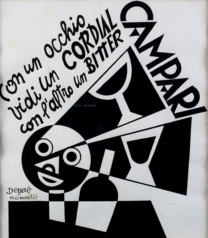
With one Eye I saw a Cordial with Another a Bitter Campari (1928), Fortunato Depero. Courtesy Archivio Galleria Campari, Milan
It seems that Campari noticed Futurism coming into style, and maybe the links it had to the political direction of the time, and as a result was prepared to give Depero creative freedom. There’s no indication in the exhibition of how the advertisements were received. But presumably they went down reasonably well, as four years later in 1932 Depero was still involved enough with Campari to design the unusual tapered Campari soda bottle – which remains in production today and stars in some of the later ads on display here.
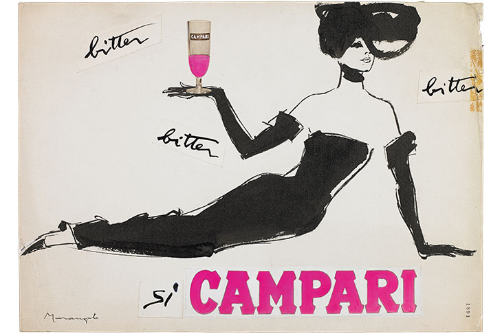
The designs of the posters from the 1960s are slightly more conventional, with the prominent logo and product and aspirational imagery making a return. They continue largely to follow the styles of the times: in one poster designed by Franz Marangolo, thick, inky brushstrokes depict an elegant women reclining with a glass of bright pink Campari, evoking the fashion illustrations of René Gruau and the images found in Marie Claire or Vogue in the 1950s and ’60s. Elsewhere there are Pop art-inspired pieces, the distinctive outline of Depero’s bottle repeated in the grid format of Warhol’s Marilyn, or playfully surreal compositions with a wit like that of Saul Steinberg, as in one example where the taper of the bottle mimics a woman’s miniskirt (both also by Marangolo).
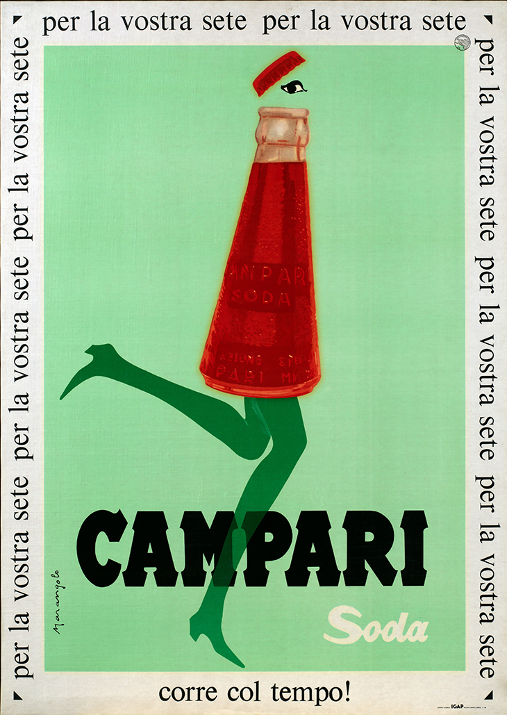
Campari Soda is in Line with the Times! (1960s), Franz Marangolo. Courtesy Archivio Galleria Campari, Milan
One wall is even filled with an enormous lithograph made up of iterations of the Campari logo – a work by Bruno Munari. In the print from 1964, another version of which is in MoMA’s collection, Campari logos from across time are collaged on a red background. What comes across here is a brand that has identified the visual trends of its times and trusted designers and artists to create something iconic. As the slogan accompanying Marangolo’s soda bottle-woman reads, ‘Campari Soda corre col tempo!’ – ‘Campari Soda is in line with the times!’
‘The Art of Campari’ is at the Estorick Collection, London, until 16 September.
Unlimited access from just $16 every 3 months
Subscribe to get unlimited and exclusive access to the top art stories, interviews and exhibition reviews.

![Masterpiece [Re]discovery 2022. Photo: Ben Fisher Photography, courtesy of Masterpiece London](http://www.apollo-magazine.com/wp-content/uploads/2022/07/MPL2022_4263.jpg)
Why are fathers so absent from art history?