From the March 2023 issue of Apollo. Preview and subscribe here.
On the eve of the first-ever survey of Hugo van der Goes, at Berlin’s Gemäldegalerie, its curator Stephan Kemperdick talks Apollo through the evidence for regarding Saint Luke Drawing the Virgin as an original work by the Netherlandish painter.
In terms of historical facts, we don’t know anything about this painting of Saint Luke except that it is a 15th-century work. We do not know anything about the commission, or about its original location and, in fact, we do not know who painted it. For a long time it was often regarded not as a painting by Hugo van der Goes (d. 1482) himself, but rather as a faithful copy of a lost work. In my eyes this cannot be, for several reasons, but it goes to show how little hard factual knowledge we have about it.
The history of the reception of this work is very peculiar. At the bottom of it all is a print from the second half of the 16th century by Anton Wierix (c. 1555–1604), which shows the very same Saint Luke combined with the Virgin set among High Renaissance, classicising architecture. To some people it looks Hugo-esque and to others not at all. To further complicate matters there is a puzzling inscription, ‘Quintin Mazzijs inuentor’, which led to the widespread belief that there was perhaps a model by Hugo van der Goes which was copied by Quentin Massys (1465/6–1530), and that either Wierix then based his engraving on that likewise lost copy, or the wing preserved today in Lisbon is the copy by Massys, or one half of it. In my view this is clear nonsense, and my colleagues and I have clearly shown that the engraving in question, with the Massys inscription, is not based directly on the Saint Luke painting in Lisbon but rather on a drawing after it. It is simply an erroneous attribution.
My positive argument for attributing this painting to Hugo van der Goes himself is simply that if you know his works well – and we have two major works by him on a large scale at the Gemäldegalerie – and you compare the details, you will find that this really astonishing, extraordinary colour scheme is something that is typical for Hugo van der Goes but hardly for any other painter. Of course, that could have been reproduced in a faithful copy; however, I would say that the brushwork and minute, more elegant details, such as the shape of eyelids or the way he paints the light catching Saint Luke’s eye, are exactly Hugo van der Goes. And then there is another obvious argument: the painting in Lisbon shows several deviations from the first design. So there were changes, most of them not so big but some more important: the placement of the easel in the background with a prepared panel on it has been shifted a little, the window has been changed, as have some smaller folds in the garment. This makes it clear to me that it cannot be a faithful copy – obviously not of a lost work. If I leave out the whole business of Massys and the print and just say the painterly style, the execution, the dabbling of the brush is typical for Hugo, the bold drawing and bold colour scheme is typical for Hugo, and then there are changes that occurred during the execution, in my eyes there’s only one solution to this, and that is to say this work is the original by Hugo.
Saint Luke Drawing the Virgin (c. 1475/80) Hugo van der Goes. Museu Nacional de Arte Antiga, Lisbon

This panel follows in a tradition of depictions of Saint Luke in his workshop that started in the 14th century. An important model for Hugo is, of course, Rogier van der Weyden, where the setting is less of a workshop and more of a palace. One always wonders what it is meant to be. Is it the dwelling of the Virgin Mary with a canopy, where Saint Luke has come to draw her portrait in the fashion of a court painter travelling to the prince or princess? In the painting of Saint Luke by Hugo van der Goes, the setting is clearly a workshop, and that might have something to do with the location for which the painting was destined. The most likely assumption is that it was destined for a painters’ chapel. If this is the case, then the panel would have represented something of the image that the painters and the corporation of painters had of themselves – citizens and draughtsman rather than servants of a prince, highly educated and highly skilled craftsmen, to such an extent that even the Virgin Mary is coming to sit for her portrait.
The whole studio that you see around Saint Luke is tidy and clean, unlike a real workshop at the time, but it’s a representation of a kind of bourgeois or petit-bourgeois lifestyle. One feels that the painters have a high opinion of themselves, and they are working in a very clear and clean manner. Saint Luke is making that silverpoint drawing of the Virgin, and the panel on the easel is ready, so he’s well prepared, but there is no paint spilled, no stains anywhere. Think of later depictions of Saint Luke with so many things lying around, all the little gadgets and whatever they had in their studio. By the 16th century, other painters loved to show Saint Luke in a studio where paint had been spilled, full of stuff and with cobwebs everywhere.
Everything here shows a certain standard: the cupboard in the background, that’s not makeshift. For us today it’s only an antique cupboard, but people in the 15th century would have realised that this is a precious piece of furniture that shows a lot of work by a skilled carpenter, with the trefoil and hinges. This is nothing in the age of industrially produced furniture, but in the 15th century it would have been hand-made. It is very different from the chest that a peasant or somebody from the lower strata of society would have.
Saint Luke Drawing the Virgin (detail; c. 1475/80) Hugo van der Goes. Museu Nacional de Arte Antiga, Lisbon

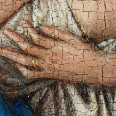
If you look at the painting you have a transition from the front to the back, in terms of what is going on. When the painter started making a drawing of the Virgin, he would have used the piece of charcoal that is lying at the front of the painting and, of course, there is the knife used to sharpen the piece of charcoal. The big advantage of charcoal is that you can erase it, and you would have erased it with the help of the bird’s wing, which was used to sweep away the black dust of the charcoal. This is still used even today and it’s much better than your hand, not only because your hand isn’t black afterwards but because you do not smear the charcoal into the paper. These three objects are used for the first step. Fifty centimetres further in the background, Saint Luke is making the drawing itself, that is, the real silverpoint drawing following the general charcoal sketch. This is the second step. Further back there is the primed panel with its frame waiting alongside the palette and the objects on the cupboard, the containers for oils and pigments – the shell is, of course, used to mix oil and pigment. These are the three steps in the execution of a portrait.
There is another reason for the inclusion of the charcoal, wing and knife. If you look at all the existing paintings by Hugo van der Goes, he was typical of early Netherlandish painters in that he did not like empty spaces. You can clearly see there are these folds of his garment, one of which is pointing towards the lower edge of the painting and then it is paralleled by the knife and the wing so the objects echo, to a certain degree, the garments of Saint Luke, and they make it clear that this is not a flat surface in front of us but a receding floor with objects lying on it.
The garments themselves add to the impression of a plastic, three-dimensional surface, with their folds and contrast. The red cap is very typical of depictions of Saint Luke, showing him as a learned man and a physician. Contemporary portraits of university teachers often have red or purple robes. Hugo was not the first artist to depict Saint Luke completely in red – Rogier van der Weyden had already established this tradition – but there is a beauty and harmony to the reds in this painting that are entirely Hugo’s own. The purplish bright red, almost a pink, of his gown painted next to the more yellow red of his hood requires a bold painter to make this combination work. If he had pushed it just a little bit further it would no longer work. Hugo was doing similar things in his Nativity (c. 1480), where Joseph is wearing the combination of this purplish red and orange which also hurts your eyes, almost. To a certain degree, I can understand why some scholars in former times found this tasteless. Try to find a painting with a similar palette at the time – it is almost impossible.
Saint Luke Drawing the Virgin (c. 1475/80) Hugo van der Goes. Museu Nacional de Arte Antiga, Lisbon

These are garments which clearly demonstrate wealth and taste: it is almost – but not quite – a sympathy for the devil. This garment entirely lined with marten fur is certainly a symbol of wealth. Luke has a golden seam along his blue cloak, which is so immense – it’s almost like a toga – that he would have had real difficulties had he tried to stand up and move. Of course, abundance of cloth means wealth and that is obviously a traditional role for St Luke – he’s an apostle but he’s not playing the barefoot apostle here; indeed, he has these nice, buckled, leather shoes. It’s a different role from his appearance at the Last Supper, where he would be soberly dressed. Here he is the learned man with the book, his gospel no doubt, in the background but also the learned man with his cap, the one who studied at university, the physician who at the same time is the foremost painter, a man whose dress and home show him to be a very well-off artist.
From the March 2023 issue of Apollo. Preview and subscribe here.