
This review of The Inscriptions of Ralph Beyer by John Neilson appears in the March 2021 issue of Apollo. Preview and subscribe here.
In John Neilson’s splendid and comprehensive account of the work of Ralph Beyer, the author recounts how in 1962 the lettering scholar Nicolete Gray’s review of Beyer’s inscriptions at Coventry Cathedral appeared in the journal Typographica. Gray was assessing a project conceived on a monumental scale – Beyer’s eight Tablets of the Word on either side of the cathedral’s nave, his equally dramatic lettering cut from brass sheet and set into the threshold floor and his further inscriptions in the Chapel of Industry, as well as a range of quotidian signage. Beyer might have hoped for a sympathetic review. He had, after all, sought out Gray after reading her article ‘Theory of Classical’ (1953). He had felt liberated by the example of David Jones’s idiosyncratic calligraphy illustrated in her piece, and found her sympathetic to freer forms of lettering, noting her awareness of the German calligrapher Rudolf Koch.
As a friend of Ralph’s father, Oskar, Koch had shaped Beyer’s understanding of the power of lettering in his boyhood. Encouraged by Basil Spence, the architect of Coventry Cathedral, Beyer had taken early Christian inscriptions and symbols as his inspiration. These had been the subject of two books by Oskar Beyer and throughout the Coventry project Ralph was encouraged and sustained by his father. Beyer’s lettering at the cathedral was in part a tribute to his father and to the world he had lost; half-Jewish, Beyer was sent to England at the age of 16 in December 1937 and his mother was to die in Auschwitz. Gray’s response was therefore a shock to Beyer, the pain of which did not diminish over the years. She was particularly critical of the Tablets of the Word, the most important part of Beyer’s demanding commission.
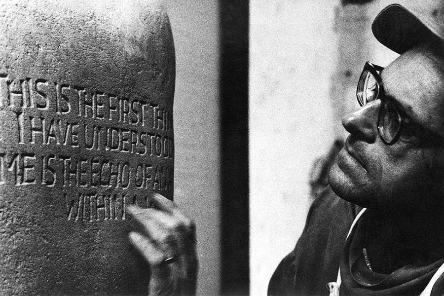
Ralph Beyer carving the ‘Son of Man’ tablet, one of the eight ‘Tablets of the Word’ in Coventry Cathedral. Photo: Estate of Ralph/Oskar Beyer
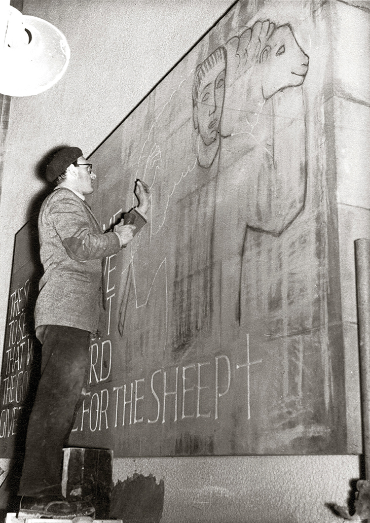
Gray suggested that Beyer lacked ‘the creative imagination or intensity of religious feeling which David Jones could have brought to the work’, taking issue with the inscriptions’ ‘false informality’, the uneven scale of Beyer’s individual letterforms, his spacing, his adaptation of early Christian symbols – the key, the vine, the cup – which she found ‘crude and banal’. She did, however, appreciate the scale of the lettering, noting that from the cathedral threshold it was possible to read the tablets – carrying texts from the New Testament – while looking down the long nave towards Graham Sutherland’s tapestry. But she did not recognise Beyer’s ambition to create communicative sculpture. Cut into stone that stood proud of the wall, Beyer’s inscriptions were worlds away from David Jones’s essentially private Latin or polyglot work on paper.
Beyer’s work was always best appreciated by individuals outside the world of lettering, beginning with Nikolaus Pevsner’s recognition of Beyer’s talent – he described him as ‘married, untidy, poor but serious and sound’ – when they were both interned at a camp in Huyton during the Second World War. Basil Spence remained unfailingly loyal to Beyer, noting that he was ‘a diffident and humble person, though a most sensitive carver’ well able to create letters that could be ‘“felt” – some irregular, some smaller than others, but each one a piece of incised sculpture in its own right’. Similarly the architectural partnership Maguire & Murray appreciated Beyer’s gifts. In 1954 Keith Murray had given Ralph a commission for a slate altar at St Katharine’s, Shadwell, an early experiment with free lettering, while his inscription for Murray & Maguire’s St Paul’s Bow Common of 1960 still stops the heart – THIS IS THE GATE OF HEAVEN in shutter-cast concrete above the architects’ austerely functionalist porch. Beyer continued to work for the firm, in 1985 creating unusual raised plaster inscriptions in English, Turkish and German for a nursery school in a deprived part of Berlin, a project that gave him great pleasure. Then there was Jane Owen, Beyer’s patron in New Harmony, Indiana, for whom he designed inscriptions sandblasted on boulders for the Paul Tillich Park and carved the Ten Commandments on the exterior of the circular Waddams Chapel. ‘I was overwhelmed by the impact of your layout of the first Commandment,’ wrote Jane Owen. ‘I felt I had never seen it before, and this is precisely the effect I had hoped it would have on the beholder.’
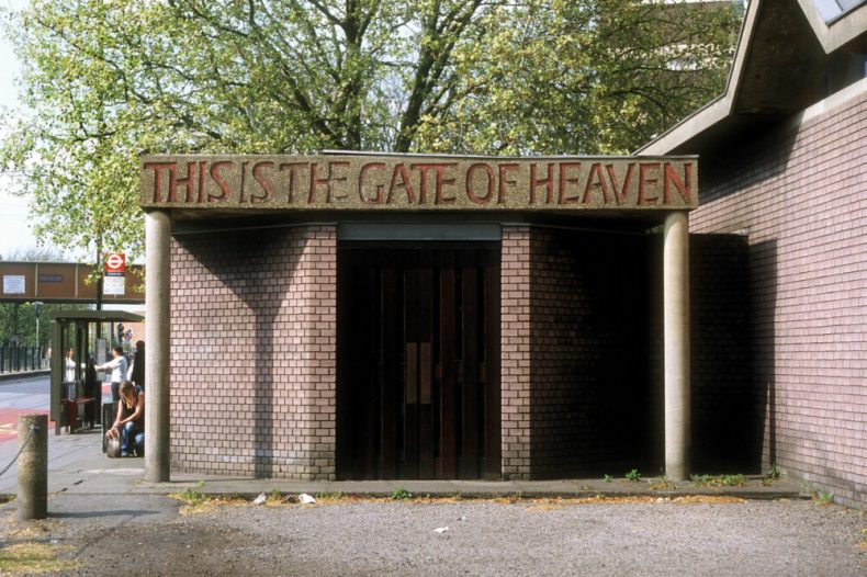
Cast concrete inscription by Ralph Beyer above the porch of St Paul’s Church, Bow Common, London, built c. 1980. Photo: John Neilson
Owen got to the heart of Beyer’s lettering. His inscriptional work was invariably presented four-square, often ranged left, with unexpected margins and personal letterforms, and to the expert eye roughly executed. But all his work had the important effect of making the viewer want to read what was written there. Tellingly, when it came to letters, typography meant more to Beyer than calligraphy. Many of the qualities associated with ‘good’ letter-cutting – perfect workmanship, centred symmetrical layout, decorative flourishes, a fondness for slate (its dead smoothness according to Beyer too much ‘like a piece of paper’), a concern with how an inscription looks rather than how it reads – were alien to Beyer. After he was sent to work with Eric Gill in 1937 – a fruitful if curious experience – Beyer’s life as an émigré in Britain was a struggle as he cleaved to the standards of European modernism central to his parents’ cultivated world in Berlin and Dresden before the Second World War.
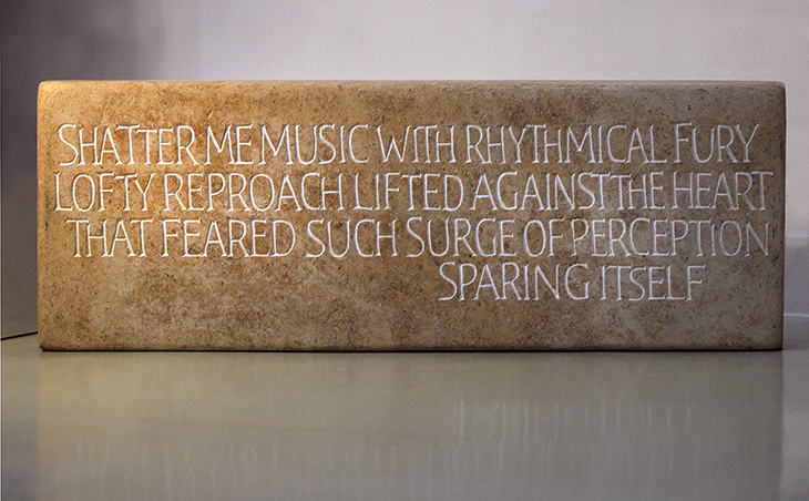
Shatter me, music (1987), Ralph Beyer. Crafts Study Centre, Farnhem. Estate of Ralph/Oskar Beyer by kind permission of the Crafts Study Centre, University for the Creative Arts
John Neilson, himself a letter-carver as well as a designer and editor, notes the Beyer effect with mild puzzlement: ‘It is interesting how many non-specialists are moved by Ralph’s lettering; its human qualities seem to speak even (perhaps particularly) to those with no particular interest in lettering design.’ Neilson gives us Beyer’s story in all its complexity, but does he ‘get’ Beyer? Yes and no. The Inscriptions of Ralph Beyer was designed and typeset by Neilson and he puts Beyer’s lines from Rainer Maria Rilke’s ‘Bestürz mich, Musik’ (‘Shatter me, music’) as the frontispiece, making clear his appreciation for Beyer’s extraordinary sensitivity to text cut in stone. But Neilson also makes plain his reservations throughout the book, whether assessing Beyer’s 1955 lettering on the plinth of Henry Moore’s Northampton Madonna and Child as ‘not […] particularly successful’, or finding the carving of the texts of the Tablets of the Word ‘in several places […] decidedly rough, even slapdash’, or noting the ‘somewhat prosaic and necessarily crude letterforms’ of the Tillich inscriptions. Here is Neilson on Beyer’s gravestones: ‘Despite their modest, perhaps unadventurous design, Ralph’s best memorials have a character and “rightness”.’
Damning with faint praise perhaps, but nonetheless Neilson sums up Beyer’s special gift. He worked in order to communicate, not necessarily to please. It is hard to think of an inscription cut or designed by Beyer, however humdrum, that does not make one pause and reflect. Neilson’s handsome book with its splendid images and a full checklist of all Beyer’s work, including his typefaces and sculpture, enables us to engage fully with this remarkable artist.
From the March 2021 issue of Apollo. Preview and subscribe here.
Unlimited access from just $16 every 3 months
Subscribe to get unlimited and exclusive access to the top art stories, interviews and exhibition reviews.


![Masterpiece [Re]discovery 2022. Photo: Ben Fisher Photography, courtesy of Masterpiece London](http://www.apollo-magazine.com/wp-content/uploads/2022/07/MPL2022_4263.jpg)
Why are fathers so absent from art history?