Did you know that the beauty spot on the wing of a Mallard Drake is the same colour as the stamina of a bluish purple anemone, and blue copper ore? Or that the common opal is the same colour as the back of the petals of the Blue Hepatica, and the white of the human eyeball? ‘Skimmed-milk White,’ the Scottish scientific artist Patrick Syme called it in his book of 1814, Werner’s Nomenclature of Colours, with Additions, Arranged so as to Render it Highly Useful to the Arts and Science, Particularly Zoology, Botany, Chemistry, Mineralogy, and Morbid Anatomy.
Précis iconographique de médecine opératoire et d’anatomie chirurgicale (1848), Claude Bernard and Charles Huette. Wellcome Library, London. ‘Skimmed-milk White’ is visible on the white of the human eyeball

Known as the ‘flower-painter’ of Edinburgh, Syme was on the staff of the city’s Wernerian Natural History Society, and his book – now reproduced, expanded, and commented upon in Nature’s Palette: A Colour Reference System from the Natural World, edited by Patrick Baty – updated the then-definitive work on the identification of minerals by the society’s namesake, the geologist and mining engineer Abraham Gottlob Werner.
 In A Treatise on the External Characters of Fossils (Von den äusserlichen Kennzeichen der Fossilien), first published in 1774, Werner proposed a way of telling apart rocks and minerals using the five senses. Colour was, Werner thought, the most immediate quality we notice, but, as Peter Davidson explains in his comprehensive essay on Werner’s career and influence, there was no standardised vocabulary for describing the hue of a mineral sample. So Werner tried to create one, and in his book provided a list of 54 colours that could be used in the laboratory or the field. Werner divided them into eight categories, or Hauptfarben (main colours): white, grey, black, blue, green, yellow, read, and brown. These were then modified by a descriptive word – mirroring the binomial classifications developed by Carl Linnaeus earlier in the 18th century – derived from a mixture, like ‘reddish-white’, or a well-known pigment or natural phenomenon, like ‘carmine-red’ or ‘sky-blue’. Each colour could then be qualified as dark, clear, light, or pale. This provided for a total of 216 distinct colours – enough, Werner thought, to describe anything you dig up out of the ground.
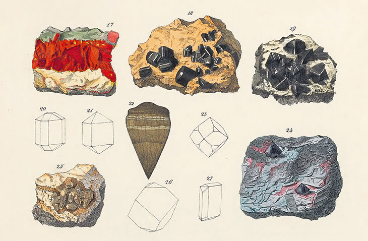
The Mineral Kingdom (1859), Johann Gottlob Kurr. ‘Greyish Blue’ is visible on the iron ore (bottom row, right)
But Werner didn’t provide any illustrations. So if you were a hardcore petrophile like Goethe, for example, or a professor with access to a good university collection, you might have your own minerals to cross-reference. But the less privileged, or less well-prepared, would struggle to understand precisely how ‘clove-brown’, say, differed from ‘tombac-brown’, or what precisely Werner meant by the poetical ‘morning-red’ (Morgenrot).
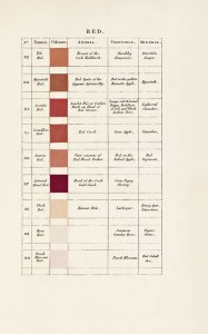
Translations of Werner’s work (interestingly, the first was into Hungarian) slowly expanded the list of colours, and some also added illustrations. But Syme, influenced by the Regius Professor of Natural History at Edinburgh and convinced Wernerian Robert Jameson, set out to do something much more ambitious. He wanted to make the book useful not just to the trained mineralogist, as his delightfully copious title makes clear, and, reflecting his own interest not just in minerals, but in plants and insects, he sought to make a work that could serve as a broader reference: a colour key that would span the natural world. In addition to adding a number of colours to Werner’s system, and increasing the Hauptfarben from eight to ten, Syme cross-referenced each colour, when possible, to examples from the animal and vegetable kingdoms.
‘Red’ in Werner’s Nomenclature of Colours (1821), Patrick Syme
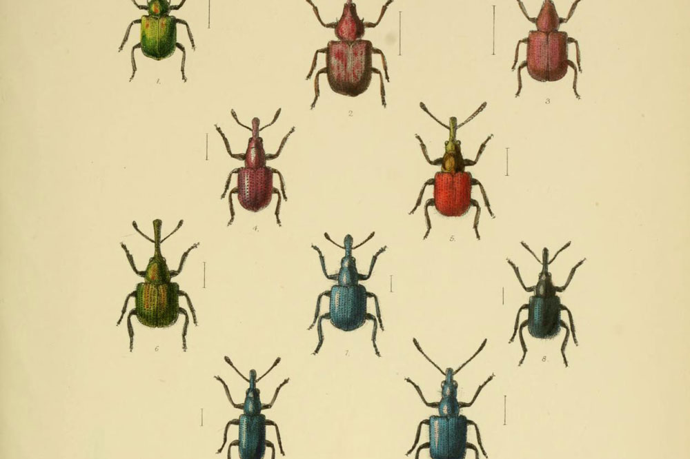
These elegant tables, which sing with the quiet confidence typical of so many Enlightenment-era efforts to chart the world, form the skeleton of Nature’s Palette. Each of the book’s five sections opens with facsimiles of one or more of Syme’s ten colour tables, followed by a historical essay, and then a walk through each of the 108 individual colours in Werner’s Nomenclature of Colours. The editors have provided a colour swatch, and Syme’s recipes for mixing the colours, but have also tracked down period illustrations of all animals, plants, and minerals that Syme names, and provide many that fill the gaps left where Syme couldn’t find a parallel himself. The result is a book bursting with pictures, teeming with information, its almost manic energy barely held in check. In addition to the massively expanded index of colours, in Nature’s Palette you’ll find charts documenting the growth, with almost every successive addition, of Werner’s original list, as well as full-page photographs of naturalia that show the importance of colour to just about every ‘ology’: painstakingly arrayed collections of eggs and shells, stuffed birds in bell jars, squadrons of scarabs. All told, there are 1,000 illustrations. Though the staid tone of the book’s essays might try to convince you otherwise, Nature’s Palette is just plain mad.
In their contributions, Elaine Charwat, Giulia Simonini, and André Karliczek show how Werner’s influence – what has been called the ‘Wernerian radiation’ – reached far and wide through the natural sciences. Most interesting, perhaps, is the appearance of Syme’s colour language in Charles Darwin’s Beagle Zoology Notes. On 28 January 1832, at the Cape Verde Islands, Darwin encountered ‘an octopus’ (in reality, a cuttlefish). ‘The general colour of animal was French grey with numerous spots of bright yellow,’ he wrote. ‘Over the whole body there were continually passing clouds, carying in colour from a “hyacinth red” to a “Chesnut brown”.’ Now he’d just take out his phone.
Nature’s Palette: A Colour Reference System from the Natural World is edited by Patrick Baty and published by Thames and Hudson.