
Midway through the Paul Feiler exhibition at the Jerwood Gallery in Hastings the texture of things changes. The artist’s abstract canvases slough off their rough surfaces, and shed chalky layers of paint, to emerge thinner, lighter and crisper than before. These ‘late’ paintings (in fact, they account for some 40 years of his career) seem more regimented, but also more ethereal than his earlier works. Painted in series, each follows a similar pattern: thin strips of finely graded colour are arranged along horizontal and vertical axes, and seem to recede into an inscrutable central space. Feiler is best known for his association with the St Ives artists, and thus as a painter who anchored his work in Cornish soil. But these works have no obvious anchor beyond their mysterious, self-contained spatial logic.

Janicon XXXV (2000), Paul Feiler. © Paul Feiler Estate, 2018
Born in Frankfurt in 1918, Feiler was one of many talented artists who were displaced to the UK as fascism took hold in continental Europe. He arrived as a teenager in the 1930s, sent by his parents to study in Canford, Dorset, and went on to attend the Slade School of Fine Art while also taking classes at the Euston Road School. In 1940, on the same day that he completed his Slade diploma, he was detained as an enemy alien and spent a year interned on the Isle of Man and, later, in Canada. Nevertheless, he returned to Britain and might easily have ended up in Eastbourne, where he briefly picked up a teaching post after the war, were it not for an offer to join the faculty at the West of England College of Art in Bristol. He moved there with his wife, June Miles, in 1946, beginning a career-long association with the region.
The exhibition opens with a small selection of Feiler’s paintings from the 1930s and ’40s, which demonstrate both his youthful promise and his initial struggle to find an idiom that he could make his own. Among them are a beguilingly sullen portrait of a young woman, and a very passable imitation of Cézanne’s famous fruit-bowl motifs. The French artist’s influence was enduring: it was through studying Cézanne that Feiler first learnt the ‘elegant trick’ of using colour and brushstrokes to unify and animate a composition. Throughout his career Feiler sought structure in his art. To begin with he looked to identifiable elements of the external world – railway tracks, window frames, and the like – to provide it, flattening and simplifying his chosen subjects to create spatially ambiguous compositions. But over time he came to see an armature of sorts in something more fundamental – in the act of looking itself. ‘I based my painting […] on the principle of something extremely complex but very simple when you explain it in words,’ he once said, ‘that we are standing creatures and we scan the world horizontally.’
You can see this concept at work in his paintings from the 1950s. In January, Yellow and Black (1957), for instance, horizontal and vertical streaks of black paint intersect the warm yellow hues beneath to create an impression of moving in stages through space; of pausing in and scanning a nondescript landscape. Other paintings from the period feature more complex surfaces, and all have a restless dynamism to them that suggests various forces, ideas and emotions at work.

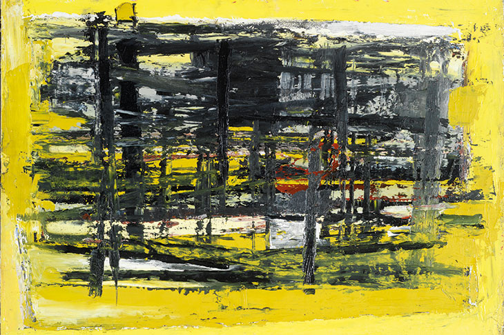
Great Zawn (1959), Paul Feiler. © Paul Feiler Estate, 2018
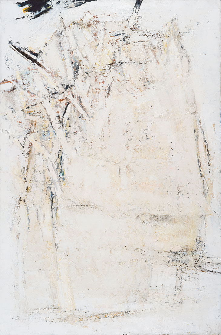
By this point Feiler was closely involved with the modernist painters of St Ives (in 1953 he established a studio in a disused chapel at nearby Kerris), and you can see their influence in the evolution of his style, which got looser and more confident over time. Morvah, White (1958), Great Zawn (1959) and Porthledden III (1960) are named after Cornish places, and each is imbued with a distinctive atmosphere. In Great Zawn, Feiler’s verticals and diagonals are visible under thick layers of off-white paint, accumulating like sediment; Porthledden III seems more fluid, like waves washing ashore or into sea caves; Morvah, White is dominated by a yawning expanse of pale paint that quietly eclipses the busier elements behind it.
These evocative works owe something to the example of his close friend Peter Lanyon, whose art likewise paid tribute to the Cornish landscape. But they also demonstrate Feiler’s mastery of his medium and increasing artistic confidence. In the later Cornish works he uses fewer colours to greater effect, favouring a palette of whites, greys and browns with occasional bright accents that structure and punctuate each piece. But the paintings’ expressive power is in their surfaces; in the way the paint piles up and thins out, caked and chalky in areas, smooth and glossy in others – as varied and inscrutable as the landscape itself.

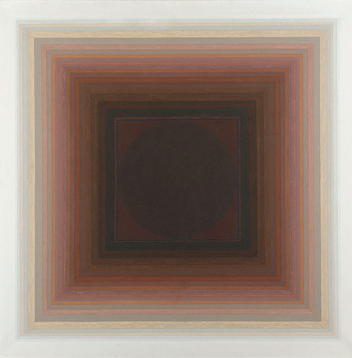
Ambit XVI (1972), Paul Feiler. © Paul Feiler Estate, 2018
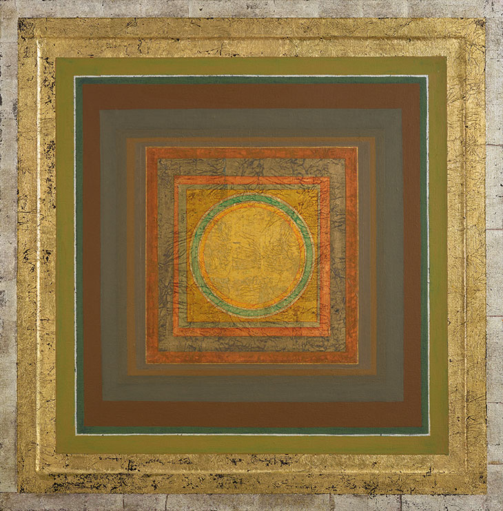
All of which makes Feiler’s subsequent artistic shift the more surprising. By 1970, he had painted the first of his Ambit and Adytum series in the new, precise style that he would spend the rest of his life refining. Colour seeps back into the canvas; scumbled paint layers are swapped for painstakingly painted stripes; and quasi-mystical titles replace Cornish place-names. (Feiler described Ambit as meaning ‘precinct’s bounds’ and Adytum ‘a place not to be entered, the innermost sanctum of a shrine’.) There are continuities: Feiler’s fascination with horizontals and verticals resurfaces in these works, and while his application of colour changes, his palette remains familiar. You might even read Cornwall’s influence into the paintings’ subtle tonal gradations, which shift as imperceptibly as the sky dissolves into the sea when viewed from the coast. But where his Cornish paintings seemed earthy and expressionist, his later works are unapologetically spiritual and sincere, and demand a similarly meditative response from the viewer.
Michael Raeburn’s accompanying monograph puts the paintings into context, pointing to Feiler’s interest in astronomy, geometry and religious symbolism and the personal upheavals that may have contributed to his changing priorities: in the 1960s his marriage broke down, and in 1970 he remarried; in the 1990s, fears about his sight prompted him to begin the Janicon series, named after the Roman god Janus who looked backwards and forwards at once. In Hastings the works stand alone as the culmination and arguably the highlight of the exhibition (a final room of assorted paintings and ephemera from throughout Feiler’s career feels like an afterthought). By bringing together paintings from the 1970s to the 2000s, the curators emphasise both the remarkable single-mindedness of Feiler’s mature career and the equally remarkable variety that he worked into his canvases. In Janicon, he modifies the glazed surfaces of Ambit and Adytum by applying gold leaf. At the turn of the century, he translated his compositions into semi-sculptural, layered Perspex wall-pieces that shift as you move past them. Feiler’s fascination with surface texture did not diminish after the 1950s – it diversified.
The Jerwood show and monograph are a good introduction to Feiler’s work. Plenty remains to be said, and as more scholars and curators engage with the work of Britain’s post-war modernists, it can be hoped that Feiler’s oeuvre will become more visible again. But I doubt it will ever lose its sense of mystery. As Feiler himself put it: ‘The most important painting is impossible to describe however simple it is.’
‘Paul Feiler: One Hundred Years’ is at the Jerwood Gallery, Hastings, until 8 July.
From the July/August issue of Apollo. Preview and subscribe here.