Over the tall wooden door of 207 East 32nd Street in Manhattan, the phrase ‘Art is Work’ is printed in Times New Roman. From the 1950s the building was home to Push Pin Studios, a graphic design studio founded by Milton Glaser and others, which later became the headquarters of Milton Glaser, Inc. The building was recently sold to the New York Review of Books, but ‘Art is Work’ remains. Glaser, who was born in the Bronx in 1929, died in Manhattan on 26 June, on his 91st birthday.
1. Object number 388.2009 in the permanent collection of MoMA consists of a ripped envelope with four characters scrawled across it. Made by Glaser in 1976 in the back of a New York taxi, it’s the initial sketch for probably the most famous piece of graphic design ever. The four red characters which look like they’ve been written in crayon sit side-by-side; they read ‘I ♥ NY’. After the taxi ride the letters became black and set in American Typewriter, and the ‘NY’ shifted beneath the ‘I ♥’. The design is so simple that it is easily copied, the NY replaced with anything from ‘I ♥ KITTENS’ to ‘I ♥ BOGNOR REGIS’ – but the source is always clear. Glaser produced the work, for a campaign to promote tourism in New York that ran in 1977, free of charge. In 2001, following 9/11, he resurrected it, adding a black mark on the heart and ‘MORE THAN EVER’ stacked beneath. The new design could be seen throughout New York, from subway posters to the front page of the New York Daily News, in the days after the twin towers were destroyed. The design’s ability to represent the city hadn’t faded in 25 years, and it hasn’t faded any more since.

Courtesy Milton Glaser INc.
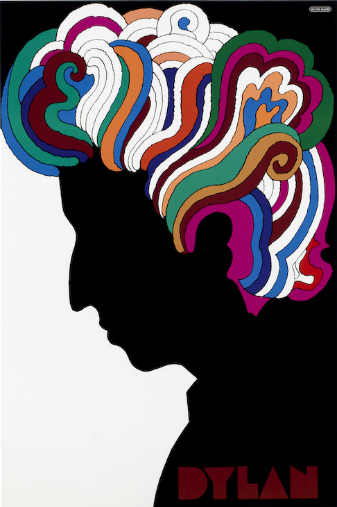
2. The cover of Bob Dylan’s Greatest Hits album, released in 1967, has a photo of the singer in profile, his head in shadow against a blue background and his wispy hair forming a halo over his head. In 1966 Glaser designed a poster to be distributed with the LP which has since overshadowed the album cover itself. Dylan’s face is shown as a black silhouette, and his hair swirls out in an array of psychedelic colours. Just as Dylan gave voice to the 1960s counterculture through his music, Glaser did something similar in visual terms. In his work at Push Pin Studios, together with fellow founders Seymour Chwast and Edward Sorel, as well as the many designers who joined later, Glaser developed a style which was a total departure from a reductive modernism. Their work was maximal, bright and jarring in its use of contrasting colours – an identifiable aesthetic that aligned Push Pin’s work with the counterculture of the ’60s. The Dylan poster managed to speak visually to what the musician represented more than any number of brooding photographs of him might have.

Courtesy Milton Glaser Inc.
3. On 8 April 1968, the first issue of New York magazine was published. On its cover was an image of Manhattan, seen from the water and bathed in golden, late afternoon light. Glaser founded the magazine alongside the editor Clay Felker. It came to epitomise the city, embracing everything from politics and sport to high and low culture. Glaser’s art direction captured this spirit exactly, and it never felt exclusive but full of humour and wit. For the 28 July 1969 issue, for example, the cover line read: ‘Is Lindsay too tall to be Mayor?’ (New York had a history of short, stumpy mayors until the tall, handsome John Lindsay was elected in 1965; now he was running for a second term). Glaser didn’t have a suitable image of Lindsay to run on the cover so he had a model stand in for a shoot and then cropped the head off, as if Lindsay were too tall to fit in one frame.

Courtesy Milton Glaser Inc.
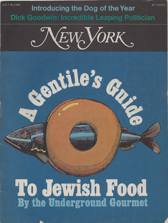
The cover of the 22 July 1968 edition was illustrated, as many were in Glaser’s term as design director – several by Glaser himself. For these he would use the style he had perfected during his time with Push Pin and his years studying with Giorgio Morandi in Bologna on a Fulbright Scholarship in the 1950s. The illustrations have the feel of comics; the bagel on the cover of the 22 July issue, which ran with the cover line ‘A Gentile’s Guide to Jewish Food’, is built up in short hatched lines – the same way that Morandi would render his jugs and vases – and the same treatment is given to the whole herring which sticks out awkwardly from either side of the bagel. The objects have a volume to them that, coupled with the bright colours, makes them feel playful. Although Rupert Murdoch bought the magazine in a hostile takeover in 1977, removing Glaser and Felker, it survives today. The same irreverent visual language and the same flamboyant masthead that Glaser drew for the first issue in 1968 can still be found on newsstands across the city.
Will Martin is a designer who lives and works in London.

I ♥ Milton Glaser – a tribute in three designs
Milton Glaser. Photo: Maria Spann
Share
Over the tall wooden door of 207 East 32nd Street in Manhattan, the phrase ‘Art is Work’ is printed in Times New Roman. From the 1950s the building was home to Push Pin Studios, a graphic design studio founded by Milton Glaser and others, which later became the headquarters of Milton Glaser, Inc. The building was recently sold to the New York Review of Books, but ‘Art is Work’ remains. Glaser, who was born in the Bronx in 1929, died in Manhattan on 26 June, on his 91st birthday.
1. Object number 388.2009 in the permanent collection of MoMA consists of a ripped envelope with four characters scrawled across it. Made by Glaser in 1976 in the back of a New York taxi, it’s the initial sketch for probably the most famous piece of graphic design ever. The four red characters which look like they’ve been written in crayon sit side-by-side; they read ‘I ♥ NY’. After the taxi ride the letters became black and set in American Typewriter, and the ‘NY’ shifted beneath the ‘I ♥’. The design is so simple that it is easily copied, the NY replaced with anything from ‘I ♥ KITTENS’ to ‘I ♥ BOGNOR REGIS’ – but the source is always clear. Glaser produced the work, for a campaign to promote tourism in New York that ran in 1977, free of charge. In 2001, following 9/11, he resurrected it, adding a black mark on the heart and ‘MORE THAN EVER’ stacked beneath. The new design could be seen throughout New York, from subway posters to the front page of the New York Daily News, in the days after the twin towers were destroyed. The design’s ability to represent the city hadn’t faded in 25 years, and it hasn’t faded any more since.
Courtesy Milton Glaser INc.
2. The cover of Bob Dylan’s Greatest Hits album, released in 1967, has a photo of the singer in profile, his head in shadow against a blue background and his wispy hair forming a halo over his head. In 1966 Glaser designed a poster to be distributed with the LP which has since overshadowed the album cover itself. Dylan’s face is shown as a black silhouette, and his hair swirls out in an array of psychedelic colours. Just as Dylan gave voice to the 1960s counterculture through his music, Glaser did something similar in visual terms. In his work at Push Pin Studios, together with fellow founders Seymour Chwast and Edward Sorel, as well as the many designers who joined later, Glaser developed a style which was a total departure from a reductive modernism. Their work was maximal, bright and jarring in its use of contrasting colours – an identifiable aesthetic that aligned Push Pin’s work with the counterculture of the ’60s. The Dylan poster managed to speak visually to what the musician represented more than any number of brooding photographs of him might have.
Courtesy Milton Glaser Inc.
3. On 8 April 1968, the first issue of New York magazine was published. On its cover was an image of Manhattan, seen from the water and bathed in golden, late afternoon light. Glaser founded the magazine alongside the editor Clay Felker. It came to epitomise the city, embracing everything from politics and sport to high and low culture. Glaser’s art direction captured this spirit exactly, and it never felt exclusive but full of humour and wit. For the 28 July 1969 issue, for example, the cover line read: ‘Is Lindsay too tall to be Mayor?’ (New York had a history of short, stumpy mayors until the tall, handsome John Lindsay was elected in 1965; now he was running for a second term). Glaser didn’t have a suitable image of Lindsay to run on the cover so he had a model stand in for a shoot and then cropped the head off, as if Lindsay were too tall to fit in one frame.
Courtesy Milton Glaser Inc.
The cover of the 22 July 1968 edition was illustrated, as many were in Glaser’s term as design director – several by Glaser himself. For these he would use the style he had perfected during his time with Push Pin and his years studying with Giorgio Morandi in Bologna on a Fulbright Scholarship in the 1950s. The illustrations have the feel of comics; the bagel on the cover of the 22 July issue, which ran with the cover line ‘A Gentile’s Guide to Jewish Food’, is built up in short hatched lines – the same way that Morandi would render his jugs and vases – and the same treatment is given to the whole herring which sticks out awkwardly from either side of the bagel. The objects have a volume to them that, coupled with the bright colours, makes them feel playful. Although Rupert Murdoch bought the magazine in a hostile takeover in 1977, removing Glaser and Felker, it survives today. The same irreverent visual language and the same flamboyant masthead that Glaser drew for the first issue in 1968 can still be found on newsstands across the city.
Will Martin is a designer who lives and works in London.
Unlimited access from just $16 every 3 months
Subscribe to get unlimited and exclusive access to the top art stories, interviews and exhibition reviews.
Share
Recommended for you
‘A poster has to be joyous’. The energy and enthusiasm of Willem Sandberg
The designer and director of the Stedelijk Museum had a remarkable life: don’t miss an opportunity to learn about him at the De La Warr Pavilion
The Design Museum Zurich gets a stylish makeover
The refurbished museum is filled with fascinating objects from New Wave typography to a Swiss railway clock
Public relations – solidarity posters from Castro’s Cuba
The 1960s and ’70s were a golden age for Cuban artists who designed striking graphics for liberation movements across the world