Like its contents, the Museum für Gestaltung Zürich (Design Museum Zurich), with its rectangular white walls, steel-framed windows and austere clock face, is part of Switzerland’s creative history. Built in 1933 in the Neues Bauen style, its purpose was to gather design exemplars and archives to support the School of Arts and Crafts (now merged into the Zurich University of the Arts), formerly located next door.
Closed in 2014 for renovation, the museum reopened in March this year with five new exhibitions spanning its four collections of graphics, decorative art, mass-produced design and posters. Its focal point is an echoey central hall, now restored to its full two-storey height, which the director Christian Brändle describes as a cross between a basilica and an industrial workshop. Students used to draw inspiration from the latest in Swiss and foreign design as they passed through on their way to lectures.
Installation view of ‘Collection Highlights’, 2018, Museum für Gestaltung Zürich, Ausstellungsstrasse. © ZHdK

While the museum still retains close links to the university, Brändle has pushed to make the exhibitions more accessible to the public. One reason for doing so is to broaden recognition of Swiss design abroad. This promotional aspect is most obvious in the gleaming Swiss Design Lounge on the first floor, whose sponsors include a number of local design companies. Visitors can touch or sit on Swiss objects that they have admired from afar elsewhere in the museum. These include a metallic ‘Plopp’ stool made to look inflatable by free inner pressure deformation, a welding process involving lasers developed in Zurich, and a ‘Cloud Lamp’ made by heating and vacuum-forming polystyrene into a bulging opalescent shell.
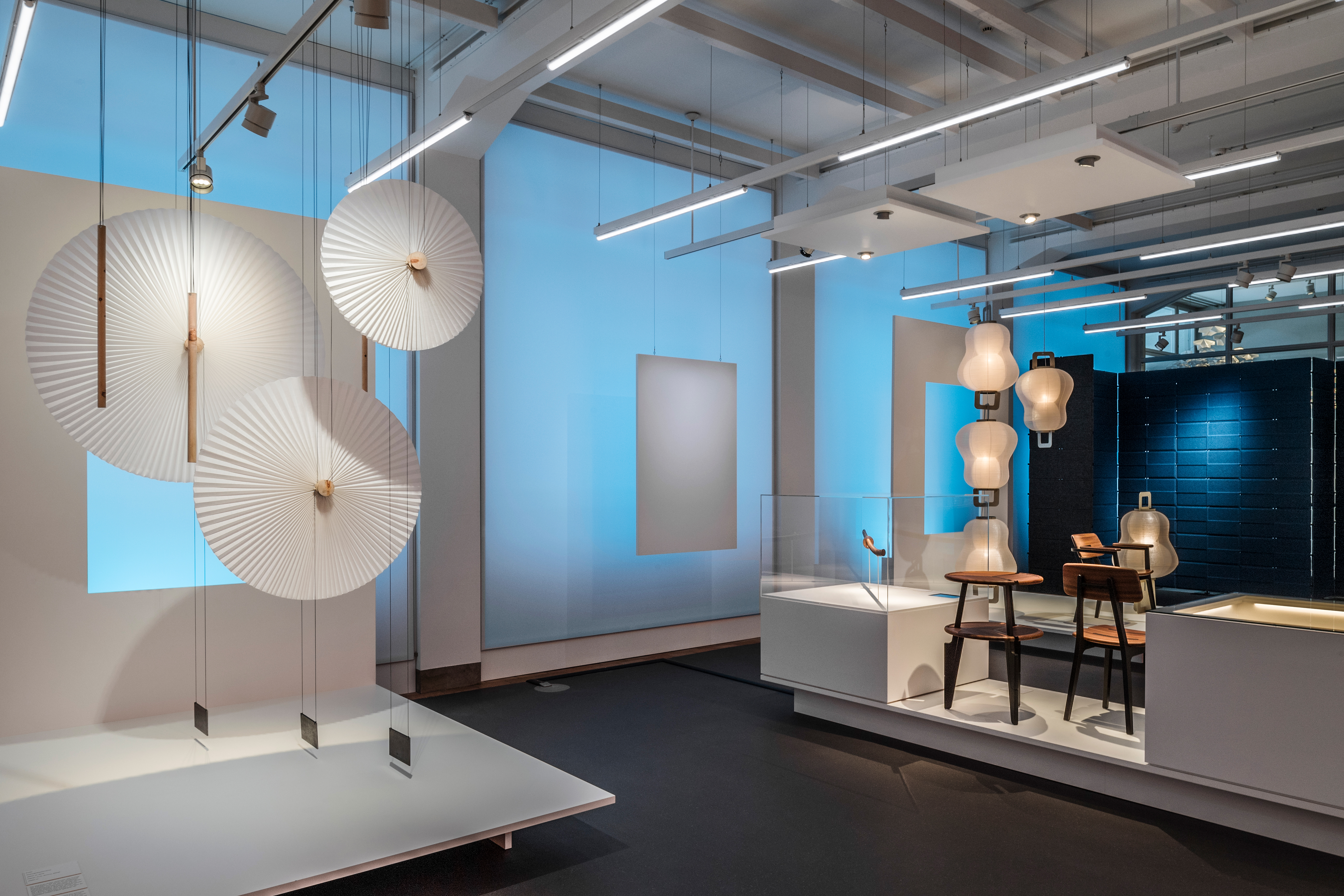
Another aim of the exhibitions, says Brändle, is to ‘build narratives’; even mass-produced objects can tell stories. In ‘Oïphorie by atelier oï’ in the main hall (until 30 September), samples of objects’ constituent materials and video clips tell the story of their production. Exhibits by the Swiss design agency include a foldable leather hammock for Louis Vuitton, lampshades of twisted aluminium rods for Foscarini, richly coloured perfume bottles for Bulgari, and, quivering gently in the air, hanging clusters of ‘Minoshi’ (white blossoms of Japanese washi paper) and ‘Helicoïdales’ (strips of pine arranged in spirals).
Installation view of ‘Oïphorie: atelier oï’, 2018, Museum für Gestaltung Zürich, Ausstellungsstrasse. © ZHdK

The exhibitions challenge the viewer to look more closely at objects that are carefully produced, but not categorised as fine art. Brändle takes issue with the idea that there might be a substantive difference between art and design: ‘since Warhol’s Campbell Soup Cans, it’s boring to keep this distinction too alive.’ What matters instead is ‘quality’ – ‘the question is if it [the object] seduces you, if it offers you inspiration.’
This aesthetic challenge is most palpable in ‘Collection Highlights’, an exhibition of 2,000 objects from the museum’s half-a-million-strong collection. This is situated in a dim basement room with pastel-pink walls – almost like a crypt, if it were not so clean. Many of the light-sensitive graphic designs are hidden away in drawers. These can be hauled open to reveal issues of typographic journal Typografische Monatsblätter and Playboy with (nearly) the same covers; studies in the letter ‘M’ by Wolfgang Weingart, the father of New Wave typography; or the 1930s origins of St Moritz’s sun logo.
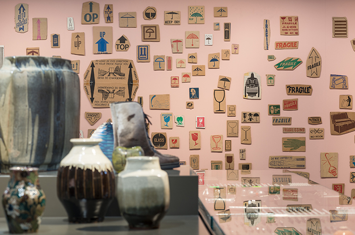
Installation view of the Collection Hans-Rudolf Lutz in ‘Collection Highlights’, 2018, Museum für Gestaltung Zürich, Ausstellungsstrasse. © ZHdK

Dozens of cut-out pictographs from cardboard boxes line one wall – what their collector, typographer Hans-Rudolf Lutz, called the ‘hieroglyphics of today’. They range from images of plucked chicken and men carrying boxes to elaborate fonts announcing rubber bands and leather shoes. Even with the humble packing logo, says Brändle, ‘you can learn so much’ about design: how many colours to use, the merits of simple versus complex lines, or how to balance words and pictures.
On top of the central display stand, a fragmented faux-classical column is poised near a 19th-century brass serpent (the wind instrument, not the reptile) and a plastic toy tractor, while a shimmering ‘lily cluster lamp’ by Tiffany sits alongside an early Toblerone box and Fred Schneckenburger’s ‘romantic siren’, a Surrealist puppet with green hair, real animal teeth and a stuffed fish clinging to her torso. The only movement in the room comes from the hands of the Swiss Railways clock, whose innovative mechanism designed in 1952 was responsible for the legendary accuracy of Swiss trains.
The idea of juxtaposing objects with little connection to each other is indebted to the cabinets of curiosities of Renaissance collectors. Their artful arrangement tries to impart to them, too, the ‘aura’ that, as Brändle points out, still attracts visitors to the ‘real’ Mona Lisa, despite the existence of high-quality reproductions. The paradox is that, unlike the Mona Lisa, many of these objects were designed to be replicable in the first place. And the exhibition itself makes use of an online ‘eGuide’, which provides digitised images allowing the objects to be seen more clearly than is possible from their position on a plinth or behind glass. As far as design is concerned, the line between imitation and reality, original and copy, seems less and less clear.


