
When the postage stamp Barnett Freedman designed to mark George V’s Silver Jubilee in 1936 racked up more than a million sales, he was dubbed ‘the world’s best-selling artist’. This may be something of an exaggeration, but in the mid 20th century Freedman was perhaps Britain’s most visible artist. His posters were widely displayed on the Underground and in buses and trams, while his advertisements for Shell petrol would have been very familiar to motorists. His striking dust-jacket designs stood out on the shelves of bookshops, while at the cinema his logo for Ealing Studios appeared at the beginning of their hugely popular films. Lyons tea shops might be displaying one of the three superb lithographs he made for them, or have windows decorated with the banners he designed to celebrate the Coronation in 1953. Yet today Freedman is not nearly as well-known as he ought to be. This is the first major exhibition devoted to him in more than 60 years, and it shows the wide range and extraordinary quality of his work.
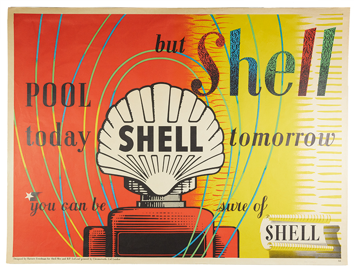
‘Pool Today But Shell Tomorrow’ poster (1952), Barnett Freedman. Manchester Metropolitan University Special Collections Museum. © Barnett Freedman Estate
The son of Jewish immigrants recently arrived in London from Russia, Freedman was born in Stepney in 1901 and never strayed far from his roots. In William Coldstream’s documentary The King’s Stamp, made for the GPO Film Unit in 1935, Freedman’s engagingly relaxed manner and authentic cockney-Jewish accent are in marked contrast to the self-conscious and stilted performances of the posh GPO executives who appear alongside him. He remained a true Londoner who claimed to hate the countryside, though the exhibition includes several exceptional paintings of rural scenes from the 1920s and ’30s that stand comparison with those of John Nash. Suffering chronic ill health, he spent much of his early life in hospital, learning to paint, play music and read widely, and he would later immerse himself in the texts of books before he began to illustrate them. He became a draughtsman for a monumental mason while a teenager, then worked for an architect on names to be carved on to war memorials, and would afterwards become renowned for the highly original lettering he designed for posters and books. In 1922, thanks to William Rothenstein (whose affectionate portrait of him is included here), he got a scholarship to the Royal College of Art.
It is appropriate that Freedman’s first exhibition, in 1929, was held at the Literary Bookshop in London, since his designs for publishers remain his best-known work. An outstanding illustrated edition of Siegfried Sassoon’s Memoirs of an Infantry Officer in 1931 inaugurated his long association with Faber, for whom he created many more dust jackets and illustrations, all bearing the stamp of his inventiveness and craftsmanship. Those he did for books by Walter de la Mare in particular support his assertion that ‘the British are a literary nation and the gift of narrative and phantasy finds ready expression in our writers and our artists’. Freedman made no distinction between illustration and fine art and believed that what he called auto-lithography (in which the artist drew directly on to the stones rather than handing over designs to be copied by a technical draughtsman) meant that ‘the book purchaser receives not a reproduction but an original print conceived in terms of the actual medium’. His lithographs are generally agreed to be unrivalled examples of that medium, and when providing illustrations for classics published by the Limited Editions Club and the Heritage Press in New York – among them Lavengro (1936), a six-volume War and Peace (1938), Henry IV, Part One (1939) and Jane Eyre (1942) – he took full advantage of the larger palette of colours such deluxe productions allowed.
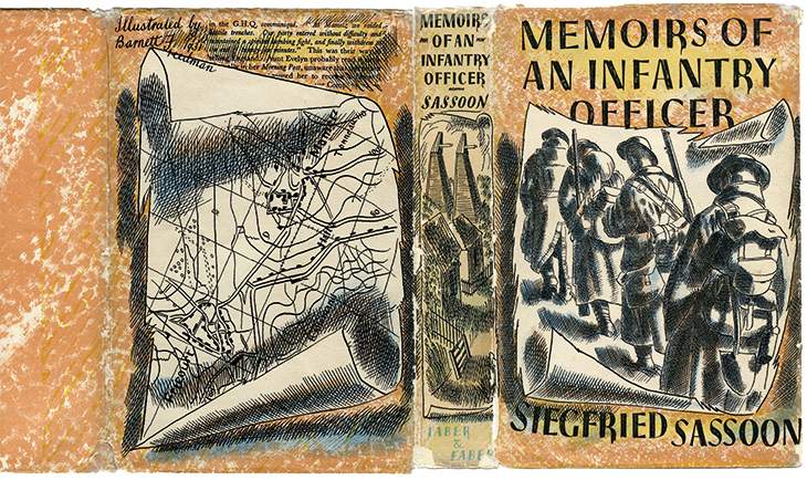
Book jacket for Memoirs of an Infantry Officer by Siegfried Sassoon, published by Faber & Faber (1931), Barnett Freedman. Manchester Metropolitan University Special Collections Museum. © Barnett Freedman Estate
This aspect of his work is well represented in the exhibition, as are his commercial work and his lively paintings of crowds and street scenes. The real revelation, however, is his work as a war artist. He was sent to France in 1941, but when instructed to paint the portrait of a famous general he said that he was ‘not interested in uniforms’ and would undertake the commission only if his subject had ‘a good head’. He produced extremely fine paintings of a gun emplacement and a coastal defence battery, but always preferred depicting the human individual. It is telling that although the head on the poster he designed for the Post Office Savings Bank in 1944, urging people to ‘Salute the Soldier’, looks like that of an emblematic armed-forces Everyman, the image was in fact derived almost without alteration from a portrait of Sergeant R. Croft of the Royal Engineers that Freedman had made in France four years earlier. Similarly, a huge graphite, ink and watercolour depiction of ‘Representative workers of an Aircraft Factory dispersed over the South-West of England’, made in 1942, consists of portraits of real people, each with their name and job inscribed beneath them, arranged in 32 identically sized ovals as if in a Victorian family album. This design is not only elegant but properly democratic, with no order of precedence, so that the suave and smartly suited ‘Hiram Winterbotham. Group Personnel Manager’ is treated in exactly the same way as the grey-haired and bespectacled ‘Mrs Ziedler. Part-Time Assembler’ in her plain brown warehouse coat. It is hard to image a better or more touching evocation of the collective war effort than this beautifully conceived and executed work.
Freedman produced similar ‘albums’ of the officers and ships’ companies while on board the battleship HMS Repulse and the submarine HM Tribune, as well as meticulously detailed watercolours of the former’s gun-turret and the submarine’s operations room. The catalogue includes a broadcast Freedman subsequently made titled ‘Looking at Submariners’, but the authorities felt he had looked too closely at the Tribune itself and his painting was hastily withdrawn from an exhibition at the National Gallery for fear it might provide the enemy with vital information about submarine technology.
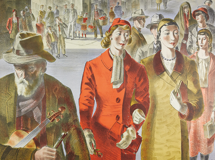
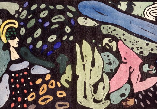
People (1947), designed by Barnett Freedman for J. Lyons & Co. Manchester Metropolitan University Special Collections Museum. © Barnett Freedman Estate
This is an exhilarating and hugely enjoyable exhibition, giving a real sense of both the man and his work. It is nicely complemented by the handsome catalogue, which includes further contributions by Freedman himself on ‘The Art of Book Illustration’ and ‘Auto-Lithography’.
‘Barnett Freedman: Designs for Modern Britain’ is at Pallant House Gallery, Chichester, until 1 November.
From the September 2020 issue of Apollo. Preview and subscribe here.
Unlimited access from just $16 every 3 months
Subscribe to get unlimited and exclusive access to the top art stories, interviews and exhibition reviews.

![Masterpiece [Re]discovery 2022. Photo: Ben Fisher Photography, courtesy of Masterpiece London](http://www.apollo-magazine.com/wp-content/uploads/2022/07/MPL2022_4263.jpg)
Has the Fitzwilliam lost the hang of things?