In 1900 the architect Adolf Loos (1870–1933) wrote a polemical parable called ‘The Poor Little Rich Man’, which, like so much of his barbed criticism, is aimed squarely at his rival and contemporary Josef Hoffmann (1870–1956). It tells the tale of a wealthy burgher who, in order to show off his status and prestige, commissions an architect to redesign his house. The architect sets about the job with gusto, replacing everything and designing bespoke fittings from cushions to door handles. The house becomes a sensation. It is published in magazines and his friends envy his taste and good fortune. The client is delighted. It is true that he has to consult the architect’s plans every time he forgets where the cigarette box should go, but the extra effort seems worth it. But later, when the architect returns, he chides his client for getting things wrong, finally flying off the handle at him for wearing the wrong slippers. ‘You designed them yourself!’ the client protests. ‘Yes,’ says the architect, ‘but for the bedroom.’ Slowly, the client realises that this gesamtkunstwerk is not a dream but a nightmare, a prison from which there is no escape. He is stuck in his dream home like a fly in a beautiful piece of amber.
It’s a strange story, and a slightly unsettling one for an architect to tell: a parable of obsession and disappointment and the dangers inherent in creating a total work of art. For, unlike Hoffmann, Loos firmly believed that a house was not a work of art, and he was to be one of the greatest critics of the Wiener Werkstätte (Vienna workshops), co-founded by Hoffmann in 1903.
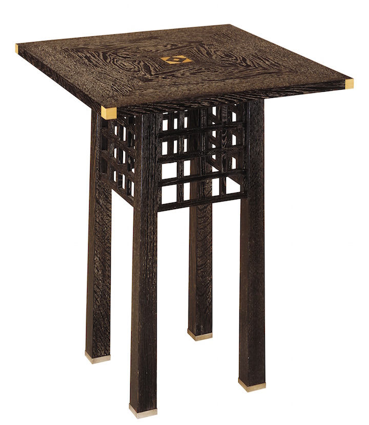
Oak table, 1904, designed by Josef Hoffmann. © Minneapolis Institute of Art
The Wiener Werkstätte represented a remarkable moment in modern design and was a response to the conservative, classical bourgeois taste of a city soaked in the baroque and rococo. The Vienna Secession had been founded in 1897 in an effort to escape the confines of the art academy; the Werkstätte was, in effect, the equivalent of the Secession for design and featuring many of the same figures, with Josef Hoffmann and Koloman Moser (1868–1918) as its chief designers. It was both a radical aesthetic success and a long-running commercial failure. The brilliance of the designs that came out of its workshops was matched only by the ineptitude of its managers, and its utter failure to produce a profit. ‘Wiener Werkstätte, 1903–1932: The Luxury of Beauty’, at the Neue Galerie in New York (26 October–29 January 2018) will present a history of the complete production of the Werkstätte and will include some of its most exquisite products – alongside a realistic assessment of its failures.
The first thing to remember about the Werkstätte was that it was founded in a city that was remaking the modern world. Arnold Schoenberg was revolutionising music, Otto Wagner and Adolf Loos were developing an architecture fit for modernity, Sigmund Freud was remapping the mind, and Gustav Klimt was in his ‘golden phase’. Nevertheless, when Josef Hoffmann decided to establish his workshop, he looked abroad, to Britain, and to an Arts and Crafts Movement that had its roots in a longing for a return to the gothic, and a fantasy of munificent medievalism. It was a vision inspired by William Morris and taken forward by C.R. Ashbee’s Guild of Handicraft, which looked to re-establish a model of production in which artisans were treated like artists, and craftsmen were encouraged to indulge their creativity and skill to create their elegant and eye-wateringly expensive products.
In 1902, as part of a study tour of art schools in Britain, Hoffmann had visited Charles Rennie Mackintosh in Glasgow. The influence of Mackintosh’s style – the tall-backed chairs, black and white tones, attenuated lines, checkerboards and squares – is clearly visible in the early works of the Wiener Werkstätte. Its treatment of graphics, lettering and geometry, and use of materials also recalls the Glaswegian genius. Mackintosh’s work was urbane while that of his contemporaries revelled in the rural and the historical, but it was also less political. Mackintosh lacked the radical socialist politics of his English contemporaries and perhaps that made him a more fitting source of inspiration for a group funded by and selling to wealthy Viennese industrialists and merchants.
Included in the Neue Galerie exhibition is an early table from the Werkstätte, a 1904 design by Hoffmann. Executed in embossed and ebonised oak, it exhibits the Japanese aesthetic that was popular at the time, with its slender, slightly tapering legs and the lighter wood inlay of the table top and the silver corner and foot details. And there, also, is the square grid that would become the recurring leitmotif of the Werkstätte’s designs. It can also be seen in Mackintosh’s chair backs for Hill House, executed around the same time, as well as in countless other designs.
Hoffmann was already established as an architect in Vienna and Koloman Moser was a successful artist. Both had been among the founders of the Secession and when they established the Werkstätte they were joined by craftsmen from almost every trade, from carpentry to silversmithing. They set themselves up in a Viennese industrial building, very much on the guild/cooperative model, and were funded for the most part by that section of the industrial bourgeoisie that was also their clientele. Chief among these was Fritz Waerndorfer, a mill-owner who was also one of Mackintosh’s most important patrons, and whose Vienna home must have been a remarkable trove of contemporary art. Drawings by Aubrey Beardsley hung on the walls, as did a specially commissioned painting by Klimt, and his children were given drawing lessons by Kokoschka.
The Werkstätte immediately embarked on an ambitious set of product designs embracing everything from jewellery to furniture. The founders were certain that they would be able to create the market for their elegant goods. But despite the beauty of their designs and the excellence of the workmanship, the market for such fearsomely expensive products was limited. The care and craft that was lavished on the designs, the cost of fitting out new shops, offices, factories – and paying their workers well – meant that they constantly made a loss on even the most expensive objects. They were subsidised by Hoffmann’s successful architecture practice, which he rolled into the Werkstätte.
The breakthrough came with a huge commission that seems to exemplify the Viennese zeitgeist. Purkersdorf was a suburban sanatorium commissioned by the industrialist Viktor Zuckerkandl. It was the Werkstätte’s first opportunity to create that longed-for gesamtkunstwerk, which embraced everything from the gardens and the architecture to the cutlery and stationery. This was a building that embodied the ideals of modern Vienna, a place of silence to treat the hysteria that Freud had been working on, and an escape from the stresses of the contemporary city enabled through harmonious design. The architecture was stripped back and austere, an expression of a contemporary obsession with hygiene (Ignaz Semmelweis, the Hungarian propagator of hand-washing in medical procedures, had died in Vienna), and the importance of eliminating dark corners and dusty cellars and inner courtyards. The interiors were white tiled, with wash-down surfaces and even the geometric, Mackintosh-influenced furniture was as white as the uniforms of the doctors and nurses. The darkness that Freud had made synonymous with nightmare and the subconscious was to be banished by modern architecture and design. Unfortunately, the Werkstätte strayed way over budget and fell out with the client. The battle over unpaid fees ended up in court and crippled the company’s finances for years.
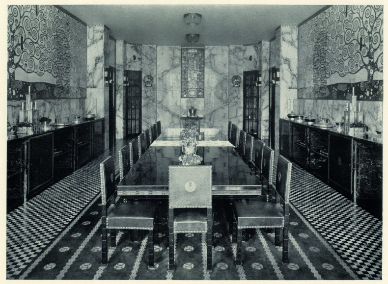
Photograph of the dining room of the Palais Stoclet in Brussels, with wall mosaics by Gustav Klimt, published in Moderne Bauformen in 1914. Photo: © MAK, Vienna
The Purkersdorf situation – an architectural and design masterpiece transformed into a financial nightmare – was replicated in the Werkstätte’s next major commission, a house for the industrialist and banker Adolphe Stoclet. Stoclet had originally wanted to build his house in Vienna, but business commitments required him to move to Brussels. One of the ironies of the Werkstätte’s legacy is that the most exquisitely Viennese company’s most perfect work should be in another city. Hoffmann’s early work had been profoundly influenced by modern Belgian architecture so there was also a little poetic justice in the location. With its proto-art deco tower and white marble-clad façades the Palais Stoclet was a startlingly modern house. Its real riches, however, were to be found inside: the interior was an obsessive illustration of the luxury the Werkstätte strove to express through its particular combination of art and craft.
The most famous room in this suburban palace is the dining room lined with mosaic murals by Gustav Klimt. It is encased in richly-veined marble, like a heavy Stilton cheese, and the sideboards and joinery are made from dark South American hardwoods. In other rooms the aesthetic is more like that of Purkersdorf. The hall, for instance, has white walls and attenuated columns. But the materials have been changed from white tiles to veined marbles, and the broad checkerboard of the sanatorium floor has become an intricate mosaic. The music and theatre room features a stage built into the end wall, the baths are carved from solid slabs of marble, and the walls are inlaid with malachite. The palace’s opulence is almost oppressive. It is a pure expression of wealth – and it became a financial sinkhole. Construction began in 1905 and was finished only in 1911. Once again, client and architect fell out over fees, expenses, and delays.

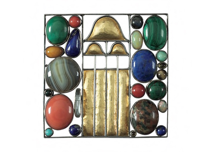
Pair of brooches, 1907, designed by Josef Hoffmann. Courtesy Neue Galerie, New York
The Werkstätte’s third major commission, the Cabaret Fledermaus, was no more successful. The theatre company commissioned the Werkstätte to redesign its premises in 1907 and the result was an interior which is still striking today. The walls of the cafe, with its famous Hoffmann-designed Thonet bentwood chairs, were lined in a multicoloured array of tiles, so that although the theatre’s architecture was white and restrained, in the bar it was set free. The Fledermaus allowed the Werkstätte to expand into yet more media, the theatre proving the perfect venue for the heroically various production of everything from playbills and postcards to costumes. The list of artists and craftsmen involved is a testament to the workshop’s breadth and depth of talent. Participants included Oskar Kokoschka, Michael Powolny, Bertold Löffler, Gustav Klimt, Carl Otto Czeschka, Emil Orlík, and Eduard Josef Wimmer-Wisgrill. (The latter had stepped up to replace Koloman Moser who had left in despair in 1907 to concentrate on painting.) Like all the other projects, it was a commercial disaster, with the Werkstätte’s backers eventually taking control of the whole theatre and running it into the ground by 1913.
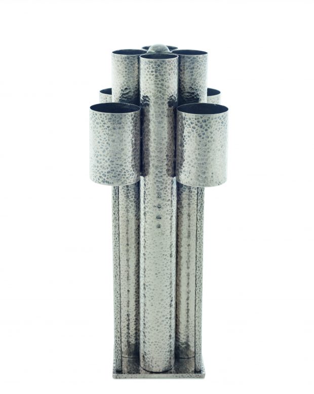
Vase (1905), designed by Josef Hoffmann. Private collection
Some of the Werkstätte’s most beautiful and successful designs fell outside even the broadest commissions of the palace or the theatre. The firm’s fashion designs and jewellery were, in a way, their most successful pieces. The brooches designed by Hoffmann were jewelled equivalents of Klimt’s canvases, works which blended representation and abstract pattern, in which gems became colour-field blocks and cabouchons were transformed into tiny fruit. The dresses bordered on architecture, applied with the black and white geometric frames used in the buildings and sometimes leavened by Klimt-like explosions of colour. The metalwork, in particular, seem to predict future developments. Some of Hoffmann’s hammered bonbonnières and vases, for instance, look like bourgeois, table-top versions of brutalist buildings. Other designs, like Hoffmann’s hourglass vase and Pavel Janák’s waisted and striped vase, point to pure mid-century modern.
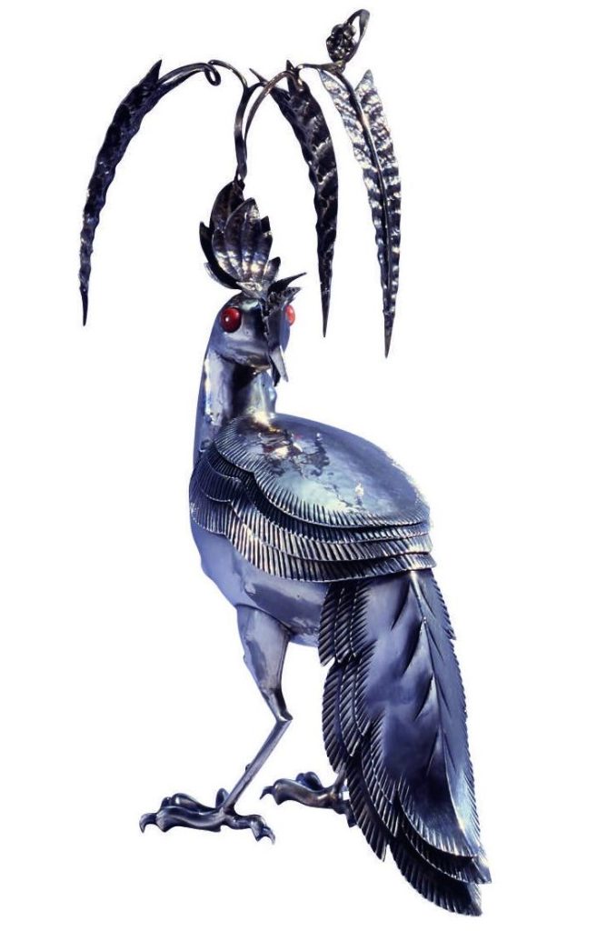
Silver bird-shaped candy box, 1920, designed by Dagobert Peche. Courtesy of Neue Galerie, New York
After the departure of Moser, and with the arrival of Dagobert Peche in 1915, the aesthetic of the Werkstätte underwent a startling change. Architecture – and the notion of the gesamtkunstwerk which had become so financially ruinous – was more or less abandoned, and the workshops went back to concentrating on the decorative arts. The products became less radical with Peche’s distinctive touch, and more ornate; cherubs appeared alongside peacocks and deer. It is striking to see Peche’s 1920 bird-shaped bonbonnière beside Josef Hoffmann’s gridded flower-baskets from 15 years earlier (the latter oddly foreshadowing Rafael Viñoly’s recently completed 432 Park Avenue a short walk away from the Neue Galerie). In a curious reversal of what was happening in contemporary art, the abstract nature of the Werkstätte’s earlier production gave way to cutesy figuration.
Hoffmann’s own designs became noticeably more rococo in style over time; the lines grew lighter and more sinuous, departing from the angular rigour of the early years. His finest pieces, like a winged goblet centrepiece from 1924, have the quality of a drawing about them; the metal is so fine it seems to be sketched rather than wrought. His architecture, by contrast, ended up as surprisingly austere. The Austrian national pavilion he designed for the Venice Biennale in 1934 is an intriguing structure that echoes Nazi neoclassicism and presages a kind of conservative modernism.
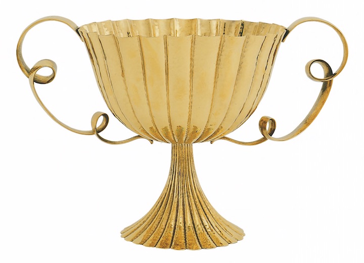
Centrepiece, c. 1924, designed by Josef Hoffman. Photo: Georg Mayer; © MAK, Vienna
The Werkstätte expanded internationally, opening stores in Zurich in 1916 and in Berlin in 1929. Joseph Urban, a set designer for the Met and designer of Mar-a-Lago in Florida, set up an outpost of the Werkstätte in New York in 1922. It was a fascinating interlude, full of potential that went mostly unfulfilled. Max Snischek’s textile design called New York (1928), with its abstract jumble of skyscrapers, makes a nod to the emerging art deco cityscape. The Neue Galerie exhibition contains photographs of Urban’s exquisite designs for the New York showroom as well as the architect’s film and opera sets, to reveal something of the surprising and rather underexplored influence of the Werkstätte across the Atlantic.
But the enterprise was unable to recover from the effect of the Wall Street Crash of 1929 on its key clients. The Werkstätte limped for a while, but by 1932 it was all over. (Poor Fritz Waerndorfer had been shipped to the US back in 1914, after losing almost his entire fortune by propping up the debts.) It had been an experiment which had cemented Vienna’s position as a centre of modernism, but one which was eclipsed first by more socially minded experiments (notably the city’s own remarkable social housing programme) and then obliterated by the rise of the Nazis. The latter would chase away or murder the Werkstätte’s leading patrons.
Despite its serial financial failures, the Wiener Werkstätte succeeded in showing what the arts and crafts, industry and capital could create together. As Karl Kraus, the most acute Viennese commentator of the era, wrote: ‘If by day art is in the service of business, the evenings are devoted to the businessman’s enjoyment of it. That is asking a lot of art, but art and the businessman make it work.’
‘Wiener Werkstätte, 1903–1932: The Luxury of Beauty’ is at the Neue Galerie, New York, until 29 January 2018.
From the November issue of Apollo. Preview and subscribe here.
Unlimited access from just $16 every 3 months
Subscribe to get unlimited and exclusive access to the top art stories, interviews and exhibition reviews.




![Masterpiece [Re]discovery 2022. Photo: Ben Fisher Photography, courtesy of Masterpiece London](http://www.apollo-magazine.com/wp-content/uploads/2022/07/MPL2022_4263.jpg)
Are the art market’s problems being blown out of proportion?