
From the January 2024 issue of Apollo. Preview and subscribe here.
When Kenneth Clark purchased William Burges’s Great Bookcase for the Ashmolean Museum in 1933, the popularity of High Victorian art and architecture was at its nadir. What had cost Burges £240 to make in 1859–62 cost Clark only £50 to buy. It was not until 2016 that Burges’s bookcase was finally put on public view. Since then, however, it has become both the subject of a monograph by Charlotte Ribeyrol (published by Yale earlier this year) and the star of the ‘Colour Revolution’ show (until 18 February) at the Ashmolean. Driven by what Ribeyrol calls the ‘chromatic turn’, these studies have emphasised Burges’s love of the art of the Middle Ages and the growing range of synthesised colours available to him and other artists in Victorian England.
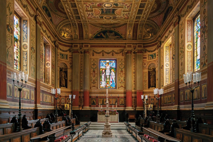
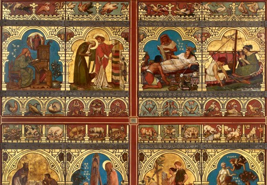
In many ways, however, the Great Bookcase was a prelude to a larger work, near the Ashmolean, which was executed immediately after it and in which colour plays a role of no less importance: Burges’s redecoration of the chapel of Worcester College of 1864–70. Redecoration seems hardly the right word, for what Burges did here was far more extreme: crowding the chapel with paintings and exquisitely executed carvings showing birds and animals of nearly every kind – among them, a dodo. More than this, he had taken the earlier chapel, a chaste neoclassical design of the 1780s by James Wyatt and attacked it with colour, gold and Renaissance-inspired ornament.
Interior of the chapel of Worcester College, Oxford, designed in 1864–70 by William Burges. Photo: © Christopher John
The result was something that could only summon up strong feelings, either in favour or against. It divided the college fellows. A former fellow, J.D. Collis, wrote in the Manchester Guardian that ‘on this side of the Alps there is no sacred building of the kind, not excepting the Sainte Chapelle itself in Paris’. Others, such as the college librarian Edmund Oldfield thought the decorations – particularly the statues of the four evangelists that Burges had squeezed into Wyatt’s corner niches – ‘idolatrous’ and instructed London barristers to argue the point. The controversy went as high as the government; even the attorney general Sir Roundell Palmer was obliged to give a view.
Burges’s assault on the chapel can in part be accounted for by his well-attested hatred of everything that he believed the earlier building to represent. A follower of the polemical Gothic Revival architect Pugin – he had been given a copy of the latter’s Contrasts by his father when he was only 14 – he thought the work of architects such as Wyatt ‘the vilest Renaissance of George III’s time’ and a corruption of the principles of classicism, ‘although even the best Roman was bad enough’. But one of the most surprising features of Burges’s decorative work, once one gets over the initial sensory overload (it takes time), is the extent to which it works with rather than against Wyatt’s earlier building. As Burges’s biographer, J. Mordaunt Crook, observes, the effect of total transformation had been achieved ‘without altering more than a few feet of Wyatt’s chastest mouldings’.
So what of this earlier building? The architectural scheme for this part of the college can be dated to shortly after 1714, the year of the college’s foundation. Working together with the politician and amateur architect George Clarke, Nicholas Hawksmoor developed a highly innovative plan for the College. It united the chapel, library and hall on the footprint of a ‘U’, with the library forming its base and the hall and chapel its arms. Drawings by Hawksmoor today in the college library record that Hawksmoor envisaged a building modelled on the Queen’s Chapel by Inigo Jones at St James’s Palace, with heavy quoins at its edges and Venetian windows at its east elevation and sides. Ornament, here, is conspicuous by its absence.
With funds being limited, only the library was built by the time of Hawksmoor and Clarke’s deaths in 1736. It was not until 1783 that Wyatt was asked to provide drawings for the completion of the chapel and the hall. To these, Wyatt applied the neoclassical sense for spatial organisation that he had recently introduced to Oxford at the Radcliffe Observatory. While working with Hawksmoor’s intentions – he kept the Venetian window at the east end – he made them less spare, ringing the chapel with elegant Ionic pilasters and adding three large windows on one side. Wyatt’s coved, as opposed to barrel-vaulted, ceiling provided the ground for delicate fan-shaped plaster ornaments and allowed him to raise a handsome dome in the centre.
The effect was likened by Mordaunt Crook to ‘an ecclesiastical drawing room’. But, as a very successful recent restoration of the neighbouring hall – a space of much the same size and given a very similar treatment – shows, Wyatt’s intentions were more serious than that suggests. Indeed, it could be argued that the chilliness of the architectural language in the hall is better suited to the quiet contemplation of God than to raucous collegiate dining.
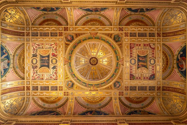
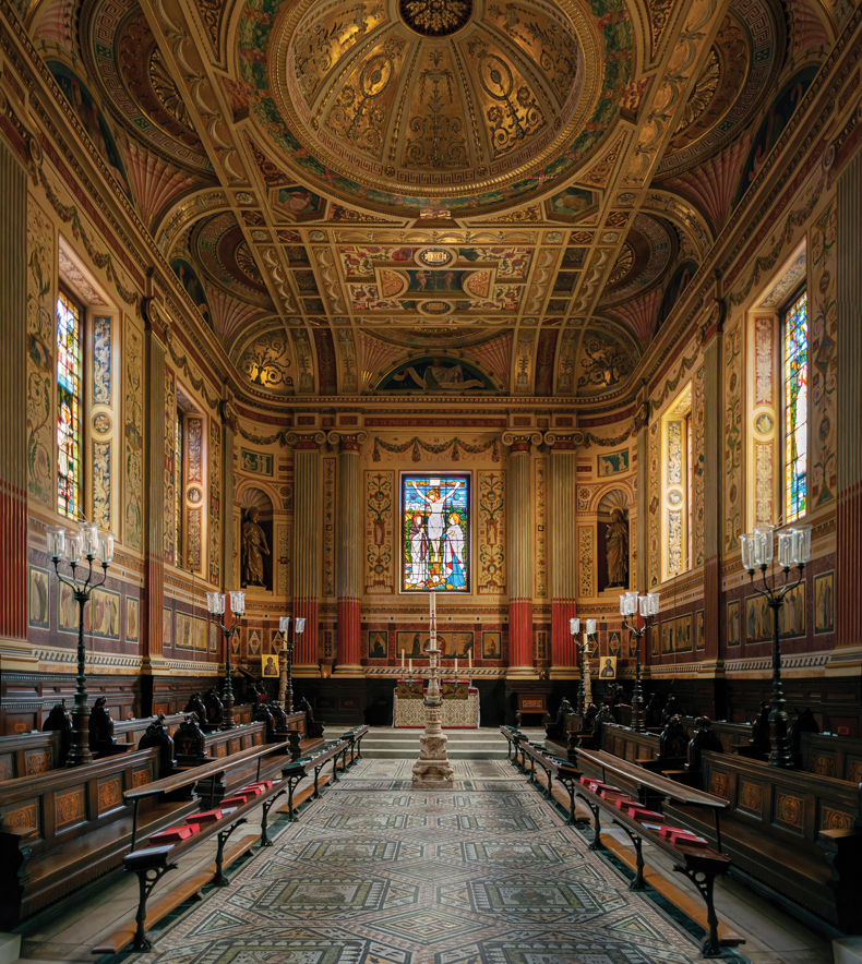
The ceiling of Worcester College, Oxford. Photo: Image Professionals GmbH/Alamy Stock Photo
Burges’s later plans for the hall were in effect thwarted and have since been entirely undone, allowing us today to see Wyatt’s work at Worcester both pre- and post-Burges. For all the intricate carvings and decorations, when the two are compared the overwhelming impression is of the sheer range of Burges’s colours. As restored, Wyatt’s delicate palette is rather limited: pastel shades of blue are accented with touches of cream and burgundy. Burges’s colours, by contrast, and those of Henry Holiday, who executed the glass, are both intense and varied – blues, greens, reds, purples and gold compete for the viewer’s attention.
If Burges’s fantasy at times approaches the outlandish, it is the discipline of Wyatt’s earlier work that pulls it back from the limit of what is acceptable. Later, when proposing an unsuccessful scheme for the decoration of St Paul’s Cathedral, one of Burges’s supporters argued that ‘Mr. Burges has attempted to think as [… ] Wren would have thought had he enjoyed the advantages of the present day.’ While that is clearly preposterous, at Worcester Wyatt’s classical discipline does more to explain the success of Burges’s ornamentalism, inspired by the world of medieval colour, than the latter would have cared to admit.
From the January 2024 issue of Apollo. Preview and subscribe here.
Unlimited access from just $16 every 3 months
Subscribe to get unlimited and exclusive access to the top art stories, interviews and exhibition reviews.


![Masterpiece [Re]discovery 2022. Photo: Ben Fisher Photography, courtesy of Masterpiece London](http://www.apollo-magazine.com/wp-content/uploads/2022/07/MPL2022_4263.jpg)
Has the Fitzwilliam lost the hang of things?