
‘Uproar!’ – a nice touch, to retain the exclamation point – takes its title from Mark Gertler, who wrote in a letter to Dora Carrington in December 1915 about the reaction to the paintings he had shown the previous month in the London Group’s third exhibition:
My pictures, apparently, have created a tremendous uproar! The critics are quite mad with rage. God knows what they are wild about. One paper said that I had done them simply to shock and create a sensation!
If Charles Saatchi hadn’t got there first, perhaps Ben Uri’s show could have been called ‘Sensation!’ The picture that caused the most offence in 1915 was Gertler’s bonkers and brilliant oil painting The Creation of Eve, and he is represented by this painting in Ben Uri’s new exhibition, which selects 50 works by 50 artists, one representing each year of the London Group’s first half-century.
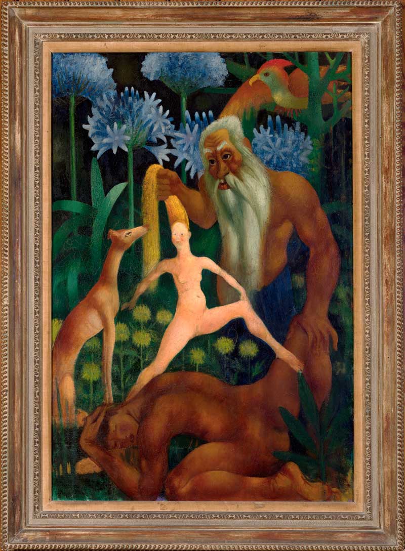
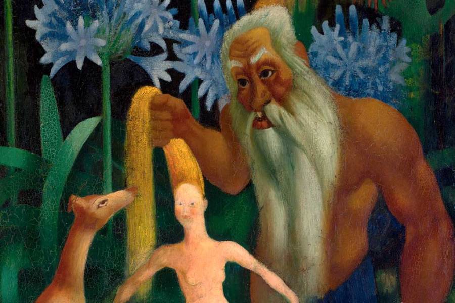
The Creation of Eve (1914), Mark Gertler, Private Collection
In The Creation of Eve a grey-bearded, brown-skinned God, with heavily muscled arms and a blue sarong round his waist, pulls up a small pale-skinned Eve by her hair out of the side of Adam, who crouches on the ground and protects his head, like a schoolboy at the bottom of a rugby scrum. Also layered in to the tight vertical lines of the canvas are a very tall deer and some towering blue flowers. A wild, cartoonish, hallucinatory vision of creation.
The painting had already been rejected by the New English Art Club for being ‘indecent’, perhaps because of the very lightly rendered cleft between Eve’s spread legs, and upon its London Group showing it was variously accused of ‘eccentricity’ and ‘impertinence, with a seasoning of blasphemy’, found ‘hunnishly indecent’ for its avant-garde affronts in wartime, and, in a label one angry fan stuck onto Eve’s belly, slandered as ‘made in Germany’. Uproar!
The ability of the London Group to provoke such explosive controversy doesn’t really extend beyond its first decade, but what does persist is the sense of an ongoing series of debates about style and modernist aesthetics, with different members of the group taking highly committed positions throughout. The London Group comes to seem less a coherent aesthetic faction than a set of loose affiliations that becomes, at exhibition time, a diverse community of risk.
In the 1910s tensions in the group extended between the original Camden Town Group, the Bloomsbury tendency (dismissed by Gertler as a lot of ‘washed-out purples and greens’), and the more radical versions of modernism plied in the paintings of the Jewish artists like Gertler and David Bomberg, or in the mechanised abstractions of the Vorticist fraction, whose work Walter Sickert tried to discredit as ‘pornometric’ at the time of his resignation from the group.
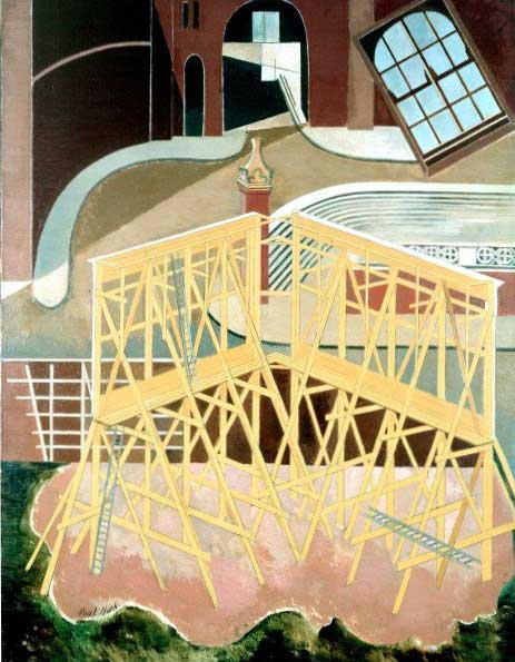
Northern Adventure (1929), Paul Nash © Tate, London 2013, Aberdeen Art Gallery and Museum
In the later 1920s and 1930s the influence of surrealism presses in, notably in paintings by Eileen Agar and Paul Nash. By an inspired juxtaposition in the second room of the exhibition, a single wall displays first Edward Wadsworth’s Rue Fontaine de Caylus (1924), a tempera portrait, in his ‘New Realist’ style, of a laundry-strewn street in the red-light district of Marseilles, then Duncan Grant’s Window, South of France (1928) – more washed-out Bloomsbury purples, reds and greens, but a superbly harmonious composition – and then Nash’s Northern Adventure (1929), showing the view from Nash’s flat overlooking the entrance to St Pancras Station, with ladders, scaffolding and architectural parts surreally jumbled.
Perhaps there is a subtle rejoinder to E.M. Forster in Nash’s painting – in Howards End (1910) Forster had a character perceive a suggestion of ‘Infinity’ in the entrance to King’s Cross, its arches ‘fit portals for some eternal adventure’, while neighbouring St Pancras was downgraded for its ‘facile splendours’. In Nash’s version the adventure starts at St Pancras before even entering the station.
Later still, aesthetic possibilities multiply. There are two fine experiments in geometric abstraction, in the selections from John Piper and Victor Pasmore. Other highlights are the vibrant abstracted landscape Red Spring (1955) by Ivon Hitchens, Euan Uglow’s Big Bertha (1953), an abundant nude in seated profile dressed only in wristwatch and headscarf, and John Bratby’s Kitchen Interior (1955-6), with its thick sloppy impasto, kitchen-sink detail gathering into centimetre-thick fatbergs of oil paint. This is to say nothing of the sculptures in the exhibition, which tell their own story of the history of style-change in the earlier 20th century, from Epstein and Gaudier-Brzeska, through to Henry Moore and Barbara Hepworth and the marvellous ‘geometry of fear’-era iron and glass sculpture by Lynn Chadwick.
The exhibition catalogue for ‘Uproar!’, edited by Sarah MacDougall and Rachel Dickson, is rich and instructive, with contributions from more than 40 critics and historians. The decision to bring in this many critical viewpoints does justice to the generous, argumentative variety of the show, and the history of the London Group itself.
‘Uproar! The First 50 Years of the London Group 1913–63’ is at Ben Uri, The London Jewish Museum of Art until 2 March 2014.
Unlimited access from just $16 every 3 months
Subscribe to get unlimited and exclusive access to the top art stories, interviews and exhibition reviews.


![Masterpiece [Re]discovery 2022. Photo: Ben Fisher Photography, courtesy of Masterpiece London](http://www.apollo-magazine.com/wp-content/uploads/2022/07/MPL2022_4263.jpg)
Is the Stirling Prize suffering from a case of tunnel vision?