On the train from London to Bexhill-on-Sea to see this exhibition on Willem Sandberg, I read up about what was a remarkable life. Here’s a quick summary:
Born in 1897, Sandberg studied art in Amsterdam before travelling around Europe where he met and learned from printers, artists and teachers, including Johannes Itten, Naum Gabo and Otto Neurath. Upon returning to Amsterdam he became involved with the Stedelijk Museum, initially as a designer and later as curator of modern art from 1937 to 1941. It is after this period that the Second World War became a defining factor in his life. I have, in previous drafts of this piece, tried to summarise his involvement in the conflict, but he did more than is possible to do justice to here. Suffice to say, many items in the Stedelijk collection, not to mention Rembrandt’s The Night Watch and the collection of Van Gogh’s heirs, probably owe their survival to his resistance efforts. Others, such as Simon Garfield, have written about his wartime achievements. I recommend this piece by Mafalda Spencer, my old tutor and daughter of Herbert Spencer, who was one of Sandberg’s pen pals. (Their correspondence, which Mafalda has inherited, is featured in this exhibition.)
After the war Sandberg was made director of the Stedelijk and oversaw hundreds of exhibitions during his 18 years in the role. Throughout this period he carried on designing the catalogues and posters that feature in this exhibition. He never seems to have retired, becoming involved in the founding of the Israel Museum in Jerusalem and the development of the Centre Pompidou until his death in 1984.
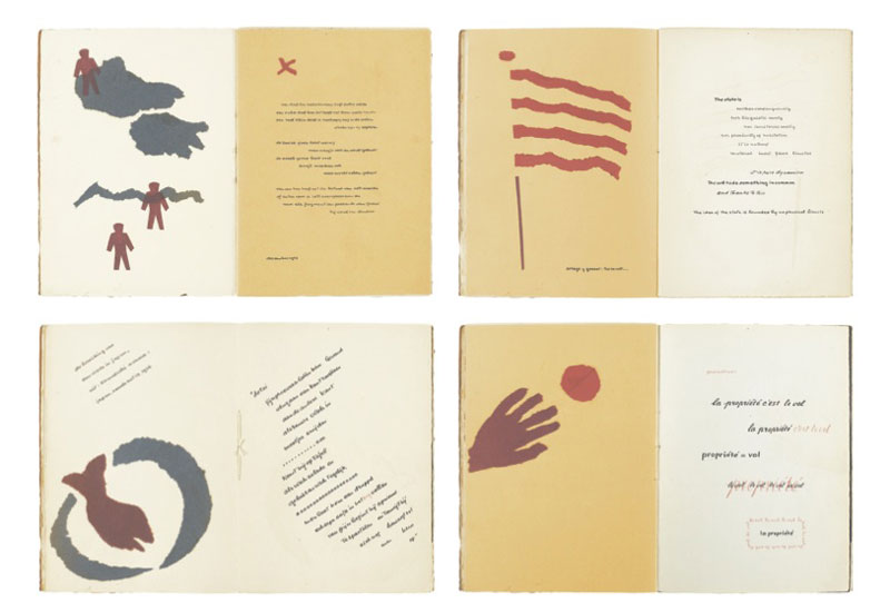
Among Sandberg’s wartime experience was the period he spent on the run from the Nazis, from 1943 until the end of the war. While in hiding, Sandberg wanted to occupy himself and decided to create a series of small booklets, each ranging from 20 to 60 pages. It is in making these that he seems to have refined what would later be the style he used for the majority of his design work at the Stedelijk. The booklets, which he called experimenta typographica, were filled with illustrations of inspirational quotes, which Sandberg took from great thinkers and other designers. Paper was limited during the war and Sandberg’s booklets took advantage of this: the different textures of the papers he was able to source add to the tactile qualities of the books and make for interesting contrasts between pages. The pages are rarely filled, relying on a lot of white space, and the shapes and texts are laid out with a sense of balance but never symmetry. Often, in a similar way to concrete poetry, texts are laid out to reflect the shapes of the images shown on facing pages.
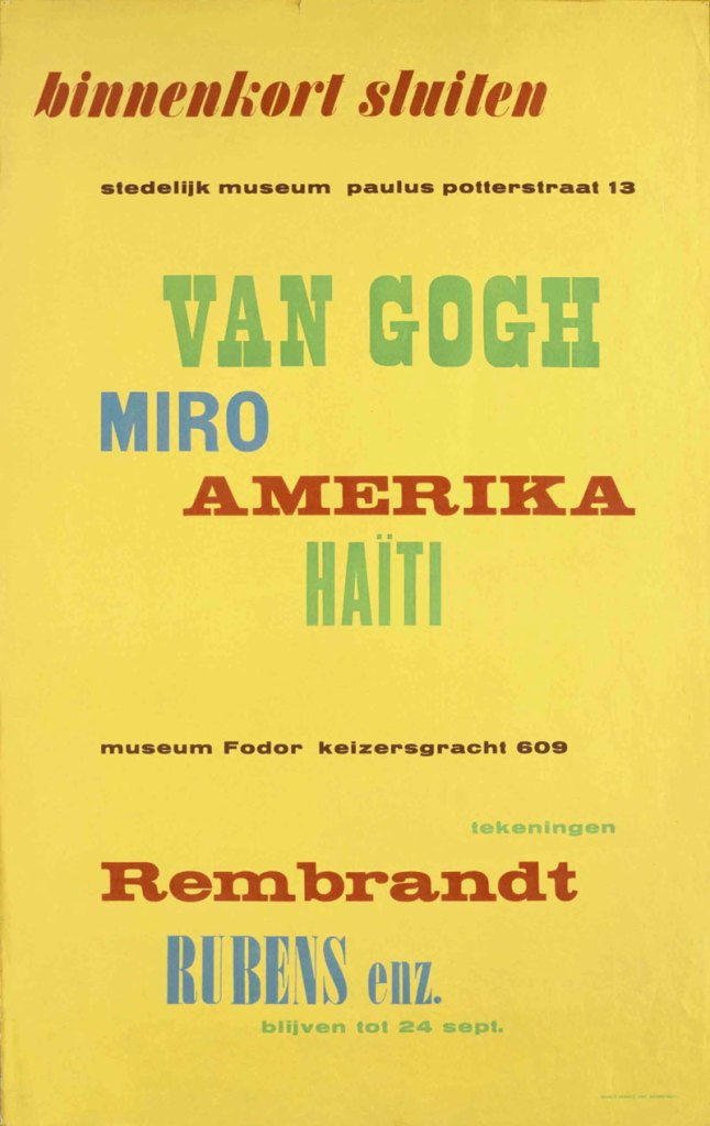
It is this playfulness with working with text which can been seen most clearly in Sandberg’s Stedelijk posters. He largely does away with the torn shapes which he used through the experimenta typographica but retains the looseness in the arrangement of the type. Names of artists are dotted across posters seemingly at random but in a mixture of colours and styles that continues Sandberg’s playful arrangement of pages from his wartime experiments. To keep costs down Sandberg rarely used images. But when he did they are used in a playful way, dotted around the paper in a similar way to the type. As he had during the war, Sandberg carried on using whatever was available, mixing up whatever typefaces the printer owned, layering them occasionally, and rarely sticking to just one typeface per poster.
Exhibition poster (1956), Willem Sandberg. Photo: Stedelijk Museum, Amsterdam
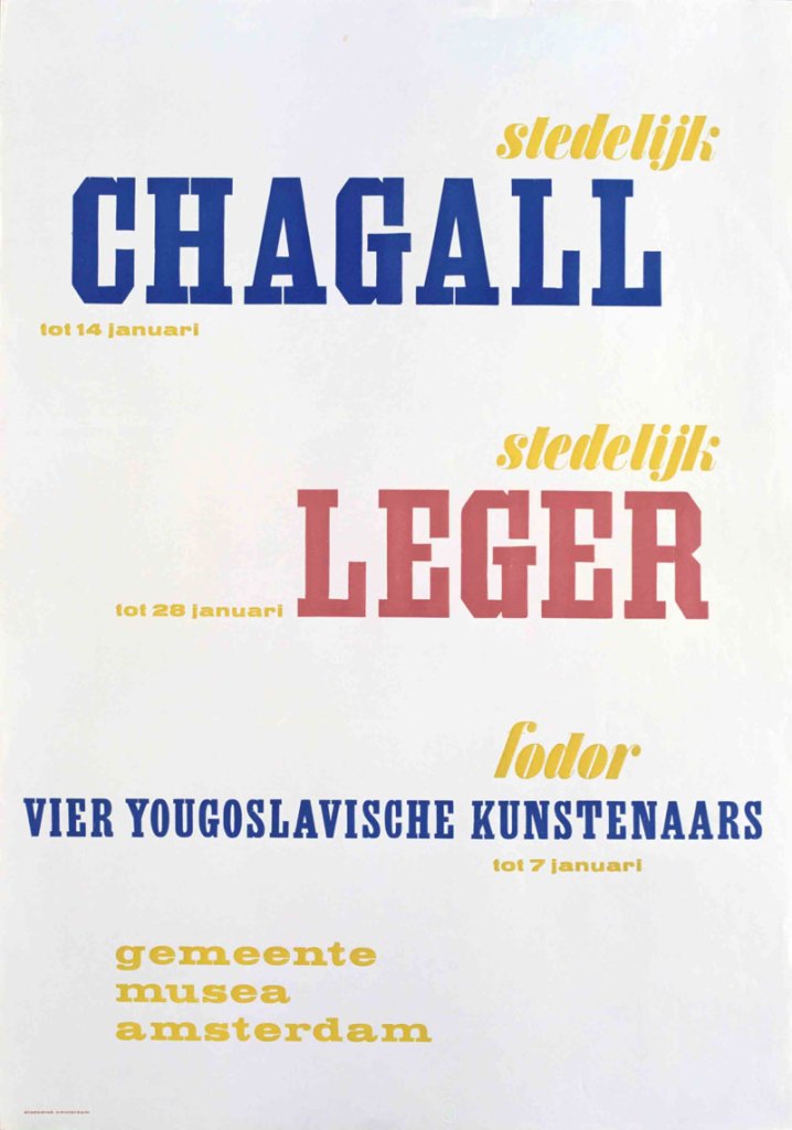
Exhibition poster (1949), Willem Sandberg. Photo: Stedelijk Museum, Amsterdam
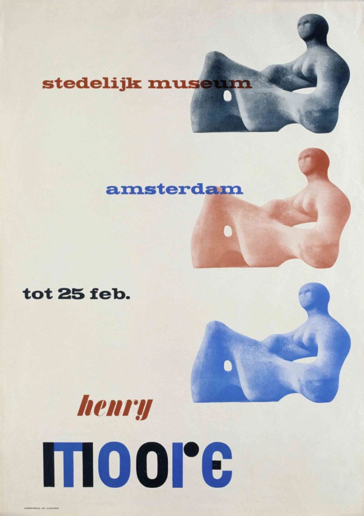
The posters don’t really establish any sense of a coherent identity in the way that a modern designer might be driven to do these days. There isn’t really any consistency in layout, the typefaces chosen to spell out the Stedelijk’s name vary widely and while the use of red in each poster is a constant, it’s not always the same shade. But they do fulfil the criteria for Stedelijk posters of the time that Sandberg himself drew up:
- a poster has to be joyous
- red has to be in every poster
- a poster has to provoke a closer look, otherwise it doesn’t endure
- with a respect for society, designer and director both are responsible for the street scene, a poster does not only have to revive the street, it also has to be human
- every poster has to be an artwork
Exhibition poster (1949), Willem Sandberg. Photo: Stedelijk Museum, Amsterdam
Sandberg packed a lot into his life and career, and the amazing thing is that most of the things he did, he did with all his energy and enthusiasm. To see the visual products of his life is to see only half of the story. A lot of people – museum directors, artists, designers and curators – owe something to his legacy, and I can only touch on his influence on graphic designers here. One of them, Fraser Muggeridge, is responsible for this exhibition. If you haven’t heard of Willem Sandberg before, it’s worth a visit to Bexhill-on-Sea. At the very least, spend your next train journey, wherever it leads, reading a few articles about his life.
‘Willem Sandberg from type to image’ is at the De La Warr Pavilion, Bexhill-on-Sea, until 4 September.