From the June 2024 issue of Apollo. Preview and subscribe here.
Artists and alcohol advertising have made for a heady mix in modern times: from Alphonse Mucha’s swirling art nouveau flora for beer and absinthe to Salvador Dalí’s branding for Conde de Osborne sherry brandy and the Jean Carlu design that launched the Mouton Rothschild tradition of artists’ labels, it seems that artists have been interested in blurring the boundaries between design and art when a drink is on the table.
Armando Testa (1917–92) fits easily into this tradition. The father of modern Italian advertising, Testa created significant post-war campaigns for products celebrated in Italian culture and a blueprint for how an image can have an impact on the collective consciousness. His campaigns for Peroni or Martini are, as much as adverts, celebrations of the purity of Italian design and its place in the optimism of modern culture. However, before the design came the art: Testa trained as a painter with Ezio D’Errico, who introduced him to modernist abstraction. Testa went on to teach other artists, including Michelangelo Pistoletto.
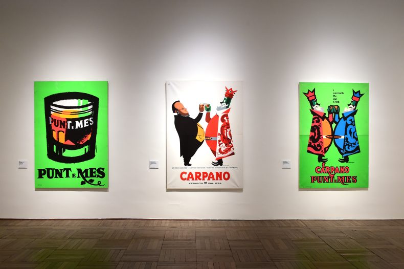
Installation view of three posters designed by Armando Testa at the exhibition ‘Armando Testa’ at Ca’ Pesaro International Gallery of Modern Art, Venice, in 2024. Photo: Roberto Serra – Iguana Press/Getty Images
In post-war Italy, breaking boundaries and an interdisciplinary aesthetic were celebrated as avant-garde, and disruption of traditional ways of communicating through images and words was actively pursued. Testa’s posters for Punt e Mes, a sweet vermouth made by the Carpano drinks company, packed a punch beyond the myriad cocktails in which it was used. The Testa retrospective now at Ca’ Pesaro International Gallery of Modern Art in Venice, which offers a comprehensive view of his drawings and paintings, shows how they fed into his advertising work and provides an opportunity to re-examine arguments about the difference between ‘pure’ art and design, the power of abstraction versus representation, and the cultural meaning of objects.
We live in a world with more and more information and less and less meaning, as Jean Baudrillard said in 1981. Testa’s vermouth campaign, on the other hand, offers minimal information but plenty of meaning. Three pieces from the same year, 1960, which now hang in a row on the white walls of an airy room in a palazzo overlooking the Grand Canal, together show the progression of Testa’s thought process and ideas about representation. Starting on the right, the first is an abstract sphere executed in urgent, thick, dark brushstrokes, which hovers over a half sphere created using the same technique. The sphere appears to be moving, spinning. This is Testa’s Uno e Mezzo in acrylic. Testa found a Daruma doll – the Japanese round, red doll’s head used to bring good luck – in San Francisco, which sparked his imagination. Traditionally Darumas were red with black decorations, with a gap in the red section where a male face is painted. The doll can be knocked over but, thanks to a weight in the base, will always return to its original upright position.
Punt e Mes Carpano (1960), Armando Testa. Ca’ Pesaro International Gallery of Modern Art, Venice
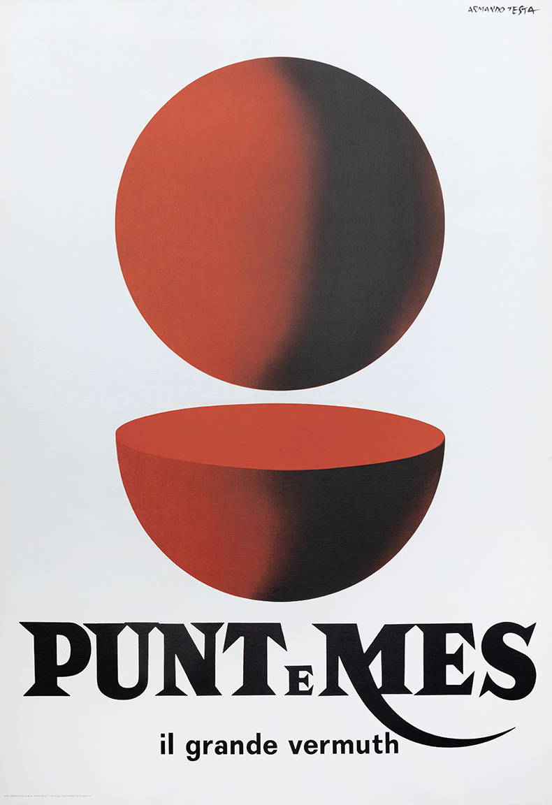
Next to the painting hangs the original Punt e Mes advertising poster, in which the sphere is now cleaner, a perfect geometric circle, with a perfect sphere sliced in half underneath it. The pun on ‘Punt e mes’ – the Piedmontese for ‘point and a half’ – is made visible, the font supporting the meaning in bold black capital letters. The name refers to the combination of rich, sweet vermouth body and herbal bitter overlay that constitutes the drink, which was supposedly invented on 19 April 1870, when a Turin stockbroker, discussing market movements in a bar, felt dissatisfied with his too-sweet tipple and gestured to the barman to add a half measure of bitter Quina liqueur.
The third artwork on the palazzo wall is a fibreglass sculpture painted pure red, the same sphere and half sphere but now in three dimensions. It could be a work of optimistic Italian pop art or a designer chair. Perhaps this is the version furthest removed from the original doll – a pure sign, divorced from reality. The artistic tradition that underpins the journey from representation to abstraction means that the doll is never read as mere mimesis; whether painted or fashioned in three-dimensional fibreglass, the doll is always, foremost, an abstract art object.
Testa’s interplay between codes of representation that wear their layered sophistication lightly, and which have resonated with millions of Italians over the past few decades, also elevates a bottle of vermouth to a cultural sign and symbol, an abstracted artwork and a product like no other. Testa said that he was envious of the ability of so-called ‘pure art’ ‘to play on ambiguities, on the undefined’; but he harnessed this in his most successful design work, too, even when he was selling a glass of fortified aromatic wine.
Armando Testa next to a selection of his advertising posters in Milan, 1970. Photo: Pino Grossetti/Mondadori Portfolio via Getty Images

‘Armando Testa’ is at Ca’ Pesaro International Gallery of Modern Art, Venice, until 15 September.
From the June 2024 issue of Apollo. Preview and subscribe here.