The Plaza de Armas is a second-hand book market in Havana. It’s in the touristic part of the old town, where there are as many Americans as Cubans, who are almost all employed selling things to the Americans. Among the tables of books with the ubiquitous images of Che Guevara and Fidel Castro, the cigar cases and red-star pin badges, are some stalls with posters. Most of these, slightly yellowed, are post-Revolution film or political posters – the latter all bearing a small glyph in one corner: an arm clutching a rifle under a globe, accompanied by the letters OSPAAAL (Organization of Solidarity with the People of Asia, Africa and Latin America).
These were my reason for visiting the market. After a few weeks travelling around Cuba in December 2017, I wanted to see the posters I’d come across on design blogs in person. Now they can be seen in London in an exhibition currently on view at the House of Illustration in Kings Cross, entirely drawn from the private collection of Mike Stanfield – one of the largest collections of OSPAAAL material in the world.
Cover of OSPAAAL’s Tricontinental 76 (July 1972). Courtesy the Mike Stanfield Collection

OSPAAAL was founded in 1966 in Cuba after the Tricontinental Conference, to which Castro invited an international group of leftist leaders, with the aim of supporting the fight against imperialism and globalisation. Part of this mission was publishing a magazine, Tricontinental, which was distributed to revolutionaries worldwide. Folded into each issue was a poster.
The posters would be dependent on a striking image. Often the typeface would be very small, used for some lines of text announcing a day of solidarity with people engaged in a fight against imperialism – in Vietnam, South Africa, Puerto Rico, and elsewhere. This was printed in three or four languages, usually Spanish, English, French and Arabic. The aim, as OSPAAAL’s artistic director Alfrédo Rostgaard once said, was ‘to create a means of communication that was immediate’. Although the magazine was meant for the current and future leaders of leftist organisations, the posters had to be able to speak to the workers who made up their potential supporters.
OSPAAAL poster (1969), Ernesto Jesús Padrón Blanco. Courtesy the Mike Stanfield Collection
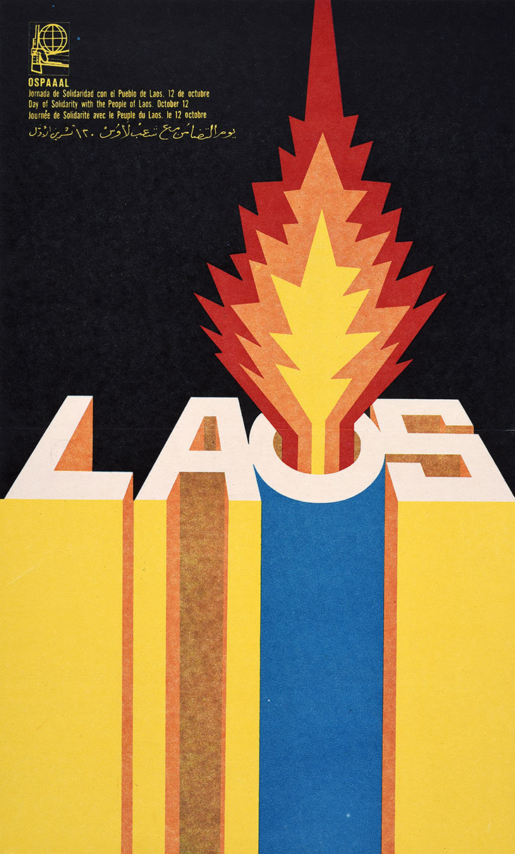
In one poster from 1970 by Ernesto Jesús Padrón Blanco, the word LAOS is written in large blocky letters, a burst of fire from the O turning it into the mouth of a gun barrel. Another, designed by René Mederos in 1971, shows President Nixon as a fang-toothed eagle, his claws sunken into a burning, heart-shaped chunk of Laos on a map. The image of the American eagle is a recurring one – in another poster it swoops down to grab Guantanamo, a small part of Cuba held by America since 1898. The words of designer Olivio Martínez Viera are printed on a flag hanging from one of the walls in the exhibition: ‘Our poster was a weapon of war.’ For a designer like myself, who works mostly on products for commercial organisations, this notion is quite exhilarating.
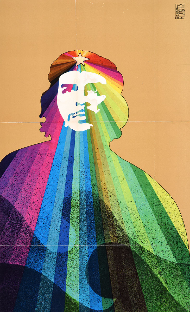
The image of Che is of course present throughout. He was exported as a symbol around the world, just as he himself had travelled to support other revolutionaries following Cuba’s example. In one poster from 1969 Rostgaard depicts Che with a rainbow of colours radiating from the star on his beret.
OSPAAAL poster (1969), Alfredo Rostgaard. Courtesy the Mike Stanfield Collection
Many of these posters can be viewed online, although not often at a very big scale, so seeing them full-size is worthwhile and there is plenty here which I hadn’t come across before. Harder to find are examples of the pages of Tricontinental, of which this exhibition has a good selection. The parody adverts which were printed throughout the magazine are especially interesting. An ‘ad’ for South African Airways, for example, gives readers a coupon to ‘an unforgettable vacation in the land of APARTHEID, where Africans are massacred, where prisons overflow with patriots fighting against white racists’. It seems that the bluntness of message from the posters was carried through the whole magazine.
It is apparent that OSPAAAL’s designers were working with little need to compromise or nuance their ideas, a rare thing in today’s design industry. In a short documentary shown at the end of the exhibition, Martínez Viera is asked by the interviewer whether he was given creative freedom. ‘Complete freedom,’ he answers.
‘Designed in Cuba: Cold War Graphics’ is at the House of Illustration, London, until 19 January 2020.