
‘I’d been working in food, washing dishes. That was my environment. I remember seeing pies laid out, processed food that I’d worked on, so I started painting these triangles and turning them into pies. I thought, “My God! I’m done in! Nobody will ever take me seriously!” Then I found I couldn’t leave it alone, it was so real to me.’
Wayne Thiebaud (b. 1920) is talking about the moment, some 60 years ago now, when he found his true idiom as a painter, and his signature subject: the point at which, you might say, he truly became an artist. It is astonishing to reflect that the transition occurred when Thiebaud himself was approaching 40.
We are meeting in London in May, just before the opening of an exhibition of his work at White Cube, Mason’s Yard. The show contains paintings created over more than half a century; the earliest picture on display dates from 1963, the most recent from 2017. The paintings show a remarkable consistency of approach, and of quality, over the decades. Thiebaud is best known for his still lifes, but he is also a painter of portraits – the only works he paints from life, the rest being from memory – and landscapes of the area around the northern Californian town of Sacramento where he has lived for most of his life. But his still-life subjects are perhaps the most startling, because often the brush strokes seem to turn into the thing they are depicting.
‘The cartoonist Saul Steinberg once likened my work to Roman mosaics,’ Thiebaud recalls. ‘He reproduced a horse’s head, with teeth, and the teeth fitted the shapes of the pieces of mosaic perfectly. He wrote: “Thiebaud’s paint is like those teeth. It’s a perfect fit.”’ Thiebaud chuckles, but Steinberg had a point. There is a visual rhyme, almost a pictorial pun, in many of Thiebaud’s most characteristic paintings. It is a match between the qualities of creamy paint – often with added Liquin for thickening – and foodstuffs such as fluffy meringue, glutinous butter-cream, and the icing on a slice of cake. ‘The painting and the frosting?’ Thiebaud exclaims when I mention this almost edible quality, ‘That’s a real indulgence.’
Clown Cones (2000), Wayne Thiebaud. Courtesy White Cube; © Wayne Thiebaud/DACS, London/VAGA, New York 2017

His paintings of such delicacies as cupcakes, cherry pie, and doughnuts put one in mind of the bill of fare at the Double R Diner in Twin Peaks – and at tens of thousands of eateries all over the US. There is something quintessentially American about Thiebaud’s subjects, as he acknowledges. ‘After all, I am an American. I’ve driven across the country, and you see the same thing in every restaurant from Sacramento to New York. The same meringue pies. So it began to make a lot of sense to paint them – and it was very intriguing.’ These still lifes, however, have led to a miscasting of Thiebaud as a Pop artist – a confusion increased by the fact that he first exhibited in New York in 1962, just as the first wave of Pop was rising.
Even so, Allan Stone – the dealer who put on that exhibition – ‘was really quite reluctant at first,’ Thiebaud explains. ‘He felt these were crazy paintings. But he said, “I can’t get them out of my mind, but I’ll have to get my courage up. If you’ll wait a year or so I’ll give you a show.” It was an immediate success because of the Pop art phenomenon. I was very fortunate to become known for that, but I had no real interest in it.’
It’s true that Thiebaud is not a Pop artist. Nor, he protests, is he a ‘realist’: ‘I don’t have much to do with realism; there’s a big difference between realism and representation.’ Despite the sensual, good-enough-to-eat qualities of his still lifes, Thiebaud’s approach is far more formal, almost conceptual, than the word ‘realism’ implies. Those cookies, ice creams, and slices of pie, for example, grew out of exercises in three-dimensional geometry. He began to paint them in the mid 1950s after returning from a sojourn in New York. Before Thiebaud set out he had been an aspiring Abstract Expressionist. ‘I had been following the example of Pollock and Gorky, I’d dripped paint.’ So he took a sabbatical from his teaching job to meet and mix with his idols. ‘I took a year out in 1956, went East and met those heroes of mine – de Kooning, Kline – and the critics as well. Then there was a single little art community, everybody went to everybody else’s show, the critics would show up. I got a better feel for what was going on, which was totally different from what I had thought it was.’ Among the elder artists he encountered, he talked most to Franz Kline, Barnett Newman, and Willem de Kooning. The last of those made the biggest impression. ‘We could talk endlessly about brushstrokes and so on. That is very much the core of the matter. There’s a film in which they asked de Kooning, “How do you go about painting? What are your strategies?” He held up his brushes and said, “I’ve got a big brush and a little brush, I’ve got a wolf’s-hair brush that makes terrific lines.” That’s what you use, it all comes out of those.’
Two Paint Cans (1987), Wayne Thiebaud. Courtesy White Cube; © Wayne Thiebaud/DACS, London/VAGA, New York 2017

It was from de Kooning that Thiebaud got a wise piece of advice. ‘People tend to try to make the signs of art, rather than work towards something you really could call art. He told me exactly what he meant: imitating the signature style, copying the brush marks, the labels. He said you’ve got to find something you love and try to deal with it – and not expect anything.’ When Thiebaud got back to Sacramento, he decided to return to fundamentals. ‘I began by starting to deal with what I could deal with, formally: basic shapes, see if I could get the form to sit on the plane, try to get the structure of the receding planes to operate properly, all that kind of thing.’
There is evidently a lot of geometry in Thiebaud. In his essay for the White Cube catalogue David Anfam suggests the ‘strict orthogonal layout of many paintings may make a passing nod’ to Mondrian, another of the artist’s heroes. Smoking Cigar (1974) for example, is an off-white square, with a thick line along the bottom, parallel to the bottom edge, and a thin one on the right, parallel to the side. So far, so Mondrian-like. The difference is that Thiebaud’s thick line is a cigar, its juicy brush strokes wonderfully evoking the papery dryness of its outline, the powdery quality of the ash at the end. While the thin line, wavering and delicate, is a light plume of rising smoke. The formula for a Thiebaud, partly at least, is geometric structure plus a wizardry worked with the brush – the latter being the contribution of Kline and de Kooning to his artistic heredity. But Thiebaud’s education comprised many other elements, and had begun long before he became a fine artist.
Wayne Thiebaud was born in Mesa, Arizona in 1920. The following year he and his family – who were Mormons (one of his great-grandmothers walked westward across the Great Plains with Brigham Young) – moved to Los Angeles. As a teenager he made posters for the theatre, then spent a brief time as an apprentice at Disney Studios. During the Second World War Thiebaud worked as a cartoonist for the Special Services Department and served in the First Motion Picture Unit, the commander of which was Ronald Reagan.
At various points early in his career, he worked as a sign painter, a fashion typographer, and illustrator. This amounted to an apprenticeship in commercial picture making and design before turning to fine art in the late 1940s (an experience he shared with many other post-war artists including Warhol, de Kooning, and Patrick Caulfield). It is a discipline he values. ‘I have a great regard for commercial art. Those wonderful people showed me what to do – sign painters, women’s fashion illustrators. There’s a lot of craft in it, and that’s admirable. They would tell you very quickly: “You’ve got to shape up! You can’t do that lettering like that!” Typography for instance is a tradition, it’s got to be done properly. So I’d go back and do it again, do it again, do it again.’
He notes that Norman Rockwell – who spent his life making illustrations for such publications as The Saturday Evening Post – is now being accepted into the canon. ‘They’re finally taking him in, reluctantly. I think that all has to be sorted out much more carefully, the whole idea of fine art, so-called commercial art. The lines should not be drawn so firmly.’ Here Thiebaud was in agreement with Philip Guston, a near contemporary of his, whose work incorporates a diversity of ingredients from painterly abstraction to comic strips. ‘We talked a great deal about cartoons, of which we shared a love.’
‘The art world is not much interested in humour,’ he reflects, ‘to its disadvantage.’ There is a sense, Thiebaud says, in which his own works ‘relate very much to caricature, which in some ways defines what I think about what I’m doing’.
What he is not is an artist in any way interested in recycling pre-existing imagery. Pop, properly understood, is all about that: advertising, media imagery; not the world directly experienced. Nor does he have any use for photography. ‘I avoid it like the plague; you can tell immediately, even a sniff of photography will show up. You would think it would help, but it’s absolutely the opposite. Photography is not like the way we see at all. Because we’re seeing with two eyes all the time, and that is a human view rather than a mechanical view. Photography, television, video have taken us over, but that’s fortunate in a way because it’s left painting alone as painting, preserved its uniqueness.’
Thiebaud has made this point epigrammatically in the past: ‘Photography starts with everything while painting starts with nothing to make something.’ That’s certainly true of his lemon meringue pies and wedding cakes – so sharply evocative of soft and sugary texture, but created from cones, cylinders, and triangles.
Y River (1998), Wayne Thiebaud. Photo: © John Bodkin, Dawkins Colour; courtesy White Cube; © Wayne Thiebaud/DACS, London/VAGA, New York 2017
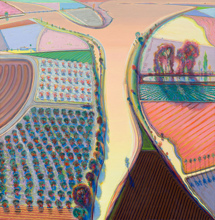
He is not concerned with caricature as an idiom to recycle in the form of art – as Lichtenstein was, for example, used the graphic style of comic books. He’s fascinated by the process by which it operates, and extends the definition from the exaggeration of someone’s face, or Superman’s physique to the ‘caricature of colour’. His own use of colour is certainly remarkable. Anfam writes that the vivid hues of the Y River (1998) landscape – a view of the Sacramento River Delta are ‘in the last analysis, hallucinatory and, ergo, colours of the mind’. In this vista, one field is the hue of raspberry cream, another dark chocolate and the river water like flowing peach juice. Thiebaud unexpectedly evokes Bonnard as a predecessor ‘who went in for wonderful exaggeration, caricature of colour. It would go all the way in temperature from one extreme to the other. It’s as if he’s working with fire and ice. It’s very powerful, and painting needs power.’ His own colours, he has said, are fighting, which makes them vibrate.
Similarly, he thinks in terms of ‘caricaturing’ space. Hence the sense of vertigo one gets from, say, Intersection Buildings (2000–14), a view of San Francisco, or the beetling cliff in Bluff (2013). Here we are looking up at an impossibly sharp, overhanging drop. In the river scenes, by contrast, there is a sense of the landscape extending like a map – although Thiebaud does not go up in a plane to make studies. He ascends in his mind. ‘The river scenes are the result of about 1,000 miles of delta down below Sacramento, I go there a lot and make lots of drawings. But the pictures are also built up out of memory and using various projective systems. They’re not done from up high.’
This part of California has always been Thiebaud’s base, and he has an affinity – at least of friendship and shared seriousness about painting – with a group of artists who flourished in the San Francisco Bay Area: Elmer Bischoff, David Park, Nathan Oliveira, Paul Wonner, Richard Diebenkorn. Sacramento, Thiebaud notes, is ‘about 83 miles from San Francisco’, so he and the others ‘were all in the area together: most of us taught in some college’. Thiebaud has been on the faculty of the University of California, Davis since 1960 (and before that, at Sacramento City College). He retired, formally, at the age of 70, but has continued to give classes as an emeritus professor. ‘Teaching was my education, I just went in because if I was going to try to be a painter I had to make a living, but it turned out I was very intrigued with it.’
Green Dress (1966/2017), Wayne Thiebaud. Courtesy White Cube; © Wayne Thiebaud/DACS, London/VAGA, New York 2017

The last artist on that list of Bay area painters, Richard Diebenkorn, was another near contemporary of Thiebaud’s and shared his trajectory from Abstract Expressionism into representational painting (though Diebenkorn, in his late Ocean Park series returned to abstraction, albeit with a strong lingering sense of coastal landscape). ‘Diebenkorn and I were quite good friends, I miss him a lot, he was very influential on my work and we had some good times together. Dick didn’t talk much, but he was very bright, he read the classics. You can see in his work a kind of hesitancy, almost like Cézanne. Is this right or isn’t it right? That holding off from what he called the headlong, keeping in tension. What is it you are trying to get to?’
In London, Thiebaud has just popped into the Royal Academy exhibition of American artists of the 1930s. ‘Those are the painters I grew up with. Hopper was really the star. Clement Greenberg said, I think, that if Hopper had been a better painter he wouldn’t have been such a good artist. He never really shows off. Let’s have the facts please! That’s enough. The architecture, the restaurant, the empty theatre with one person sitting in it, it’s very poetic. If he’d slicked those up, maybe they wouldn’t have been so interesting.’
‘That’s the query about painting. “What is it? and what is it that gets those elements which are rare and somehow distinguish the work?” It’s very, very puzzling. You can talk a great deal about it, then when you come down to it, as with Hopper: just what is it about his characterisation, what he leaves out and what he puts in, that makes the difference?’ That is indeed the crucial question – with Thiebaud’s diners, pastries, delta landscapes and people, too. It’s a sign of his distinction that he makes you ponder it.
He tells another story about de Kooning. The Dutchman was once asked, ‘“Did you get a degree from art school?” He said, no, you had to go before a board and convince them that you were trained. He said, “How the hell would I do that? I’m not trained. I have to start over every day.” That’s what painting is. It’s hard for people to appreciate that, and it probably sounds pretentious, but at least it’s the case with me.’
From the September issue of Apollo. Preview and subscribe here.
Wayne Thiebaud, photographed in front of Fields and Furrows (2002), in 2013. Photo: Sacramento State/Mary Weikert
