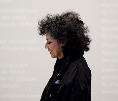
‘You’ve come at an odd time,’ Hurvin Anderson (b. 1965) tells me when I arrive at his South London studio. He has only recently moved into the modified lilac shipping container – wonderfully light but, on an afternoon in early August, also wonderfully hot – on the Tulse Hill site where he’s worked for many years, and hasn’t settled in yet. His paints and canvases are still tidied away, and only one painting-in-progress, a group of men sketched against an acid yellow background, is visible; the first drips of paint mark the new concrete floor beneath it. Although the work is at an early stage, it already betrays the languid atmosphere of Anderson’s paintings, which often capture in-between places and quiet moments. The new studio signifies a quiet interlude for Anderson himself. Exhibitions of his work have recently opened at the New Art Exchange, Nottingham, and the Art Gallery of Ontario: ‘Even though I’m working towards another show in November [at Michael Werner Gallery, New York], there’s this downtime at the moment. You can just make things more freely.’
The bare studio seems too neutral a space for the creation of Anderson’s dense, colourful landscapes and enigmatic scenes, which he draws from memory and photographs. Many reference ‘that other place’, as he calls it – the Caribbean. Anderson was born in Birmingham to Jamaican parents, and a formative artist’s residency in Trinidad in 2002 has shaped the direction of much of his subsequent work, not only in subject matter – the landscapes, architecture, and decorative features that have intrigued him – but also the intensity of his palette – which had previously tended to monochrome. Perhaps especially, the experience provided means of thinking about the ambiguous position that Anderson likes to occupy as a painter. ‘Whilst I was in Trinidad, there was this moment where you felt part of it, not part of it. I was this interloper, coming through the veldt, a bit of a spy, but I was found out.’
In washes and stencil layers of colour – electric blues, dark greens, yellows, and pinks – Anderson’s paintings of empty municipal spaces and roadside verges, houses and overgrowth, are full of complex detail and texture. He pulls out a large painting of a Caribbean house surrounded by bright Hindu prayer flags: ‘I was intrigued by the scenario of the flags and the house, and the multi-ethnic question in this place, with its French, British, Italian, and African history.’ In places the texture of the canvas comes through; some areas are heavily worked and others washed over in white. ‘When I came back I still had the effect of the light out there,’ he explains. ‘Then, as I started to get used to being back here, it took on a London greyness. The vibrancy got washed out.’
Complicating or doubling the image – like adding London grey to Caribbean colour – is characteristic of Anderson’s work. Although many of his early landscapes, paintings such as Road: Western Maine (2003) and Beach Scene (2003) are remarkably open – so open in fact that they seem deliberately unfinished, the paint often giving way to bare canvas – Anderson soon started to experiment with ways of disrupting this easy entrance into the work. In some this meant using foliage in the foreground – ‘I was trying to use the palm trees as a device, something that blocked the way’ – and in others he made use of the paint itself, washing or blocking out areas to create the effect of surface damage or disintegration, or the bleaching of an over-exposed photograph.
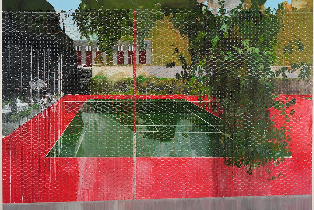
This developed into more literal ways of separating the viewer from the scene. In Country Club: Chicken Wire (2008) from the Country Club Series (2004–08), Anderson took one of the municipal locations that intrigued him, a tennis court, and depicted it behind a barrier of meticulously painted hexagons. The fence stretches almost across the entire canvas, separating us from the beauty of the empty green court and its dramatic red surround. Anderson’s concern with surface and space can work counterintuitively. His compositions are often so precisely rendered that they seem to block themselves out into flat areas, so that the more superficial details – here the play of light on the fence – take on greater depth and interest. ‘When you take a photograph you focus on something in the distance, but you get this residue of highlights, a glint of light. Maybe I was too obsessed with the hexagons, but the more you work with it the more you see that even a glint of light could describe something, could disturb the surface.’
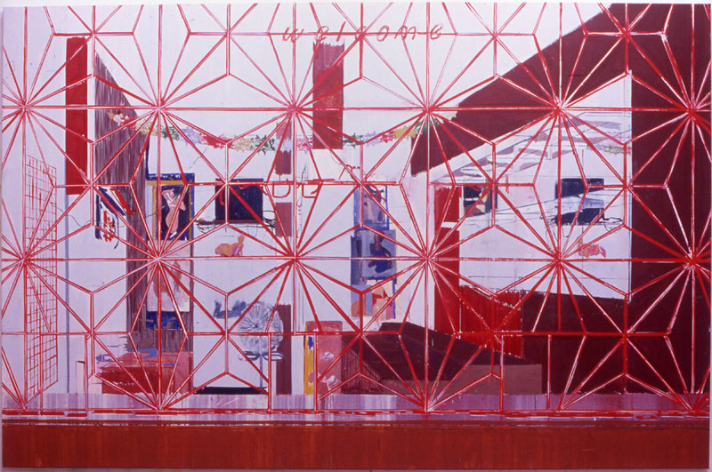
In the Welcome Series (2004–08) Anderson took this compositional complication even further, portraying interior spaces through the decorative security-grilles common to the Caribbean. ‘The grille became device, motif, code, all those archetypes, those types of words that could possibly structure the painting,’ he says, ‘but it’s also a blot on landscape. Something’s not right.’ It is at once part of and not part of the painting – at first glance, in works such as Some People (2004), the red patterned framework of the grille appears like a decorative overlay, but it never entirely covers the canvas, always attaching to a frame at the bottom and hence to the spatial reality of the image. These works are beautiful but frustrating: it is impossible to see the scene behind the grille clearly. ‘When you’re making the painting, you feel as though you’re not supposed to be setting this thing in front of it […] If that’s how it feels making the painting, how does it feel living somewhere surrounded by these grilles? It’s a form of oppression.’
It’s a strange stance for the artist to take – deliberately positioning himself outside his picture – and it is a creative challenge, too: ‘It’s a bit of a fight. It’s hard to balance the two things – if you deliberately make it disruptive, how do you make the thing whole?’ There’s a personal interest too. Anderson attributes his interest in motifs to the decorative features of his childhood home. ‘That is part of my education – the doilies and patterns, the kitsch items. I’m drawn to that but at the same time you’re meant to reject everything you’ve been taught. Should I reject it? It’s a battle.’ The battle is at the heart of his fascination with painting. ‘In real life, the space I occupy is not the space where you can do everything that you want, it’s only in painting that you can do everything you want.’
Anderson’s faith in painting comes from a slightly distanced position from the traditional establishment, despite his acclaim. As a child he was interested in drawing – his older brothers Rupert and Claude also drew and took photographs – but Anderson didn’t start studying art until his mid 20s, and didn’t grow up intending to be a painter. He took his BA from Wimbledon College of Art in 1994. I ask whether painting was problematic when he was at college. ‘I think it became more so […] Painting is this outdated thing, that’s why I come back to it. No one can truly leave it behind. […] I’m fascinated with the things painting can do. When painting became exciting again – I remember thinking, I thought no one liked painting! But it’s that excitement which you’re trying to create.’
Anderson’s paintings are especially exciting – for their technical accomplishment and for the unpredictability with which he disrupts that accomplishment, often leaving visible the marks of the process. Superficially, his washes, stencils and muted vibrancy are reminiscent of Colour Field artists, but in refusing to abstract his work, he plays with perception and perspective. Is he trying to be provocative? ‘I’m trying to be! I’m never sure.’ His paintings are often compared to those of his contemporary and teacher Peter Doig, and I wonder how he feels about the moniker ‘dreamlike’ that’s frequently applied to both. Isn’t it too placid a word? ‘I should be more annoyed maybe than I am,’ he replies, ‘but I know I’m trying to do a lot of things.’
In many of his paintings Anderson works by taping out foreground areas to create a stencil, and then pouring layers of paint over the canvas to create striated backgrounds, which are then painted over. Sometimes the layers don’t make pictorial sense: there’s light coming from somewhere deep in the foliage, or sky that should be visible through the leaves is painted on top of them. ‘This is part of trying not to be too restrictive, of allowing this light to come through or bringing forward this thing from far away,’ he says. Recently, however, he has moved away from the grille – the process, he says, was slowing him down. ‘I wanted to find a way to get right into the painting very quickly, so I went back to this kind of idea of gridding up the drawing, the way we were taught at school. It was a good way of just starting to think about painting very quickly.’
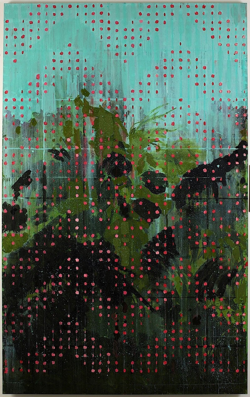
In paintings such as Siding (2013), he created a grid using string, which then left its stencil mark when pulled away from the painted canvas. This lighter touch is also evident in Beaded Curtain – Red Apples (2010), which uses both the grid, and a decorative overlay of red dots: the pattern of a beaded curtain, another feature of the Caribbean. While the grille is a way of keeping people out, the beaded curtain separates the domestic space from the outside. Anderson hung it up in the doorway of a hotel room in Jamaica, he tells me, before photographing the foliage beyond from inside. ‘I almost got into trouble for taking it through security. When they opened up my bag at the airport I thought, how do I explain this?’
The 2011 exhibition, ‘Subtitles’, at Michael Werner Gallery in New York, proved to be a transitional point away from the literalness of the grille paintings and towards a greater abstraction. The works here, inspired partly by photographs taken of the palm trees at Kew Gardens, experimented with entirely artificial overlays and compositional motifs. ‘I started to construct my own scenes, essentially. I wanted them to be grille-like but more refined, a bit more playful. I pulled back and they started to become a bit more abstract.’
‘Dub Versions’, his current exhibition at the New Art Exchange, Nottingham (until 18 September), also features works that gesture towards complete abstraction, but for Anderson it’s key that they are seen in series with their more representational counterparts. The main space features small and large paintings, sketches, finished works, and images from the process of their creation, all grouped closely together. Anderson’s practice is as significant as the work itself. He works from photographs and drawings, creating collage-like compositions, and then experiments with different ways of drawing out the aspects that interest him – whether highlighting the surface detail or distant object, or by painting a version of the image as a blocked-out negative of flat colour. ‘They’re not just black blocks,’ he says of Jet (2016). ‘You make all these drawings, come across all these scenarios, and try to explain the movement through that space.’
‘Dub Versions’ has two main strands, the first of which takes its cue from the Peter’s Series (2007–09), which was exhibited at Tate Britain in 2009. The paintings are based on the barbershop in Birmingham that Anderson’s father frequented when he was a child. Like many immigrant spaces, it is ambiguously located between the private and the public. In some of the paintings, the room looks like a bedroom (it was a converted attic); in others, like Peter’s Sitters 2 (2009) or Peter’s 3 (2007), it looks like a modern gallery space, with its low white ceiling and mirrored squares like canvases. Anderson was initially interested in the kaleidoscopic effect of the mirrored walls, the sense of stillness in the midst of movement they created, and the surface decoration of the photographs stuck to them – photographs of black politicians and sportsmen, as well as hairstyles.
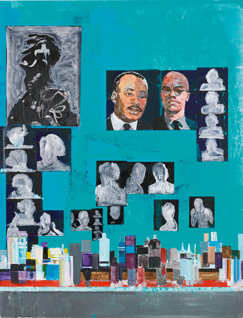
These images have become the basis of new work, most importantly Is It OK To Be Black? (2016), which alludes to questions of identity more directly than Anderson’s previous work. Unlike the earlier paintings, Is It OK To Be Black? puts the viewer right up against the mirror, but instead of seeing our own reflection, it is Martin Luther King, Malcolm X, and other hazier figures that gaze back at us. ‘The original idea was to have a figure in there, that would represent you, or [the viewer] looking back at you, so there was a sense of trying to find a scale where – when you were standing there – you would feel like that person. But in the process of painting the figure never appeared, so it became about the images and the dislocation.’
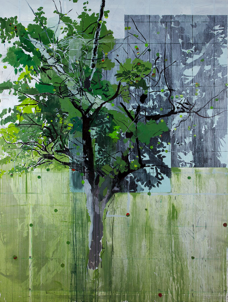
Figures that don’t materialise are a recurring theme in Anderson’s paintings. ‘Ninety per cent of them,’ he says, ‘are meant to have a figure somewhere.’ The second strand at the Nottingham show is based around the painting Scrumping (2013); inspired by the memory of his brother scrumping apples in Britain and mangoes in the Caribbean, it doesn’t feature the fugitive scrumper at all. Of a canvas he shows me in the studio, an eerie swimming pool lit in pink and blue, Anderson tells me the idea was to paint one of his own childhood experiences: ‘I almost drowned when I was 12. Well, I was never going to drown, in hindsight – there were people around, it was in Birmingham – but at the time it seemed so, and then later I was interested in trying to paint this scene of the black boy almost drowning. I wasn’t sure whether the idea would come across and in the end the figure didn’t make it in at all.’
I wonder what it means to be a portrait painter without the people? ‘With a portrait it feels like if you’re just representing something, you could just take a photograph. You look at a Velázquez portrait because you always feel like he’s trying to tell you something about this person, there’s the sense of trying to extract something else from the scenario.’ Perhaps a straight portrait is too immediate – it loses something? ‘Yes, I think it’s a state, isn’t it? In which this figure should exist, should feel like something’s happened to them, similar to what I feel about the figures in the new painting [in the studio]. They’re still, and they could stand there all day but there’s a sense that they’re waiting for something, that something might happen, or they’re waiting for something to happen, in a sense.’
That’s been true of his work for a long time, I suggest – that he’s been trying to deal with complicated subjects, such as questions of identity and alienation, while keeping the work as open and interesting as possible. ‘It is hard. I have taken a position. Being a black artist – sometimes you want to take part in it, sometimes you don’t.’ But it is painting itself that allows for multiple perspectives: ‘In real life, somehow the rules aren’t the same as the space I occupy – or try to – when I paint.’
New work by Hurvin Anderson will be shown at Michael Werner Gallery, New York, from 3 November.
From the September issue of Apollo; preview and subscribe here.