In the winter of 1960, a young man appeared at the Judson Memorial Church in Lower Manhattan for a brief performance. He was wearing a stained artist’s smock; in his hands were a can of paint and a brush. First he painted the words ‘I love what I’m doing’ on the canvas behind him, then he drank some of the paint (it was actually tomato juice), and poured the rest of it over his head before jumping through the backdrop like a circus acrobat through a hoop.
This ‘happening’ – as such events were known in the early ’60s – was called The Smiling Workman. Looking back over 57 years, its creator and sole performer Jim Dine sees it as a self-portrait. ‘It was about obsession – and the obsession remains. I was put here as a worker and I find a romance in working; I work with my hands every day. I don’t take holidays – there is so little time.’
Dine, now 81, has been endlessly prolific over the intervening decades in many media: painting, drawing, sculpture, poetry, and printmaking. In this last category his output is enormous – he has made, he thinks, around 1,200 prints. ‘Poet Singing’, a recent exhibition of eight new works at the Alan Cristea Gallery (9 February–11 March), made clear just how much of a maverick Dine is in the often rigid world of artists’ prints. Rather than stick with one medium per work – etching, lithography or woodcut – as is more normally the case, he mixes one with another, and adds more of his own invention (cardboard intaglio, for example, which produces a soft effect akin to a charcoal drawing). Then, when the printing is finished, Dine may well paint or draw over the resulting image.
Some works fit neither the definition of a print or a painting, but are effectively both. ‘Without a doubt they are in the border territory,’ Dine agrees when we meet shortly after the opening. ‘There are works which are painted on top of prints. Those are not monoprints, they’re paintings on paper.’ But then, Dine continues, he doesn’t care about technique for technique’s sake. ‘I get off on the sensuousness of the material.’
Poet Singing Beautifully (2016), Jim Dine. Courtesy the artist and Alan Cristea Gallery, London

Certainly, that’s what comes across – a feeling for lines and marks, the endless variation between fine and fuzzy, loose and sharp – along with energy and emotion. Dine clearly deserves his place in the British Museum’s blockbuster exhibition, ‘The American Dream’ (until 18 June), a survey of printmaking in the USA over the last 60 years. It is not quite so obvious, however, exactly where he belongs in it, art-historically speaking.
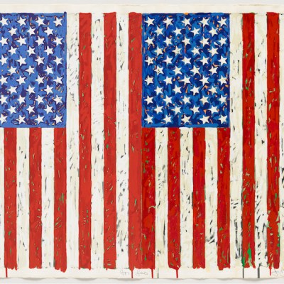
The subtitle of the British Museum show, ‘From Pop to the Present’, is a loose signpost intended to give the general public some sense of what might be displayed. But Dine, as he rapidly makes clear, is not and has never been a Pop artist. ‘I never felt comfortable with the label. I don’t regret that I’ve been lumped in there commercially because it’s been an advantage. But it has nothing to do with my work.’ I agree. If it means anything, Pop must refer to art that is concerned with popular culture and mass media, taking those as both starting point and subject matter. Dine doesn’t fit that definition at all. ‘Here’s who the Pop artists are: Wesselmann, Warhol, Rosenquist, sometimes Oldenburg, but not really. I’m a much more interior artist than that, eccentric. I go my own way with this potty, romantic expressionism that I practise.’
Dine’s origins do not lie in advertising or comic books, but rather in a hardware store in Cincinnati, Ohio. When he was 12, he went to live with his maternal grandparents, who ran the shop. Around that time he started painting seriously: ‘I knew I was an artist, I was always going to be an artist.’ A few years later, aged 17, he discovered a book by Paul J. Sachs called Modern Prints & Drawings. ‘That was the first time I saw German Expressionist woodcuts: Kirchner, Nolde, Schmidt-Rottluff. The graphic quality of them struck me, but I didn’t know how the hell to do it. I went into the basement of my grandfather’s house, where I lived, and took chisels – not woodcut-maker’s gouges, just chisels that carpenters use – and I cut away a drawing, printed it with oil paint, with a spoon in my hand. It gave me some sort of visceral thrill to pull this print off. It was a way of giving birth.’
July, Summer 2014 XI (2014), Jim Dine. Courtesy the artist and Alan Cristea Gallery, London

As a result, Dine had quite different points of reference to those of most of his contemporaries in the US (or in Britain for that matter). German Expressionism wasn’t a standard influence then, even in Germany, but it’s still evident in Dine’s work – as is that of Edvard Munch, who he soon added to his private list of mentors. ‘Munch has been a primary old uncle to me.’ You can see Munch’s influence in an image that recurred in the ‘Poet Sings’ exhibition, morphing through numerous variations of technique, colour and approach: a schematic drawing of the artist, with mouth open. ‘I saw that I could use my big ears and my bald head – fortunately – as a matrix,’ Dine tells me. It looks distinctly Munch-like, if less angst-ridden: The Song rather than The Scream.
This motif was in turn derived from an exhibition of some 60 self-portraits that Dine exhibited at the Albertina in Vienna last year. At the time he defined the subject of these as ‘the psychology of me’, adding, ‘I paint who I am; I paint what I am.’ These are statements which make sense in many artistic traditions, but not so much in Pop, where self-portraiture is confined to the occasional image of Andy Warhol in his fright-wig.
Wild Blue Marvels (2013), Jim Dine. Courtesy the artist and Alan Cristea Gallery, London

When Dine arrived in New York in the late ’50s, he was helped by several older artists, in one way or another. ‘In an exhibition, although I scarcely knew him, De Kooning said to me “You’re a real painter”. I was 25 years old. That was pretty good. And Jasper Johns was extremely generous to me. I think he’s a wonderful lithographer – the colour especially – although what he did never influenced me. But Jasper took me to Long Island to the printer Tatyana Grosman at ULAE [Universal Limited Art Editions, the fine art print publisher]. I began there and that got me in the groove that I’ve never left: just the idea of printing and printing and printing and printing.’
His closest colleague at this stage was Claes Oldenburg. ‘He was the first great artist that I met and worked with; he is six years older. Of course he had an international life, his parents were diplomats in Chicago, he was highly educated, he’d been to Yale, was a reporter, a really smart man. Just working with him taught me a lot,’ Dine says.
In the early ’60s, Dine and Oldenburg collaborated on installations and performances, or happenings (such as The Smiling Workman). But neither artists were thinking at that time in terms of Pop art. Indeed, they’d never heard the term, as Dine recalls. Until, that is, one day when it was used by the British curator and critic Lawrence Alloway. ‘Oldenburg and I were standing there and I asked, “What’s he talking about?” Claes and I both thought he meant ‘Pop’ Hart [George Overbury ‘Pop’ Hart, 1868–1933] who was some sort of American primitive painter.’
In 1962, together with a number of younger artists, including Roy Lichtenstein, Ed Ruscha, and Wayne Thiebaud, Dine participated in ‘New Painting of Common Objects’, curated by Walter Hopps at the Pasadena Art Museum (now the Norton Simon). Some of the artists involved were certainly Pop, others much less so – Dine perhaps least of all.
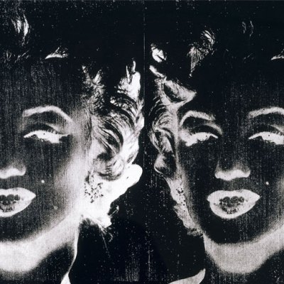
There are superficial resemblances between Dine’s work and, say, Warhol’s. They both use printing as part of the process of painting, for example – though Warhol used silkscreen which, Dine notes, he ‘loathes’. Each is inclined to repeat certain images: in Warhol’s case, Marilyn Monroe, Elvis, and Campbell’s soup cans; in Dine’s, tools, paint brushes, a dressing gown, and hearts. But there is a crucial difference. Warhol’s are found images, while Dine’s – with the exception, perhaps, of Pinocchio – are subjects that come from his life and his past.
Some art historians have seen a connection between Dine’s pictures of hammers, saws, and pliers and Duchamp’s utilitarian readymades, such as his 1914 Bottle Rack. ‘I made a painting in 1962 called Black Bathroom No 2, which consists of a china sink which I hung on a canvas and then painted around it. People said, “Ah ha, this is Duchampian.”’
It turns out Dine actually had a little to do with Duchamp. ‘Marcel was OK. I knew him slightly, he was sweet, a very nice old guy, mellow. In advance I’d thought I was going to meet someone you could scarcely speak to, he would be so cool.’ But Duchamp was doing something very different as Dine sees it. ‘Duchamp and I don’t have anything in common. Duchamp did things to break the norm; he was revolutionary in that way. He was a kind of historical terrorist.’ In contrast, Dine’s art is, in some ways, right in the American grain. ‘It wasn’t Duchamp, for me it was realism. I grew up with plumbers, in my grandfather’s store. For me there was nothing weird about taking tools as a subject, it was like using a tube of white paint. I feel the mystery of tools, the romance of tools not having been designed, but evolved through the use of people’s hands. For that reason they are beautiful. They are also metaphorical. A screwdriver isn’t always a screwdriver, you know.’ Indeed, all manner of connections can be made – and have been – between Dine’s tools and human anatomy, sexuality, and psychology.
For a long, long time Dine kept to his repertoire of imagery – the tools, the bathrobe, the hearts, plus other items including the Venus de Milo and certain birds (he has drawn wonderful owls). He carried on, in fact, until a few years ago. ‘So much abstraction is decoration for me. It wasn’t until I was 75 years old that I left it all behind to become a so-called abstract painter. I didn’t do it on purpose, I just couldn’t keep up that 50 years of imagery that I had chosen as my own. The variations were amazingly diverse, and some were boring and some were fine. So for two years I made paintings about painting; I wouldn’t call them abstract. They are concrete paintings of paint. But the imagery, the human image has crept back in.’
Pale Self (1995), Jim Dine. Courtesy the artist and Alan Cristea Gallery, London

There is more to the question of Dine’s artistic personality than imagery, however. There are common traits, such as flatness, that he shares with many other modern American painters. British artist Allen Jones once noted that when he arrived in New York in the mid ’60s, there was a ‘huge, noticeable difference’ between his generation in London, and their coevals across the pond. British painters hung on spatial illusion, whereas flatness and frontality came naturally to the Americans. This tendency, Jones felt, transcended stylistic distinctions between figurative and abstract. ‘In formal terms a Roy Lichtenstein is as flat as an Ellsworth Kelly or Tom Wesselmann.’
Dine agrees that American art tends to be ‘like a sign; it’s flatter, more graphic’. A lot of Dine’s art has that American directness: the tools and array of paint brushes, for example, could be illustrations to a chapter headed ‘American Realism’. They are what they are: simple, straightforward, honest, lined up as if in that Cincinnati hardware store.
On the other hand, Dine has spent a lot of time outside America; for much of his long career he has been a wanderer. From 1967 he spent many years, on and off, living in London, where he made friends with Richard Hamilton and R.B. Kitaj, and worked with Paul Cornwall-Jones at Petersburg Press – ‘he was the most creative publisher I had ever met, and probably still is.’ ‘In the ’60s, I saw a lot of people because the artists were very friendly then. And it was exciting to me, but after that I stayed in London because it was a place where I could hide and not be in New York, which I don’t like very much. I never did.’
Dorian Gray at the Opium Den from The Picture of Dorian Gray (1968), Jim Dine. British Museum, London. Reproduced by permission of the artist

‘Saul Steinberg [the American cartoonist and illustrator] once said I was a moving target, that way I could not be hit. It suits me and I still do it. I’m still moving. I’ve spent a long time in Paris this year because I have a great studio there and I’ve been painting a show for Chicago [‘Looking at the Present’ at Richard Gray Gallery; 28 April–10 June]. I’m going to Vienna half the time, I’ve got an exhibition in Rome coming up. It feels right to me.’
Dine has always worked a great deal in Europe. The cardboard intaglio technique, for example, came out of a conversation with an Austrian printmaker called Kurt Zein, which took place in a heurigen – a bar in a vineyard – outside Vienna. Over the season’s new wine, Dine asked, ‘Can’t we make an etching that looks like a charcoal drawing?’ And, months later, Zein came up with the solution. This incident recalls how printmaking is often a dialogue in which the printer, a master craftsman, helps the artist find the right language. ‘In a way, I speak through them,’ Dine tells me.
His collaborations with printers, over the years, have been legion. ‘For 60 years, this has been a constant source of camaraderie. Working with those people – some dead, some living, some still printing for me – has enhanced my life, not just my printing life but my existence as a human being. It’s been a pleasure.’
Dine has been a serial nonconformist. He did not fit into the zeitgeist – particularly in the ’60s when the prevailing aesthetic – whether in Op, Pop or Hard-Edge Abstraction – was detached, often ironic; certainly not impassioned. Dine was the reverse of this, as his favourite motif, the heart, perhaps suggests. ‘In 1967,’ Dine recalls, ‘Alan Solomon, an art historian and curator in New York, wrote an article entitled, “Hot Artist in a Cool Time”. And it’s true. I’ve suffered from it, but only in art politics.’ After all this time Dine still passionately loves what he’s doing. ‘There are so many things I want to do, I have so many ideas, I’m so busy. So – I continue, I continue, I continue.’
From the April 2017 issue of Apollo: preview and subscribe here