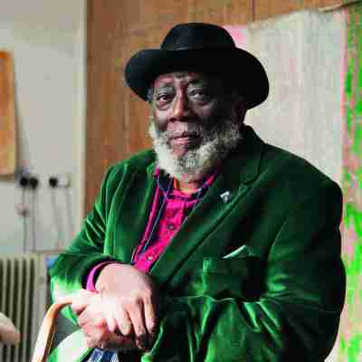
The artist Joe Tilson has died at the age of 95. Whether making paintings, sculptures or installations, Tilson made Pop and abstract art in his own idiosyncratic style. In the September 2018 issue of Apollo, the artist talked to Martin Gayford about being at the centre of the London art world in the late 1950s and ’60s, his love of Italy and the importance of striking out in new directions.
‘Looking back,’ says Joe Tilson, ‘is one of the hardest things to do, understanding how it really was at a certain time.’ He’s talking about art history, a subject in which he is well-versed, and pondering ‘what it was like to be Giotto or Piero or Masaccio’. But he is also thinking about his own past, which stretches back a long way. This autumn he has celebrated his 90th birthday – and 70 years of making art. The milestone has been marked with exhibitions at Alan Cristea Gallery (1–22 September) and Marlborough Fine Art (28 August–8 September), both in London.
Tilson’s has been a long, long career, in which he has done many things and met innumerable people, including the most celebrated fellow artists of the mid 20th century. He has also taken many turns, stylistically and geographically. Over the years, Tilson has lived and worked in Sicily, Rome, Venice and rural Wiltshire, and still spends several months a year in Italy. In the late 1950s and early ’60s, however, he was at the absolute centre of the London art world.
That era and its art scene were encapsulated in a remarkable work – part painting, part sculpture, both installation and collaboration – which Tilson entitled the A–Z Box of Friends and Family (1963). This resembles an old-fashioned printer’s tray with oblong, open sections. Beneath each of the larger containers is a neatly cut-out wooden letter of the alphabet in its own space. And above almost every letter is a work of art by an artist friend. Here then is the London art world of that moment in a box: A is for Frank Auerbach, B for Derek Boshier, D for David Hockney, E for Eduardo Paolozzi, J for Allen Jones, L for John Latham, R for Richard Hamilton, and so on.
For Jake and Anna, Christmas (1961), Joe Tilson. Courtesy the artist and Alan Christea Gallery, London; © Joe Tilson

Tilson himself was the common factor. The participants, he notes, were ‘the people I knew, some of whom knew each other, and some who didn’t. My range of friends included all manner of people who had nothing to do with what was later called Pop art. I retained ties with Frank Auerbach and Leon Kossoff, for example, who were absolutely the opposite.’ (Tilson was a sitter to Auerbach in 1980.)
Nor did the friends collated in the box belong to a single generation. Some – Auerbach, for example, and Peter Blake – were Tilson’s own contemporaries from art school. But later on, after returning from a period in Italy, he taught at St Martin’s School of Art and got to know the artists studying at the Royal College of Art. ‘The students then included Hockney, Boshier, Peter Phillips, Kitaj, Allen Jones, and later Patrick Caulfield. We lived over a dairy in Notting Hill – the rent was £3 a week – and David Hockney lived round the corner, so we were very close friends for a time. At that time I got to know a lot of very talented young painters.’ In London at the time, he remembers, there was an ‘enormous sense of excitement on every level’, but ‘no movement whatsoever’. In other words, the artists he knew were, in the phrase R.B. Kitaj later used when defining his concept of a ‘school of London’, a ‘herd of loners’.
The carpentry of that box came naturally to Tilson, because he had begun his working life as a professional joiner – despite his early ambitions. ‘I decided to become an artist at the age of eight,’ he recalls precisely. ‘I won a prize for a banner – the LCC award for safety in crossing the road – and that obviously inspired me. I thought, “I’ll be a painter!”’ Tilson pauses, then adds that he remembers asking his teacher, a Mr Dodwell, how to paint the sun. ‘He said, “well, you take some white and a bit of yellow and mix them.” I can still see the room in South London where we were that day.’
The Stones of Venice, La Scuola Grande di San Giovanni Evangelista (2015), Joe Tilson. Courtesy the artist and Alan Christea Gallery, London; © Joe Tilson

Another deep attraction that he discovered at an early age was for the warm South and its art. As a child he won another prize for painting: a book on Giotto and Italian painting. ‘I was straight in,’ he says. He travelled into central London, to Charing Cross Station, then walked up Charing Cross Road, browsing in the art bookshops. ‘The Warburg Institute was still in this ancient building, the Imperial Institute, in South Ken. I walked up the stairs past these marvellous dioramas, signed in at the desk and it was open shelf, so I looked at amazing books that Aby Warburg had brought to England and stored there.’ Later he learned Italian, and began to visit the country – as he has continued to do ever since.
Tilson’s journey has been a long one. He was born ‘into poverty’ in 1928; after war broke out, his parents thought of emigrating, but ‘the Germans sank the previous ship, so my parents decided we would not go to Canada.’ The family stayed on through the Blitz and the doodlebugs. ‘My father disliked art really intensely and wanted to have nothing to do with it. He said, the best thing you can do is learn a trade. So I went to the Brixton School of Building at 13, and stayed there two years. Then I started work in a factory making tables at 15 and a half.’
Consequently, Tilson goes on, ‘wood was a natural material to me’. Indeed, what the French call bricolage – constructing things from this and that – became part of his approach as an artist. The Brixton School, he recalls, was on five floors. ‘You did plastering on one, and bricklaying, painting and decorating on others. The top floor was masonry. I studied all those subjects.’ It was an unusual preparation for an artist in those days (although, as Tilson points out, painting and decorating were exactly what Willem de Kooning first studied in Rotterdam). Then fate moved him in an very different direction. At 18, in 1946, he was called up and spent three years in the RAF. This was time wasted, says Tilson, except that he ‘came out of it with a demob suit, a hat, an FET [further education and training] grant and a lump sum of money with which I went to Italy for three years. Then I started at St Martin’s School of Art with the grant. My father would certainly never have dreamt of paying a penny towards an education in art.’ Among his fellow students were Frank Auerbach, Bernard Cohen and Leon Kossoff. ‘Then I went on to the Royal College with Frank, and the next year Leon arrived and also Peter Blake.’ From a joiner’s bench, Tilson had moved into a group of brilliant younger artists.
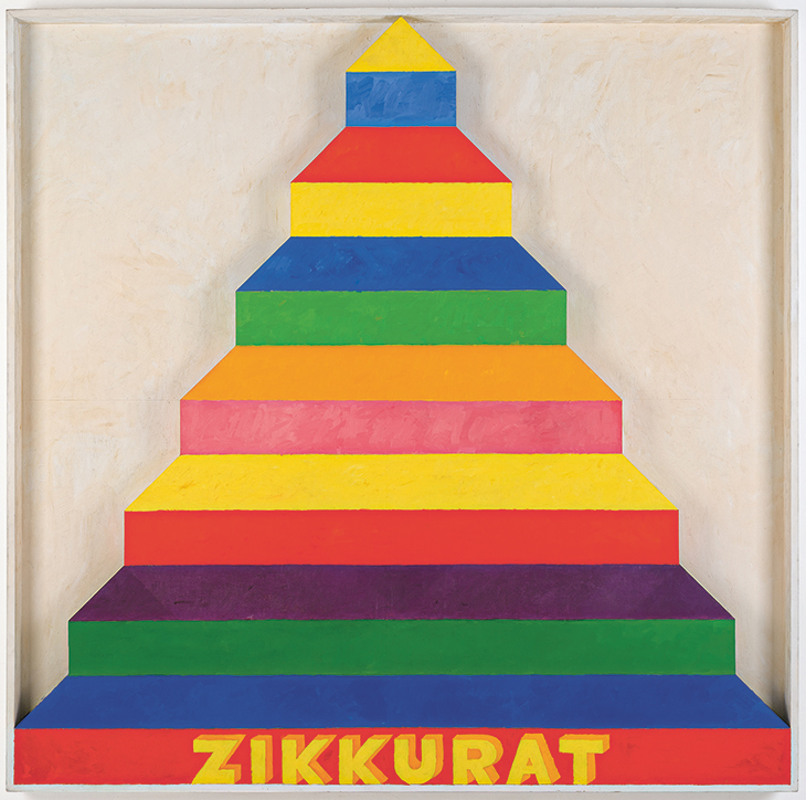
Zikkurat 3 (1967), Joe Tilson. Courtesy the artist and Marlborough Fine Art, London; © Joe Tilson
The idea of making art from everyday materials such as cement, wood and sackcloth was, Tilson recalls, ‘very much part of what was going on’. He continues: ‘The thickness of the material substance of paint was pushed enormously by Frank and Leon, whose work was hugely heavy. It was scorned by the teachers at St Martin’s, who said their paintings looked like a lot of turds. So the idea of an object-painting was something I was always very close to.’ By 1960, Tilson was making a series of Wood Reliefs, which occupied an intermediate zone between painting and sculpture (which was one of the things that irritated his elders, who felt he should choose between two- and three-dimensional art). His Wood Reliefs were, effectively, geometric abstracts, in which the stripes and circles consisted of solid pieces of timber – so sculpture, painting or joinery?
In 1961, Tilson took a leap with a relief he named for the two young children he then had with his wife, Joslyn – For Jake and Anna, Christmas. The Wood Reliefs had been oblong, like conventional pictures. This was X-shaped, painted, as Tilson puts it, in ‘bright, very urban colour’, and covered in abstract, or semi-abstract shapes – crosses, circles, triangles – and words. It looked like a pile of playroom bricks, but simultaneously like a work in the tradition of Malevich and Russian Constructivism. Actually it is both, which is its true novelty. It is characteristic of Tilson’s works, particularly of this period, that it is hard to say just what they are.
Key Box (1963), Joe Tilson. Courtesy the artist and Alan Christea Gallery, London; © Joe Tilson

A work from 1963, Key Box, consists of the word ‘key’ below a giant keyhole cut into the surface, its brass surround screwed in with workman-like neatness. Here was a variation on Magritte’s ‘Ceci n’est pas une pipe’. Tilson shows us a real keyhole in need of a key – except of course, that it’s actually a work of art. Such experiments moved Tilson, as he puts it carefully, ‘closer to what is known as Pop art’. In the early 1950s, he remembers, ‘There was a great division between fine art and Pop art. When we used the term Pop art in those days, we often meant collecting comics and Americana. For Peter Blake and me and lots of people, American culture was part of our lives in the suburbs of London.’ He continues: ‘There were huge discussions about it. I remember one evening at the ICA when [the influential critic] Lawrence Alloway said, “Can you see any possibility of making fine art out of popular art?” He went around all the painters in the room, and not a single one said that he saw any chance of doing so. No one imagined taking a Coca-Cola bottle or a soup can and reproducing it. That was absolutely impossible.’ Then Peter Blake and Richard Hamilton began to make their versions of Pop, and Tilson ‘tentatively’ followed suit.
But what was Pop, really? Tilson still finds the question dubious, after all these years. ‘Pop art,’ he says, ‘is a very odd, totally inaccurate term. When I first went to New York nobody called it Pop. A whole series of different labels were given to it – it was often called “painting of common objects”, for example. As soon as you call it “Pop”, it gets narrowed down.’ Tilson’s Pop phase, if that is what it was, did not last long. By the late 1960s, he and his wife had become intensely political. To that phase belong a sequence of screenprints and paintings, featuring such radical heroes as Che Guevara, Malcolm X and Ho Chi Minh. Politicised art was in the air, of course, and Tilson was not the only artist to move sharply in a revolutionary direction (Pauline Boty, before her early death, was travelling along a similar path). It was a period that Tilson now looks back on with a shudder.
Let a Thousand Parks Bloom (1971), Joe Tilson. Courtesy the artist and Alan Christea Gallery, London; © Joe Tilson

‘I was highly responsive to the spirit of the times,’ he admits. ‘We were deeply committed for a period, then completely disillusioned, concluding that politics was not the way forward. It was very brief and a complete waste of time. Mixing art and politics is a bad idea: I was stupid and young.’ The Tilsons soon switched to another track altogether. In the early 1970s, Joe and Joslyn moved to the country, buying an old rectory and growing their own food – the type of existence chronicled in the popular sitcom of the time, The Good Life.
Tilson’s work of the 1970s and ’80s returned to fundamentals. The Alcheringa print series dealt with the four elements: earth, air, fire and water. The primordial myths of the ancient world were another theme of prints such as The Oracle of Zeus (1981) and The Shield of Achilles (1989–90). But these are as much abstract as symbolic, as indeed is the ziggurat, a favourite motif of Tilson’s from the ’60s onwards.
The Shield of Achilles (1989–90), Joe Tilson. Courtesy the artist and Alan Christea Gallery, London; © Joe Tilson

The artist’s own contributions to the A–Z Box of Friends and Family included, above the letter Z, a ziggurat. In ancient Mesopotamia, of course, a ziggurat was a pyramidal structure climbing towards the sky in stages. Tilson’s version is a tower of stripes, with each of its levels a different colour. Over the years, Tilson has made ziggurats in various modes: wooden reliefs, prints, and free-standing sculptures. They are a reminder that Tilson was always as much an abstract artist as a Pop one – stripes being part of the lingua franca of Color Field abstractionists such as Kenneth Noland or Frank Stella. But Tilson’s ziggurats are stripes with a difference: they carry a hint of Babylon and Babel. ‘Every individual artist is completely different from every other,’ he notes, ‘and every group is different’. But his idiosyncratic work has connected all manner of apparently diverse strands in the art of his times – ‘Pop’, abstraction, the brightly coloured sculpture of Anthony Caro from the 1960s – and his work has affinities with them all.
The Tilsons enjoyed living the simple life in the village of Christian Malford near Chippenham. Looking back, however, Joe reflects that ‘Leaving London entirely, dropping London life, was obviously the worst career move I could have made. Clearly, the thing to do was to stick with Pop art and become famous and rich. Instead of which we decided to go to the country, and become unknown and poor. It’s worked very well.’ This is of course far from accurate. Tilson has not only had a very long career, but a productive and – one senses – extremely happy one. He is a Royal Academician, and the RA held a career retrospective of his work in 2002, since when he has carried on. But it is undeniable that from the ’70s onwards, his course has diverted from the mainstream in London, or for that matter the US. At one point, he and Joslyn almost migrated to New York – they had booked tickets on a liner – when she discovered she was pregnant. They cancelled the transatlantic move.
Instead, his life and art have been rooted in the Mediterranean, and especially Italy, where the Tilsons have spent much of their time. They have often stayed for extended periods in Venice, for example. A series of prints from the last decade, under the general title The Stones of Venice, mingles the architecture of the city – including that of more obscure churches such as San Zan Degola and Sant’Alvise – with Tilson’s own vocabulary of shapes and colours, still visibly descended from his work of almost 60 years ago. He looks back without regret. ‘I was very lucky, it was the greatest luck to come from nowhere and meet everybody who was of importance, and be part of something exciting as it developed.’
Exhibitions celebrating Joe Tilson’s 90th birthday have been held at Marlborough Fine Art and Alan Cristea Gallery, both London, from 28 August–8 September and 1–22 September respectively.
From the September 2018 issue of Apollo. Preview and subscribe here.