From the April 2024 issue of Apollo. Preview and subscribe here.
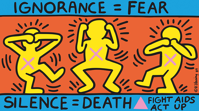
It is September 1989 and at the start of an AIDS awareness protest outside the New York Stock Exchange, a young gay activist unfurls a colourful banner. It depicts three jumping yellow figures on a red background with their hands in ‘see no evil, hear no evil, speak no evil’ poses. It is bordered by blue stripes bearing the slogans: ‘Ignorance = Fear. Silence = Death. Fight AIDS. Act Up’ and a pink triangle. At exactly the same time, 600 miles away in small-town Ohio, a woman is hanging her striking new kitchen clock. She bought it on a recent trip to New York City in this cool store in SoHo. It’s tomato red with a cute white cartoon dog at its centre outlined in heavy black. The whole family loves it – she can’t wait to show the neighbours. The East Village activist and the midwestern woman could hardly be more different culturally. But what unites them is that they are both holding artwork by Keith Haring.
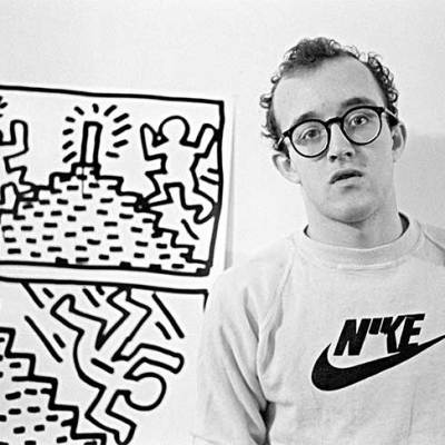
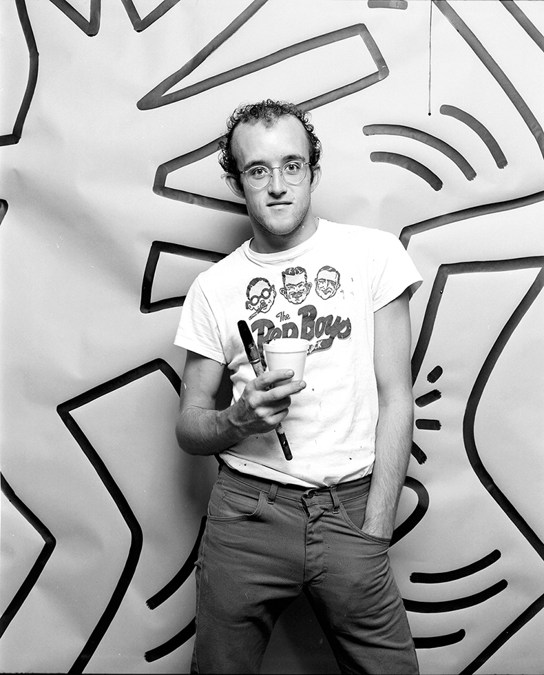
Pale and nerdy with receding curly hair, round glasses and a uniform of sneakers, pale jeans and graphic T-shirts, this skinny young gay kid from Pennsylvania makes for an unlikely global superstar. Yet within years of arriving in New York, Haring was friends with Warhol and Madonna, his imagery exhibited around the world and emblazoned across the chests of thousands. How did he do it?
‘The public has a right to art. The public is being ignored by contemporary artists,’ Haring wrote in his journals in 1978. ‘It is the responsibility of a self-proclaimed artist to realise the public needs art and not to make bourgeois art for the few and ignore the masses. Art is for everybody.’ The early years of Haring’s diary may fizz with the uncomplicated optimism of youth and the tail-end idealism of the 1970s hippie years. But they outline a manifesto that he would more than fulfil during his brief but dazzling career, cut short by his death from AIDS-related illness in 1990, at the age of 31. Haring’s work, from his early chalk drawings on the New York subway to decorating an airship for the French government, from street artist to global consumer brand, spans just a decade. Yet his cultural footprint is huge and enduring.
Ignorance=Fear, Silence=Death (1989), Keith Haring. Courtesy Keith Haring Foundation; © Keith Haring Foundation
Haring absorbed American society and reflected it back. In his pictures, the comics and cartoons he loved as a child (Disney, Dr Seuss, Peanuts) are mashed up with 1980s street style, Egyptian hieroglyphics, Japanese calligraphy, Pop art and neo-Expressionism. ‘I always want to stay 12 years old on the inside,’ he wrote in 1986. ‘Children are the bearers of life in its simplest and most joyous form.’
At the same time, his work is infused with political anger. As Alexandra Kolossa writes in her 2006 book on Haring: ‘His work is like his life: varied, headlong and purposeful […] he drew on a repertoire which, at its core, speaks of love and happiness, joy and sex, but also of violence, abuse and oppression.’ Indeed, much of his early drawing, from 1980 and 1981, contains disturbing imagery of persecution, torture and death.
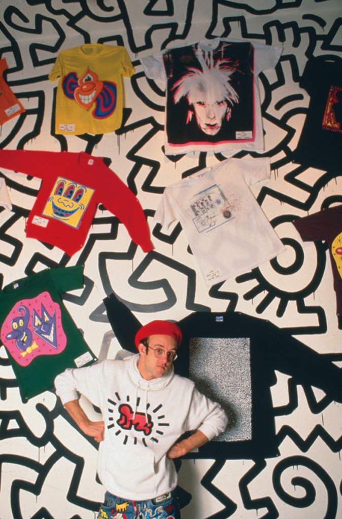
As with many of his generation of gay male artists, stunted by AIDS, we can only imagine what Haring might have gone on to do. Unlike almost any other, though, he lives on in the public consciousness. His instantly recognisable and much-loved symbols, still reproduced on T-shirts, hoodies, badges and bags for adults and children alike, give him a household status even Warhol can’t match. From his own Pop Shops and Swatch collaborations of the 1980s to the Haring Foundation’s more recent high street fashion collaborations, entry-level Haring has never gone out of fashion. The ubiquity of his symbols – the crawling baby, seen in early form in a drawing from 1980, the barking dog, the three-eyed face – is exactly what he wanted.
Like the tags of a graffiti artist on a global scale, Haring’s logos took over the world – as if he was in a race against time to cover every possible surface with his art. As he wrote when he was just starting out as an artist, ‘I am interested in making art to be experienced […] by as many individuals as possible.’ He had the genius of foresight to make this come true.
Haring deployed his mass merchandise in three distinct but important ways. First, to allow him to pursue a rich and varied artistic career that included much darker, troubling or politicised work; second, to smuggle some of these radical messages as widely as possible into the mainstream; and third – consciously or otherwise – to ensure his immortality. ‘That is why my activities are so important now. To do as much as possible as quickly as possible,’ he wrote in early 1988, the year after his HIV diagnosis. ‘I’m sure that what will live on after I die is important enough to make sacrifices of my personal luxury and leisure time now. Work is all I have and art is more important than life.’
As such, life and death are always fused within Haring’s work. Even his most familiar motifs, dancing figures and thick black line drawings, such as his huge visual alphabet The Matrix (1983), which pulsate with optimism and celebrate life, have a manic, carpe diem quality. Reading Haring’s early journals is a poignant experience, revealing he was preoccupied with his own mortality, and the condition of the artist generally, right from the start. In November 1978 he wrote: ‘It seems that artists are never ready to die. Their lives are stopped before their ideas are completed. Matisse making new discoveries up until the time he could hardly see […] I am not a beginning. I am not an end. I am a link in a chain.’ And a few days later: ‘Art is the only sensible primal response to an outlook of possible destruction (obliteration).’
Untitled (1982), Keith Haring. The Broad, Los Angeles. Courtesy The Broad Art Foundation; © Keith Haring Foundation

After a childhood in small-town Pennsylvania, Haring moved to New York in 1978, at the age of 20. His artistic talents had been encouraged by his father, as he told his biographer, John Gruen: ‘My dad made cartoon characters for me and they were similar to the way I started to draw – with one line and a cartoon outline.’ Mickey Mouse was to be a recurring motif in his drawing; at times comical, at others more menacing. A graphic design course in Pittsburgh proved to be not for him. He swapped after a year to study fine art at the School of Visual Arts in New York, but ultimately decided not to complete his degree. Although an enthusiastic and productive student, it was the streets and subculture of the city that were calling him, particularly the bars and clubs of the gay scene. Haring openly acknowledged his sexuality and it was never to be far from his art.
In the New York subway he saw the potential to disseminate his work to a mass audience. While the graffiti artists he admired were spray-painting walls, Haring chose white chalk for his striking sketches on vacant advertising spaces. (Pasted over in sombre black paper, these spaces were crying out to be brought to life.) The work was upbeat and playful, against the backdrop of what was then a rundown and almost bankrupt city, and enthralled thousands of commuters. Pulsating dancing figures, UFOs and robots, breakdancers and ghetto blasters, accompany public messages of defiance such as ‘Still alive in ’85’.
Just as Haring had to draw at great speed on the subway to avoid arrest, his work radiates energy. This is most strongly expressed by the cartoon motion marks surrounding his figures, such as the angel at the centre of Untitled (1984), but there’s also a transfer of kinetic energy from artist to surface. It’s no accident that the symbol for which Haring is most famous, and which became his ‘tag’, is the radiant crawling baby – that nucleus of potential and new life. ‘Babies represent the possibility of the future, the understanding of perfection, how perfect we could be,’ he wrote. ‘The reason that the “baby” has become my logo or signature is that it is the purest and most positive experience of human existence.’
While there is more to Haring’s art than his poppy visual alphabet, it remained the core, an address to a public of all ages and backgrounds. There is also a ritualistic, magical quality to the repetition of these symbols: like pagan incantations they provide comfort and protection.
Haring started his vinyl tarpaulin works in 1982 after securing Tony Shafrazi as an art dealer and working towards his first gallery show. The material was the perfect vehicle for his drawings, being brightly coloured and the ideal size to create much larger pieces – yet industrial and rooted in the streets. He had an aversion to using traditional canvas: ‘It represented this whole historical thing – and it just psychologically blocked me,’ he wrote.
Keith Haring at the opening of Pop Shop in Manhattan, New York. Photo: Nick Elgar/Corbis/VCG via Getty Images
The tarpaulins continue the exuberant imagery of the subway pieces above ground, throwing them into bright daylight and technicolour to an art-world audience with cash to splash. They range from simple emblematic drawings of crocodile men, jumping dogs and religious iconography to much more intricate versions resembling tribal markings; prototypes for his later paintings. That first show launched Haring’s rapid rise to fame. As ever, Haring saw himself as a conduit for his art: it did not exist without the audience and the audience gave it life. ‘The viewer creates the reality, the meaning,’ he had written in 1978. ‘I am merely a middleman trying to bring ideas together.’
Babies, barking dogs and figures with glowing red hearts on T-shirts, badges, fridge magnets, posters and watches first became available when Haring’s Pop Shop opened in New York in 1986, staying open until 2005. ‘The Pop Shop makes my work accessible,’ he said. ‘It’s about participation on a big level.’ A second shop opened in Tokyo in 1987 but lasted only a year, largely because there was already a tide of non-official merchandise available elsewhere. Since 2005, Haring’s imagery on clothing and accessories (now including iPhone cases, of course) has proliferated. It can be easy to misinterpret it all as selling out or cheapening his work, rather than being part of a defined mission. As Dieter Buchhart writes in the catalogue for ‘Keith Haring: The Political Line’ (2014) in San Francisco, ‘It was precisely this level of commercialisation that prompted numerous art critics, museum personnel and even artists to maintain a critical distance from Haring.’
As more recent reappraisals of his work (including the excellent Tate Liverpool retrospective in 2019) have demonstrated, the darker, angrier side has always been there if you seek it out. Haring uses anti-nuclear imagery, disturbing religious iconography (in his Ten Commandments series of 1985) and atrocities in South Africa (Apartheid, 1984). There is disease-related symbolism in his nightmarish yellow painting AIDS (1985) and in his devil sperm motif, while graphic Bosch-like images of sexuality populate other works. Meanwhile there are posters or murals for Act Up, safer sex, anti-drugs campaigns, Ban the Bomb and benefits for African relief. It’s a long way from a jazzy bumbag.
Haring, writes Buchhart, ‘was one of the most political artists of his time, even though he never saw his art as the spreading of doctrines’. As such, his more commercial work and merchandise has a soft power that charms and entertains, quietly colonising people’s homes and hearts, precisely so he can go for the jugular elsewhere.
HIV/AIDS hit New York in the early 1980s and by 1985 had it fully in its grip. The city was affected more than anywhere else in the United States principally because of its large gay community. Arts and creative organisations were particularly active in grassroots efforts to combat this frightening and barely understood virus – and particularly hard hit by it. Haring’s journals chart the progress of the virus from distant fear to clear and present danger, killing friends and lovers and eventually, inevitably, infecting him too. In July 1986, he expressed fear about his vulnerability, galvanising him to work even harder: ‘Life is so fragile. It is a very fine line between life and death. I realise I am walking this line.’
Keith Haring in April 1984. Photo: Jack Mitchell/Getty Images
The following year he was more defiant, writing that he had long assumed he would not grow old: ‘I always knew, since I was young, that I would die young. But I thought it would be fast (an accident, not a disease) […] Time will tell but I am not scared. I live every day as if it were the last. I love life.’ And yet, later, ‘I would love to live to be 50 years old. Imagine… hardly seems possible.’
Haring was diagnosed with HIV in 1987, at the age of 29. Between diagnosis and death he was driven to create art more obsessively than ever: drawing, painting, travelling, seizing every day, shoring up his legacy. Much of his work from that period depicts sex acts and phallic imagery intended to raise awareness of HIV/AIDS and promote safe sex – but also to celebrate the gay community as its media depiction became ever more hateful. His vivid poster for National Coming Out Day 1988 is joyful and unapologetic.
Elisabeth Sussman, curator of the retrospective at the Whitney in 1997, writes: ‘in the last years of his life, major works not only summed up his painting ambitions but were socially active and angry responses to his imminent death’. The chilling Silence = Death (1989) is perhaps among the most powerful.
Haring’s final musing on mortality in his journals, in September 1989, echoed his earlier sanguine outlook as he faced his final months with courage and pragmatism. ‘Many people at many times only lived to 30 or 40. If I was born in another place or time, maybe I would have died at war or in another disease. Aids is the new plague. Why do I think I should be exempt? Why not me? There is an illusion of safety in the world I live in… Nothing lasts forever.’ Yet Haring’s imagery, unforgotten and celebrated, has achieved just that.
Last year, 44 shipping containers were prised open in Los Angeles. Inside were the rides and artwork for the world’s first ever ‘art amusement park’, Luna Luna, shown in Hamburg in 1987 for only three months, then shut away for 36 years. Now carefully restored, a new generation is finally able to experience these works. The attractions include a mirrored dome by Salvador Dalí, an enchanted tree by David Hockney, a ferris wheel by Jean-Michel Basquiat – and, most distinctly, a multicoloured carousel by Haring. It is decorated in his signature line drawings, with the traditional horses replaced by 3D versions of his red dog and dancing figures.
Significantly, at its centre is one of the only self-portraits ever drawn by Haring, rendered in cartoony black and white. As the carousel spins, Haring’s image gazes out: playful, defiant, forever young.
Installation view of the carousel designed by Keith Haring in 1987 for the ‘art amusement park’ Luna Luna, Berlin, now on display in Luna Luna: Forgotten Fantasy, Los Angeles. Photo: Robyn Beck/AFP via Getty Images

From the April 2024 issue of Apollo. Preview and subscribe here.
Keith Haring: Art for Everybody is at the Walker Art Centre, Minneapolis, from 27 April until 8 September.