The global pandemic has revealed a surprising lacuna in the fight against the virus. Where are the posters and visual messages to inform and persuade us? The history of graphic and communication design, especially in poster form, is full of useful and inspirational examples that remind us of the power of simple language.
The poster was the first form of image designed to be seen from a distance and while the viewer was on the move. In the first instance, its effectiveness derived from the greater scale and colour effects made possible by lithographic printing. Later, the more complete integration of word and image allowed the poster to keep pace with the accelerating machine-ensemble of modern life, and to communicate instantly.
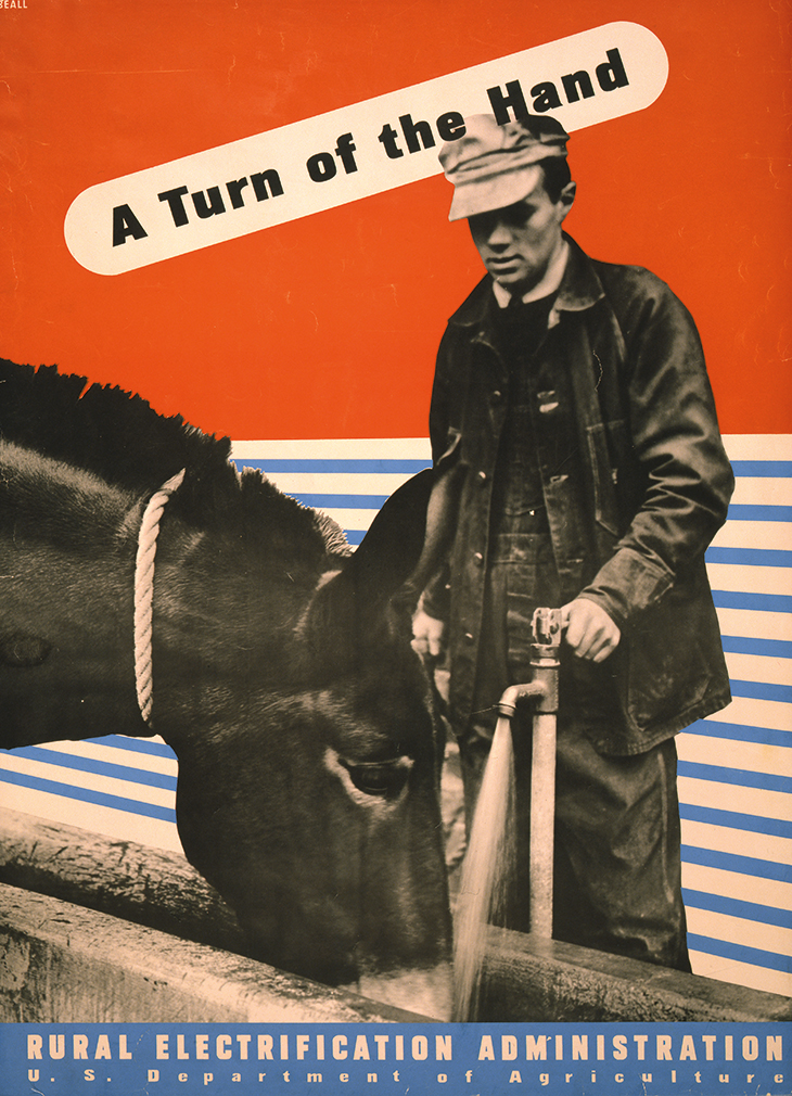
The origins of modern graphic design, in the aftermath of the First World War and especially in the experiments of Soviet constructivism, show how colour and form can be used to powerful effect. El Lissitzky’s famous ‘Red Wedge’ poster of 1919 uses a simple red triangle to represent the dynamic and percussive force of the Red Army. The effectiveness of communication through this new form of information design made it attractive beyond the command economy of the Soviet Union. In the United States, the ideas of mass communication were developed, by Walter Lippmann and Edward Bernays, into strategies that aligned information with the dominant structures of market economy, commercial advertising and public relations. Lester Beall’s posters for the Rural Electrification Administration’s activities in the 1930s combine colour and abstraction, but add elements of photographic detail that humanise the message of modernisation and progress.
‘A Turn of the Hand’ (1930s), Lester Beall. Library of Congress, Washington, D.C.
In Britain, the public information poster reached its most sophisticated form during the Second World War, although the propaganda efforts of the Ministry of Information got off to a muddled start. The first three posters produced by the ministry in 1939 adopted a tone that was understood to suggest an us-and-them approach to preparedness and collective effort (‘Your Courage, Your Cheerfulness, Your Resolution – Will Bring Us Victory’ and ‘Freedom is in Peril – Defend it with all Your Might’). Ironically, the most famous of the posters – ‘Keep Calm and Carry On’ – is the one that wasn’t used. Over the course of 1940, the messages aimed at both military personnel and civilians became clearer and more coherent and, from 1941 onwards, aligned with the objectives of post-war reconstruction.
In the military context, the designer Abram Games produced a series of remarkable posters representing his philosophy of ‘maximum meaning and minimum means’. Games was able to combine, through his skill in design-thinking and simplification, two ideas into a single message. The poster he designed to promote good health and hygiene across the British Army can be found in the Wellcome Collection. Another series Games designed for the Ministry of Health addressed the associated dangers of coughs and sneezes (‘spread diseases’).
‘Please Pass Along the Platform’ (1944), Cyril Kenneth Bird, known as ‘Fougasse’. Paul and Karen Rennie British Design Collection, Folkestone
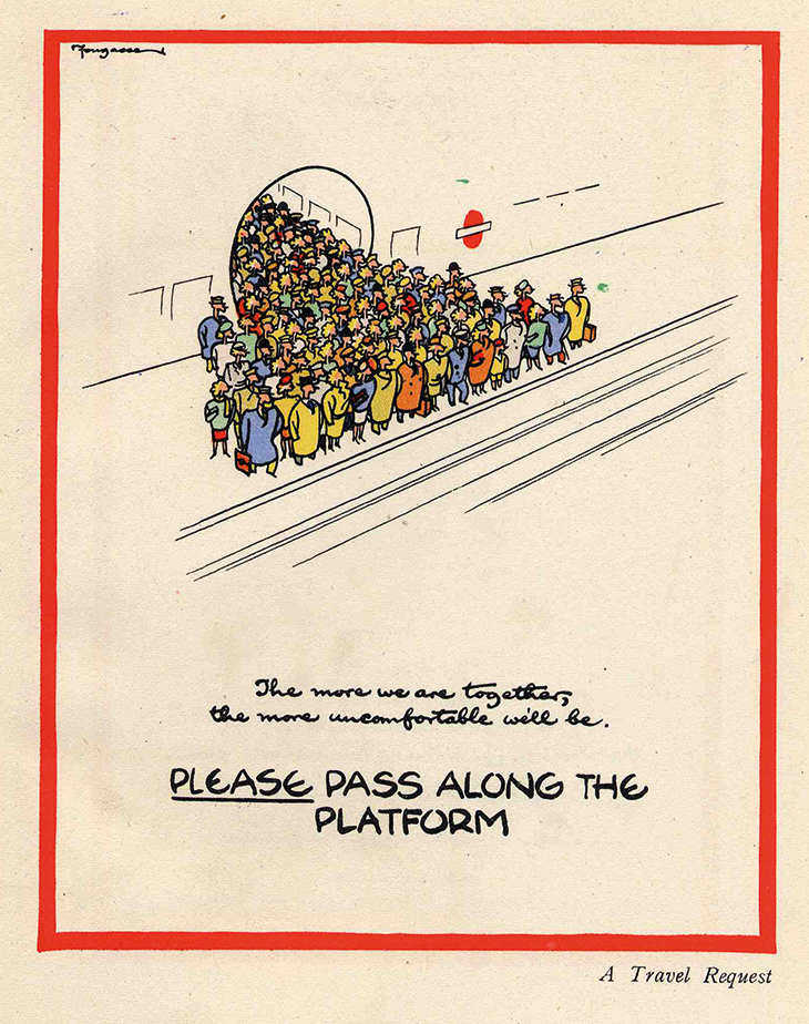
The humourist and illustrator Cyril Kenneth Bird, known as Fougasse, is best remembered now as the designer of the ‘Careless Talk Costs Lives’ series of posters. Writing in 1946, he outlined his approach to effective communication: eye-catching design to attract attention and curiosity, humour and intelligence to engage the spectator, and a space to allow the viewer to reach the conclusion on their own. ‘In propaganda,’ Fougasse writes, ‘the poster must attract, persuade, so as to provoke action […] each of these is a necessary characteristic without, on its own, being sufficient. Each of the three must be considered together.’ He noted that shouting at people was hardly ever effective and that it was important to help people feel that they had made a considerate contribution through their actions. Fougasse also created posters for London Transport, and for the Thomas Tilling bus company, about passenger etiquette and the convenience of staggered travel times. These themes of consideration towards fellow passengers could translate easily to those of social distancing.
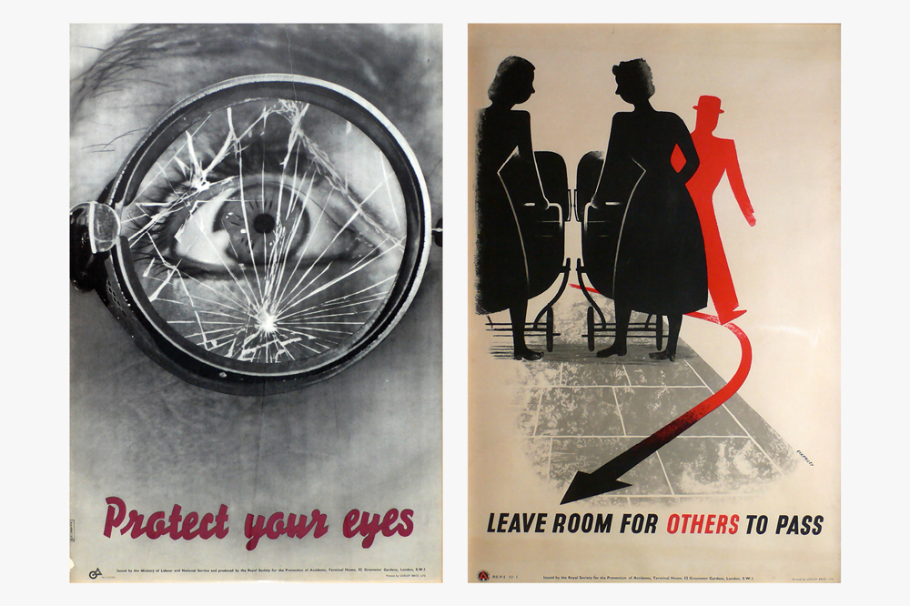
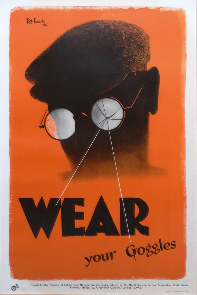
A similar approach was adopted by Ernest Bevin’s Ministry of Labour in promoting the industrial and road-safety messages of the Royal Society for the Prevention of Accidents. Their campaigns combined simple messages, humour, consistency and continuous repetition, to promote tidiness and consideration as expressions of collective effort and decency. One of the society’s most important campaigns was to promote the wearing of safety goggles in workshops and factories. That’s not so different from asking people to wear masks. After the war, the appeal to safety as a means of increasing economic production was recast as common courtesy and consideration.
‘Wear Your Goggles’ (1942), designed by Pat Keely. Paul and Karen Rennie British Design Collection, Folkestone
The new systems and structures of the post-war settlement also required the same kinds of public information in relation to the availability of resources and services. The Ministry of Information was re-badged as the Central Office of Information and continued to make public information posters, often by Reginald Mount and Eileen Evans, and information films until it was finally closed in 2011. There is also a sense in which the poster has moved to the internet, where it has become a meme. The common-sense messages of public information have, over the years, been shifted to the mass audiences of television soap-operas and dramas. We may expect the storylines of Eastenders and Coronation Street, when they resume, to be full of health anxieties, community spirit and resilience.
The paucity of clear and consistent public-health messaging during the pandemic has exposed a huge problem for the effective communication of public information. The fragmentation of the media landscape combines with the costs attached to securing media space to price these communications out of the national market. Also, it looks as if these messages are better created outside straightforwardly commercial organisations. It will be interesting, in the months ahead, to see how the power of communication can be mobilised beyond the immediate demands of public relations. The present circumstances provide an ideal opportunity for us to reconnect with the simple and effective power of the poster. Posters are immediate and inexpensive, and their history shows us how to combine information, communication and direction.
Paul Rennie is head of context in graphic design at Central Saint Martins, London. His book Tom Eckersley: A Mid-century Modern Master will be published by Pavilion Books in 2021.
From the September 2020 issue of Apollo. Preview and subscribe here.