Joe Bradley takes an unorthodox approach to abstraction while paying meticulous attention to the process of painting. The artist talks to Samuel Reilly about his exhibition, ‘Day World’, at Gagosian in London.
What ideas inform your solo exhibition, ‘Day World’?
Maybe five or six years ago, I decided that I didn’t want to rely on ideas. The works in this show are the product of just painting, of improvising, of showing up at the studio every day. Now, after the fact, I can look around and tease out reoccurring motifs and that sort of thing, but I don’t go in with an idea, or the ideas are so banal that they’re barely worth mentioning. Typically I’ll be thinking about formal things – maybe the paint should be a little thicker or thinner, or some sort of idea about scale, or palette.
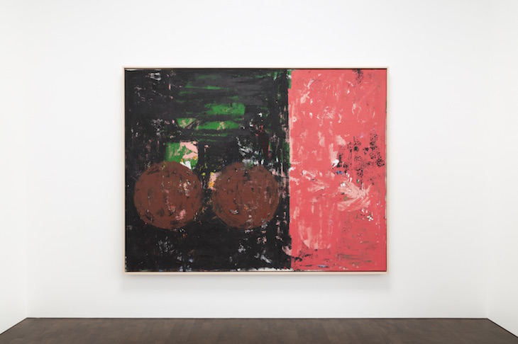
Vanguard (2018), Joe Bradley. Photo: Rob McKeever; courtesy Gagosian; © Joe Bradley
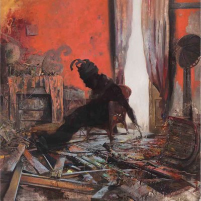
There’s an epigraph to this show from Moby-Dick, describing ‘a large oil painting’ that is ‘in every way defaced’ but that also holds a ‘sort of indefinite, half-attained, unimaginable sublimity’. Does that sound like a description of your paintings?
Well, I was at a friend’s studio recently – a painter. We were talking shop; he mentioned that when he approaches a painting, he needs to finish it in a day or two. If he didn’t, he would lose touch with the painting. My approach is really the opposite – I work on these things slowly, over a long period of time. And one of the things that has to happen is I have to feel a certain remove from the painting so I feel free to deface it, to ruin a perfectly good painting to try and get to the next page. Whether or not there’s any shot at the sublime – that isn’t for me to say.
That pull from Moby-Dick – I’ve been rereading it. I don’t remember it being so funny. It’s hysterical, every paragraph is so craggy, so loaded – the language is so dense. I thought that description of the painting was so funny, and I felt like it related in some way. Of course, I know it’s a silly and pretentious idea, to tap Melville…
Is humour important to you?
It’s not something that I consciously set out to achieve. I like funny paintings – I don’t know if these are funny paintings. I would hope that there’s some sense of levity, at the very least, to these things.
In many of your paintings, seemingly abstract forms can be read as figures. Is this something you’re aware of as you’re working?
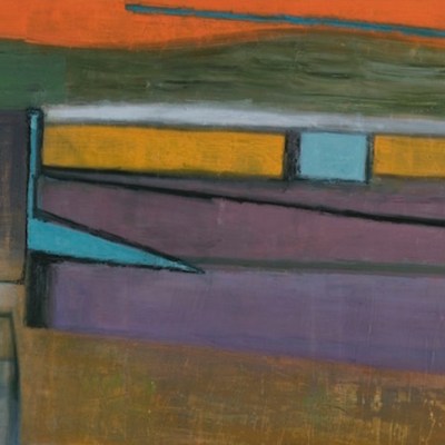
The figure is definitely present in these paintings. I know that they read as abstract paintings, but I can’t tell myself that I’m painting an abstract painting because I would have nothing to hang on to. So I’ll think of the human body – and there are a few paintings in this show that allude to a cityscape. I don’t know if this is something that necessarily translates for the viewer, but it’s helpful for me as a point of departure.
Installation view of ‘Joe Bradley: Day World’, 2018. Photo: Lucy Dawkins; courtesy Gagosian; © Joe Bradley
What is your relationship to the tradition of abstract painting?
I think it’s interesting when an abstract painter doesn’t have an orthodox approach to abstract painting. The first person that pops into my head is de Kooning. He was so fluid, in the sense that he seems so comfortable incorporating the figure, and then losing the figure – he’s certainly someone that I’ve thought a lot about over the years. Then there’s Baselitz. I’m thinking here of the early ’80s, the Orange Eaters – there’s a brutal quality to these works that I love. I could go on about this, but the idea of inverting the painting – it’s such a stupid idea, but he did it. I love it when an idea sounds really awful on paper but succeeds in the flesh.
A lot of your paintings have first names as titles – Black Peter, for instance. Why?
I like the idea of naming a painting, rather than titling a painting – naming a painting like you would name a child. In a way, I look at paintings – maybe we all do – much like you would look at another person. If you ran into somebody in a dark alley, you would look at them and size them up, read their body language, look at what clothes they’re wearing.
In the same way, you recalibrate the way you’re looking at a painting depending on what sort of a painting it is. I often think of this relation to scale – the scale of a painting tells you where to stand. You’re looking at a Vermeer, you get as close as you can to it, and it’s a very cerebral kind of buzz. My canvases are more of a body buzz.
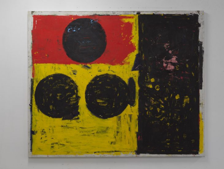
Black Peter (2018), Joe Bradley. Photo: Rob McKeever; courtesy Gagosian; © Joe Bradley

There’s a lot of black in these paintings. How do you select your palette?
There is a lot of black. Black serves as a drawing tool, a way of obscuring the part of the painting that needs to be obscured. Is it even really a colour? I think of it more like ink – a drawing medium – but I suppose it can also be read as outer space, or just the absence of colour.
I almost want palette not to present itself as an issue. I don’t want the viewer to get lost in the nuances of colour. The palette skews towards iconic – the sort of colours you might see in a flag. When you look at a comic book, there are no more than eight colours – they register, but it’s not something that’s occupying too much space in your head.
Installation view of ‘Joe Bradley: Day World’, 2018. Photo: Lucy Dawkins; courtesy Gagosian; © Joe Bradley

You spoke earlier about paying attention to the thickness of paint. Do you think there’s something sculptural about your paintings?
I’ve always been preoccupied with the sculptural quality of painting, or rather, the fact that the painting is also an object. We tend to ignore the fact that a painting is a physical, three-dimensional thing, and to treat it more as a window, or a portal. Paintings have that power and that quality, they can function like that – but they’re also these rickety things that have a backstage area we’re not privy too. I have this idea that there’s something suspicious about painting – I think that’s part of it. A sculpture isn’t pretending to be anything other than a sculpture – a painting asks you to suspend disbelief, there’s an expectation of an illusion that you’re being treated to. I guess I like to drive home the fact that it’s a thing, made out of cloth and paint.
‘Joe Bradley: Day World’ is at Gagosian, Grosvenor Hill, London, until 15 December

