Most architectural styles are pioneered by the wealthy. The villa, the mansion, the upmarket apartment block, the blockbuster cultural centre: these have been the vehicles for new architectures. The Amsterdam School was different, driven by the imperatives of social housing, municipal building and civic infrastructure. Its moment, though very specific to the Netherlands, was remarkably influential and, perhaps unusually, a huge physical legacy survives. Even the Bauhaus never achieved this kind of success, its influence being felt through its successors and a small number of exquisite items which emerged from its workshops.
The Amsterdam School embodies several contradictions. It is an architecture that is instantly recognisable yet difficult to define. It celebrates the communal and the social yet gives almost infinite room for individual expression. It can look hyper-modern yet curiously medieval. And, at its most creative, it can be utterly, infectiously bizarre.
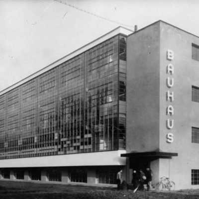
Design for Het Scheepvaarthuis (‘The Shipping House’), designed by Joan van der May and others and built in 1913–16. Courtesy Het Nieuwe Instituut, Rotterdam

The buildings date from the years around the First World War until about 1930. They are mostly executed in brick and, with a few notable exceptions, found in Amsterdam. This was not a creative moment that punctuated city streets with a few recognisable and lavish landmarks but rather one that created entire neighbourhoods, huge new chunks of city, in a style that was coherent without being monotonous or repetitive: brilliantly planned, beautifully executed and elegant quarters that stand remarkably intact and work as well today as they did a century ago.
The Netherlands never really succumbed to art nouveau, as neighbouring Belgium did. Instead architects looked to England, to the simplicity and craftsmanship of Arts and Crafts, to the national romanticism emerging in the Scandinavian countries, and to their own traditions of quirky brick construction. The Amsterdam School’s first great monument was Het Scheepvaarthuis (‘The Shipping House’) of 1913–16, a great brick cliff of a building on Amsterdam’s waterfront, designed to house a number of shipping companies. It displays the exuberant explosion of formal ideas and decorative motifs that would come to characterise the school, but they are still clearly nascent, evolving. It takes bits from Hanseatic brick warehouses and fragments of colonial exoticism, notably Indonesian temples and Asian pagodas and stupas. It looks a little towards Chicago – to Louis Sullivan’s towers for urban scale, and to Sullivan’s pupil Frank Lloyd Wright for its obsessive geometric detail (and a touch of the Japanese ornament he was so fond of). This was an architecture that spanned the Atlantic, the Pacific and the North Sea, embodying a nautical architectural circumnavigation of the globe completely appropriate to its purpose; and it predicted other architectures including Expressionism and Art Deco. Now a hotel, the Scheepvaarthuis remains a formidable presence. The design was led by Joan van der Mey in collaboration with Michel de Klerk and Piet Kramer; all three had worked in the office of Eduard Cuypers – a traditionalist who encouraged his colleagues to follow their own paths.
Het Scheepvaarthuis (‘The Shipping House’), designed by Joan van der May and others and built in 1913–16. Photo courtesy Het Nieuwe Instituut, Rotterdam

The success and popularity of the Scheepvaarthuis opened the floodgates. During the First World War the Netherlands was neutral; construction continued and the architecture developed, helped by a 1901 housing act that initiated huge slum clearances, and by commissions from the ministry of housing and construction and from the ministry of public works. The latter employed young Amsterdam School architects to design everything from street furniture and bridges – Piet Kramer designed an astonishing 500 new bridges, more than 200 of which were built – to municipal schools and swimming pools.
The most characteristic works, though, were housing. The best known is De Klerk’s Eigen Haard (‘Own Hearth’), also known as Het Schip (‘The Ship’), built 1917–20. The project draws on Arts and Crafts ideas: built in brick, with terracotta-tiled roofs draped low over the walls, it’s a self-contained complex, with a community hall, a post office and a curious central spire like an attenuated stupa, though the only religion here is decent housing. The details are exquisite, from the rounded corners to the blue-tiled caretakers’ booths. The intimate scale is unlike, for instance, the public-housing experiments in Red Vienna a few years later, which celebrate the proletariat through scale and mass rather than, necessarily, finesse.
The Tuschinski Theatre, designed by Hijman Louis de Jong and built in 1921. Photo: Scenics and Science/Alamy Stock Photo

In contrast with the acres of attractive working-class housing enlivened by brick reliefs and delicate brick corbels, there is the incredible exoticism of Hijman Louis de Jong’s Tuschinski Theatre (1921), a cinema that foreshadows the decorative orgies of Art Deco. In the streamlined, curving corners of many of the buildings you can spot the impulse behind Britain’s Odeon cinema boom of the 1930s; in the more restrained buildings, you can see the influences behind Britain’s solid town halls and the municipal architecture of the interwar period. You can see, too, how German Expressionism was profoundly influenced by these buildings with their blend of the angular and the organic, the crystalline and the watery.
The movement came with its own inhouse publication, perhaps the most beautiful of all architectural magazines. Wendingen (‘windings’) was catholic in its approach, never limiting itself to being a mouthpiece for the movement. Covers were designed by El Lissitzky, Johannes Duiker, W.M. Dudok, Hendrik Wijdeveld, Hermann Finsterlin, and Vilmos Huszár, issues were dedicated to Frank Lloyd Wright, Jan Toorop, Josef Hoffmann and Erich Mendelsohn, tackling subjects as varied as Eastern art, Hungarian art, advertising, seashells, skyscrapers and crystals. The graphics range from psychedelic Expressionism through sparse suprematism and swirling symbolism. There has never been anything quite like it.
Among the contradictions embodied by the Amsterdam School was that it was an avant-garde modern architecture that revelled in ornament – perhaps the last of the breed. And it has remained resolutely popular and profoundly practical. The hundreds of bridges, booths, urinals and streetscapes Piet Kramer designed remain a part of Amsterdam’s everyday landscape, largely unremarked on and not on the tourist trail. It was a modernism tailored to a particular place, imbibing its historic scale and material culture while inventing something that still seems strikingly new and enduringly useful.
From the March 2019 issue of Apollo. Preview the current issue and subscribe here.