This month I have been mostly thinking about verdigris. As winter’s snow is scraped away, or simply melts, that distinctive jade hue has once more emerged across the rooftops of Helsinki. Several of the city’s churches are an adroit combination of verdigris copper roofs and spires atop walls of iron-red bricks. Celebrated Finnish architect Alvar Aalto went through a ‘red brick period’ in the 1950s during which he too embraced this beautiful combination of colours. His Kulttuuritalo (Culture House) in the north of the city is one of the finest examples.
Such elegant sights are not confined to Helsinki: the grey-green of oxidised bronze, brass or copper is common on public buildings throughout northern Europe. But across the Baltic in Tallinn – a city divided between medieval old town, baroque parklands, and Soviet-era housing blocks – it took a Finnish architect to introduce the unique charms of verdigris.
In the formal gardens of Kadriorg Park to the east of the city is KUMU, one of five branches of the Art Museum of Estonia. Designed by Pekka Vapaavuori in 1994 (but not built until 2006), KUMU’s exterior boasts a similar jutting sharpness to Kiasma in Helsinki – designed by American architect Steven Holl just one year earlier. Tonally, however, KUMU is quite different. The outside is a symphony of greens courtesy of coloured glass, an undulating grass roof, and, of course, verdigris on copper. Meanwhile, sweeping interior curves and unlikely angles create challenges for the museum’s curators. Some of these have simply been ignored, leaving various unsatisfactory dead spaces. Some, however, have been tackled with a certain imaginative verve: one gallery devoted solely to busts – in rows high up the wall or mounted upon Perspex plinths – is a minor triumph. Perhaps unsurprisingly, it is Tamara Ditman’s Portrait of a Gull (1982) – its bronze eyes glistening in its grey-green verdigris head – that stands out among the great and the good of Estonian history.
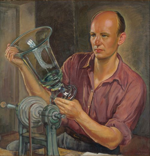
Portrait of the Artist M. Roosmaa (1951), August Jansen. Art Museum of Estonia
Unfortunately, KUMU’s permanent displays are mostly underwhelming. On this evidence at least, Estonian art history consists largely of unmemorable imitations of the major movements originating in Paris and elsewhere. Fortunately, the museum’s temporary exhibitions are more interesting. ‘Romantic and Progressive’ – a concise exploration of the artistic movement known as Stalinist Impressionism – is especially insightful (until 1 May). In August Jansen’s Portrait of the Artist M. Roosmaa (1951), for example, we see the artist as archetypal artisan: clean shirted, clean shaved, and admiring his handiwork. It’s interesting to note a comparable combination of power and schmaltz in the architecture of Soviet-occupied Estonia too – notably the ornamental wheatsheafs, laurels and stars adorning a vast block on the corner of Liivalaia and Lastekodu (now home to the city’s most cutting-edge contemporary art gallery, Temnikova & Kasela).
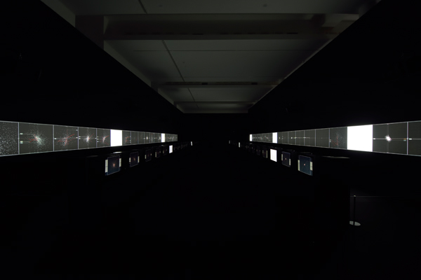
supersymmetry ( 2014–15), Ryoji Ikeda. Courtesy of the artist. Exhibition view (photo: Stanislav Stepaško)
What ‘Romantic and Progressive’ demonstrates is that art is not always as subversive as we might like to think. Sometimes it simply serves the dominant discourse of the times. In this light, it’s interesting to look again at Ryoji Ikeda’s Supersymmetry, currently occupying KUMU’s ground floor Great Hall (until 28 February). Based on research at the Large Hadron Collider at CERN, is this flashing, thrumming spectacle, with its dozens of projectors and power-hungry flat-screens, offering anything more than unthinking praise for the awe-inspiring grandeur of today’s big science techno-sublime? And if not, does that even matter?
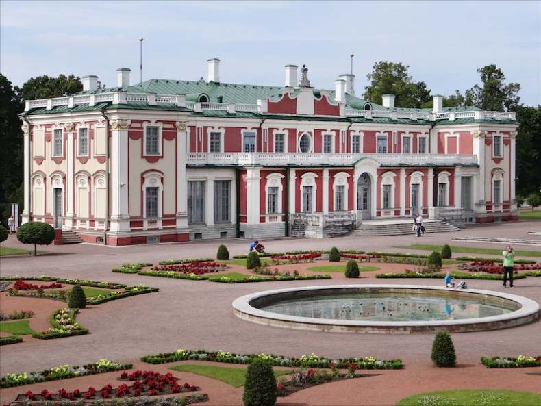
Kadriorg Palace, Tallinn. Photo: Jean-Pierre Dalbéra
Across the park from KUMU, in Kadriorg Palace, verdigris is once again to the fore – this time not in architecture but in art. Microanalysis of Christ Driving Money-lenders from the Temple, a painting once believed to be by Hieronymus Bosch, has discovered traces of verdigris amid the layers of paint. On a screen next to the painting, that vivid green is visible in a microscopic cross-section. Sadly, dendrochronology has proved that the painting, like the three others of the same scene (in Copenhagen, Glasgow and a private collection), is a copy. Leonardo da Vinci wrote that the beauty of verdigris ‘vanishes into thin air if not varnished immediately’. At least this copyist knew how to handle their pigments.
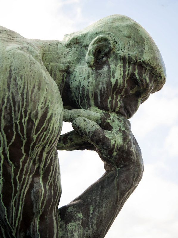
‘The Thinker’ (detail), Auguste Rodin, 1909. Photo: Nationalmuseum Linn Ahlgren
Back across the Baltic, on the third floor of Helsinki’s Ateneum, is the unexpected money shot for verdigris fans. As part of ‘Auguste Rodin’ (until 8 May) a monumental bronze version of the French sculptor’s celebrated The Thinker perches, all manly and pensive, above mere human-sized museum visitors. The whole room is a celebration of the versatile patinations of bronze – from tempered chocolate to lightly tanned leather. But it’s the pale jade leeching and dripping down the poet’s neck and shoulders that is perhaps the most remarkably beautiful.
And, if you stand at just the right angle, you can appreciate the work’s full splendour against the backdrop of Helsinki’s own central station – an icon of National Romantic architecture whose green, copper-topped clocktower and muscled, globe-bearing statues have done so much to foster the image that Finland likes to present of itself. Verdigris against verdigris: no wonder I can’t stop thinking about it.
More from this series


![Masterpiece [Re]discovery 2022. Photo: Ben Fisher Photography, courtesy of Masterpiece London](http://www.apollo-magazine.com/wp-content/uploads/2022/07/MPL2022_4263.jpg)

Baltic Diary: The charms of verdigris
KUMU, Tallinn Photo: Jamie Silva
Share
This month I have been mostly thinking about verdigris. As winter’s snow is scraped away, or simply melts, that distinctive jade hue has once more emerged across the rooftops of Helsinki. Several of the city’s churches are an adroit combination of verdigris copper roofs and spires atop walls of iron-red bricks. Celebrated Finnish architect Alvar Aalto went through a ‘red brick period’ in the 1950s during which he too embraced this beautiful combination of colours. His Kulttuuritalo (Culture House) in the north of the city is one of the finest examples.
Such elegant sights are not confined to Helsinki: the grey-green of oxidised bronze, brass or copper is common on public buildings throughout northern Europe. But across the Baltic in Tallinn – a city divided between medieval old town, baroque parklands, and Soviet-era housing blocks – it took a Finnish architect to introduce the unique charms of verdigris.
In the formal gardens of Kadriorg Park to the east of the city is KUMU, one of five branches of the Art Museum of Estonia. Designed by Pekka Vapaavuori in 1994 (but not built until 2006), KUMU’s exterior boasts a similar jutting sharpness to Kiasma in Helsinki – designed by American architect Steven Holl just one year earlier. Tonally, however, KUMU is quite different. The outside is a symphony of greens courtesy of coloured glass, an undulating grass roof, and, of course, verdigris on copper. Meanwhile, sweeping interior curves and unlikely angles create challenges for the museum’s curators. Some of these have simply been ignored, leaving various unsatisfactory dead spaces. Some, however, have been tackled with a certain imaginative verve: one gallery devoted solely to busts – in rows high up the wall or mounted upon Perspex plinths – is a minor triumph. Perhaps unsurprisingly, it is Tamara Ditman’s Portrait of a Gull (1982) – its bronze eyes glistening in its grey-green verdigris head – that stands out among the great and the good of Estonian history.
Portrait of the Artist M. Roosmaa (1951), August Jansen. Art Museum of Estonia
Unfortunately, KUMU’s permanent displays are mostly underwhelming. On this evidence at least, Estonian art history consists largely of unmemorable imitations of the major movements originating in Paris and elsewhere. Fortunately, the museum’s temporary exhibitions are more interesting. ‘Romantic and Progressive’ – a concise exploration of the artistic movement known as Stalinist Impressionism – is especially insightful (until 1 May). In August Jansen’s Portrait of the Artist M. Roosmaa (1951), for example, we see the artist as archetypal artisan: clean shirted, clean shaved, and admiring his handiwork. It’s interesting to note a comparable combination of power and schmaltz in the architecture of Soviet-occupied Estonia too – notably the ornamental wheatsheafs, laurels and stars adorning a vast block on the corner of Liivalaia and Lastekodu (now home to the city’s most cutting-edge contemporary art gallery, Temnikova & Kasela).
supersymmetry ( 2014–15), Ryoji Ikeda. Courtesy of the artist. Exhibition view (photo: Stanislav Stepaško)
What ‘Romantic and Progressive’ demonstrates is that art is not always as subversive as we might like to think. Sometimes it simply serves the dominant discourse of the times. In this light, it’s interesting to look again at Ryoji Ikeda’s Supersymmetry, currently occupying KUMU’s ground floor Great Hall (until 28 February). Based on research at the Large Hadron Collider at CERN, is this flashing, thrumming spectacle, with its dozens of projectors and power-hungry flat-screens, offering anything more than unthinking praise for the awe-inspiring grandeur of today’s big science techno-sublime? And if not, does that even matter?
Kadriorg Palace, Tallinn. Photo: Jean-Pierre Dalbéra
Across the park from KUMU, in Kadriorg Palace, verdigris is once again to the fore – this time not in architecture but in art. Microanalysis of Christ Driving Money-lenders from the Temple, a painting once believed to be by Hieronymus Bosch, has discovered traces of verdigris amid the layers of paint. On a screen next to the painting, that vivid green is visible in a microscopic cross-section. Sadly, dendrochronology has proved that the painting, like the three others of the same scene (in Copenhagen, Glasgow and a private collection), is a copy. Leonardo da Vinci wrote that the beauty of verdigris ‘vanishes into thin air if not varnished immediately’. At least this copyist knew how to handle their pigments.
‘The Thinker’ (detail), Auguste Rodin, 1909. Photo: Nationalmuseum Linn Ahlgren
Back across the Baltic, on the third floor of Helsinki’s Ateneum, is the unexpected money shot for verdigris fans. As part of ‘Auguste Rodin’ (until 8 May) a monumental bronze version of the French sculptor’s celebrated The Thinker perches, all manly and pensive, above mere human-sized museum visitors. The whole room is a celebration of the versatile patinations of bronze – from tempered chocolate to lightly tanned leather. But it’s the pale jade leeching and dripping down the poet’s neck and shoulders that is perhaps the most remarkably beautiful.
And, if you stand at just the right angle, you can appreciate the work’s full splendour against the backdrop of Helsinki’s own central station – an icon of National Romantic architecture whose green, copper-topped clocktower and muscled, globe-bearing statues have done so much to foster the image that Finland likes to present of itself. Verdigris against verdigris: no wonder I can’t stop thinking about it.
More from this series
Unlimited access from just $16 every 3 months
Subscribe to get unlimited and exclusive access to the top art stories, interviews and exhibition reviews.
Share
Recommended for you
Baltic Diary: Freezing weather and frozen art funding
The Finnish arts organisation Checkpoint Helsinki has had its funding cut. Can it survive?
Baltic Diary: The Purpose of Art Prizes
The Lorck Schive art prize has an important role to play in Trondheim’s growing art community
Baltic Diary: Rethinking the role of art in the city
Engagement, interaction, the co-creation of meaning: these are the museum buzzwords of today. But what do they actually mean?