
Art has often been put to educational use. Altarpieces have informed congregations for centuries and, whether accurate or not, history paintings dominated Europe’s salons before 1900. However, the information being conveyed was, relatively, imprecise. Over the last two centuries, however, the importance of statistical analysis to the scientific community has also given rise to new, and more precise, forms of visual communication.
‘Beautiful Science: Picturing Data, Inspiring Insight’, at the The Folio Society Gallery in the British Library (until 26 May), charts – excuse the pun – the intersections between data and visual culture. Framed as the ‘elegant’ union of two disciplines, the graphics here range from the humble table, to state-of-the-art digital and interactive displays.
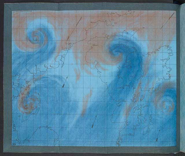
Air Currents over the British Isles (London, 1863), Robert FitzRoy, from ‘The Weather Book: A manual of practical meteorology’
Early attempts sought to fuse basic statistics with more traditional modes of representation. The author of The Rochester Ship’s Journal (1709–12), for example, saw fit to enrich his charts with delicate illustrations of the fauna he encountered en route to China. Although engrossing, the results are more complementary than cohesive.
The quality and sophistication of both the science and design quickly developed. Robert FitzRoy’s remarkable The Weather Book (1863) depicted wind and weather patterns above the British Isles. These satellite’s-eye views, created in an age before powered flight, required an impressive conceptual leap.
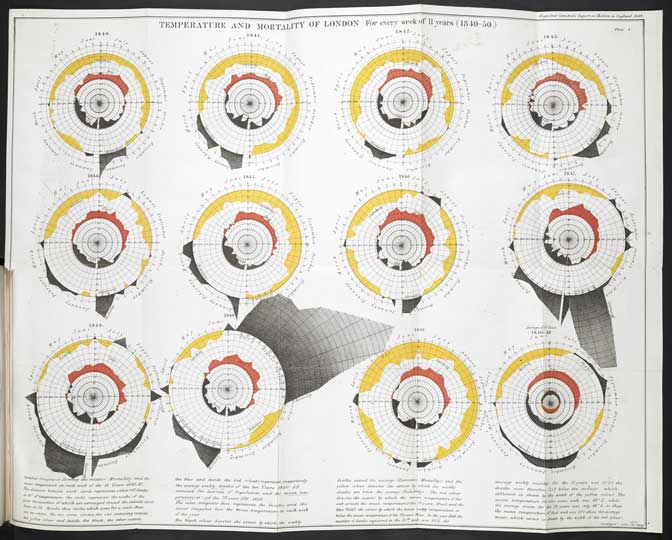
Temperature and Mortality of London (1852), William Farr, from a ‘Report on the Mortality of Cholera in England, 1848–9’
Such effective visualisations enjoy apparent power and legitimacy. As David McCandless points out, ‘it can be hard to argue with a graph’. But implicit agendas often lurk beneath the vibrant colours and beguiling lines. William Farr’s Temperature and Mortality of London (1852), for example, purportedly reveals the correlation between cholera and ‘bad air’. As it turns out, there isn’t one. But it raises the question, are we recognising pre-existing patterns or simply inventing new ones?
When liberated from any burden of proof, however, the charts and graphs are often aesthetically very beautiful. Indeed, had I not known that Martin Krzywinski’s multi-coloured Circles of Life (2014) were complex DNA comparisons, they could just as easily function as vibrant abstract designs.
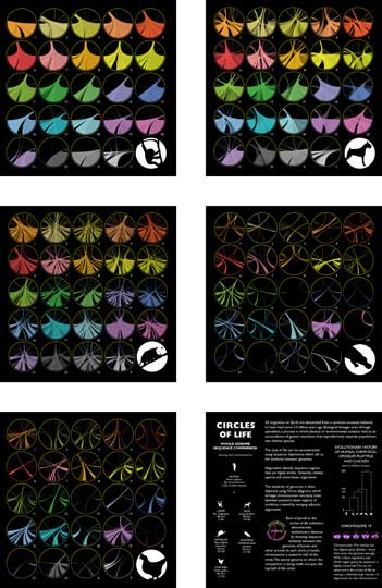
Circles of Life (2014), Martin Krzywinski © the artist
But at their most ‘artistic’, data visuals are in danger of being at their least useful. Graphic translations often ‘soften’ the raw data through visual analogy. Trees and circles are particularly popular motifs, such as Ernst Haeckel’s Pedigree of Man (1879), an evolutionary paradigm brought to life as literal tree, or Georg August Goldfuss’ System of Animals (1817), which makes use of an elaborate egg metaphor. Both are striking, but perhaps at the expense of precision.
Putting such doubts aside, though, this exhibition reveals an innate truth about art: it’s useful. Graphics can clearly and efficiently communicate concepts and information to an audience. Artists have long enjoyed this communicative power – after all ‘art’ predates the written word by many thousands of years. The scientists and designers in this exhibition have simply made use of the best tools at their disposal. A picture may speak a thousand words, but it can also speak a thousand numbers.
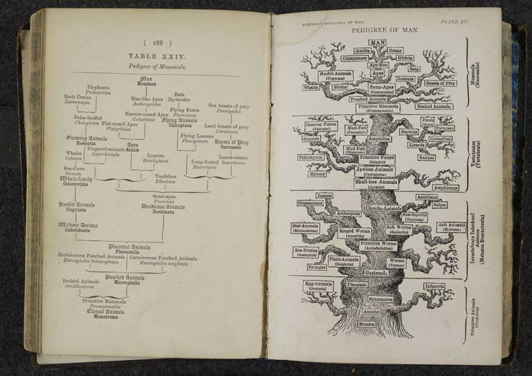
The Pedigree of Man (1879), Ernst Haeckel
‘Beautiful Science: Picturing Data, Inspiring Insight’ is at the British Library, London, until 26 May.
Unlimited access from just $16 every 3 months
Subscribe to get unlimited and exclusive access to the top art stories, interviews and exhibition reviews.


![Masterpiece [Re]discovery 2022. Photo: Ben Fisher Photography, courtesy of Masterpiece London](http://www.apollo-magazine.com/wp-content/uploads/2022/07/MPL2022_4263.jpg)
It’s time for the government of London to return to its rightful home