This handsome book documenting Bridget Riley’s prints over nearly 60 years is the revised and expanded edition of a catalogue raisonné, last published in 2012. It is therefore the definitive source for her prints. Each print has been assigned a catalogue number, and a concordance at the back of the book aligns this new system with Karsten Schubert’s previous numbering of the prints, which he compiled for Bridget Riley: Complete Prints 1962–2012 (editions one to four). But it is the overall presentation of this new edition, plus an additional essay by art historian Robert Kudielka, which brings it into line with The Complete Paintings 1946–2017, a five-volume set published in 2018. Together, these six volumes are a testament to the unremitting combination of passion and rigorous critique that has driven Riley’s work over the last seven decades.
 Riley’s prints have grown in importance in recent years as their number has increased. In the past a one-off print was sometimes made for a charitable cause, or so that its edition could be given to a public gallery to make up for some of the costs involved in mounting a Riley exhibition. But the artist now speaks of her prints as a ‘very valuable addition’ to her working life and a means by which she can ‘extend particular trains of thought’. The ‘shifts of interest’ and ‘continuity of intent’ which she detected while preparing this new publication are part of its appeal, making clear to the reader that the forward, yet sometimes circular, development in her paintings is echoed in her prints. The current literature on her oeuvre lists just over 100 prints, as opposed to 656 paintings, suggesting they must have been the product of only sporadic attention. Riley views them, and her wall paintings, as ‘a sort of appendix to my work in my studio’. Nothing has altered the accuracy of Lynn MacRitchie’s claim, in an essay that has evolved through the various editions of the print catalogue, that the paintings are indubitably the ‘supreme centre of [Riley’s] activity, and all her prodigious energy and resolve are brought to bear on their creation’.
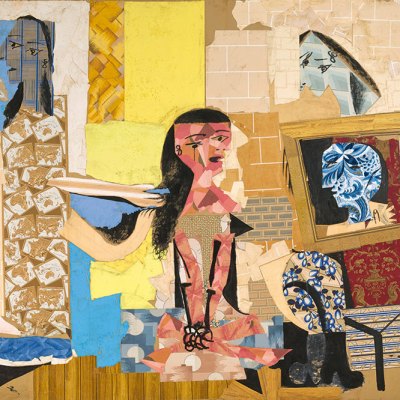
Fête (1989), Bridget Riley. © Bridget Riley 2020. All rights reserved

The fascination of Riley’s prints is undeniable. Some of them have been triggered by studies that relate to an earlier painting, the rediscovery of which suggested to the artist how a former way of working could be revived or extended – hence the chronological disparity that sometimes occurs between source ideas and the actual making of the print. Fête, for example, is dated 1989 so as to relate it to the rhomboid paintings made that year, but it was printed in around 1999. Most of the prints, even when intimately related to a particular painting or series, have a stand-alone identity, adjustments having been made to suit the medium. In the case of Rose Rose and other stripe works, colour relationships call for attention as fiercely in the prints as they do in the paintings. Kudielka, who has watched Riley’s career unfold since 1967, observes that the prints provide ‘intermittent insights’ into the necessary creative exploration that lies behind her paintings. This sense of connectedness is also affirmed by Craig Hartley, a specialist in printmaking, whose essay argues that Riley’s work reveals ‘how complex and varied the relationship between painting and print can be’.
Riley was initially opposed to printmaking. She associated it with, in her words, ‘what you saw in the British Museum, with that very handmade look’. It is easy to imagine the kind of lithographs from the 1940s she might have had in mind, or the sort of mark-making that, in her view, gets in the way of a direct rapport with the viewer. After her first commission resulted in a small edition of screenprints based on Movement in Squares (1962), she began making prints of her own accord. Like Richard Hamilton and Eduardo Paolozzi, she made use of the screenprint, a new medium which had recently developed in sophistication and flexibility. It enabled her to create a shuddering visual whirlpool in the Op Art print related to her series of paintings Blaze (1962–64), and the impact made by this and other of her prints helped place the screenprint at the forefront of contemporary printmaking.
Untitled (based on Movement in Squares) (1962), Bridget Riley. © Bridget Riley 2020. All rights reserved

In 1965 she made a bolder move still. Fragments, seven prints based on tangential images created in the course of preparatory work for a painting, were printed on Plexiglas. In each print the black image is perfectly positioned on the reverse of the sheet and a white layer, added afterwards, forms the background. These were emphatically new and fresh; in MacRitchie’s view, ‘dazzling in their composure and completeness’.
Riley’s originality, in her imagery and choice of medium, placed her at odds with the art establishment at the time: her radical stance seemed to sever bonds with the past. This is deeply ironic given her later emphasis on the necessity of knowing about past art, her respect for tradition and her emphasis on the binding continuity of pictorial problems across generations. Having made her black and white images of the 1960s jitter and dance, she went on to explore the instability of colour; how colours depend on each other and their sequencing for their visual effects and emotional appeal. Interestingly, it was Nineteen Greys (1968), a portfolio of four prints requiring infinite subtlety in the handling of movement, tone and light, that led up to this move into colour.
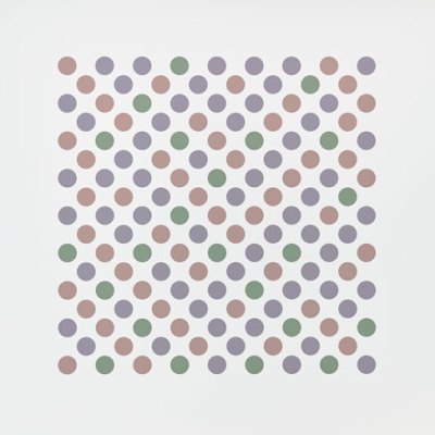
Sideways (2010), Bridget Riley. © Bridget Riley 2020. All rights reserved

Since then, Riley’s ability to create colour relationships that release shimmering sensations of light and hazy after-effects has proved effective both in her paintings and prints. Clarity of purpose has always been to the fore in her art, but in the last decade Riley’s return to the stripe has felt like a return to first principles. In the small print Sideways (2010), composed of nine stripes identical in size and placed close together, the vertical alignment is offset by the way the eye moves back and forth across the image, owing to the intense attraction of the seven colours and their relation to each other. Its absolute certainty is invigorating.
Bridget Riley: The Complete Prints 1962–2020 by Craig Hartley, Lynn MacRitchie et al. is published by the Bridget Riley Art Foundation and Thames & Hudson.
From the October 2020 issue of Apollo. Preview and subscribe here.