Digby Warde-Aldam selects this week’s exhibition highlights in the capital
Thank god for September. The art year has kicked off like a mule with a grievance, and already I’m counting the shows I want to see but haven’t. Of these, top priority is Marcus Coates and Henry Montes’s show at Kate MacGarry (until 24 October). Coates is one of the good guys: a proper artist, with proper ideas. Despite being robbed of this year’s Fourth Plinth commission, recent evidence suggests that he is producing the best work of his career to date. I can’t wait.
Untitled (2013), Francis Alÿs. On display at Parasol Unit as part of ‘The Gap: Selected Abstract Art from Belgium’. Courtesy of the artist and Francis Alÿs’ studio

Then there’s Parasol Unit’s show of Belgian art (until 6 December) curated by Luc Tuymans – a sore point for me. I have today received a council tax bill that has scuppered my plans to get to Brussels before the end of the year. Rather than the Eurostar to Belgium, I shall be taking the Northern Line to Shoreditch. Again.
◎
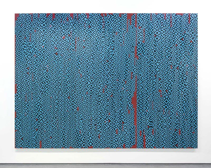
The exhibitions I have managed to see have been encouraging. First off was FOLD gallery’s Dominic Beattie exhibition (until 3 October). I’ve liked Beattie’s work for a while, but always thought it lacked some crucial quality that I couldn’t put my finger on. Well, now I know: that quality is scale. His new collages are enormous things that amp up the mesmerising patterns he has made his trademark without losing an ounce of the subtlety. The FOLD show is more or less a potted history of modernism, as viewed through Google Images. If you want to see vital British art that reflects its time like a cracked mirror, get yourself to New Cavendish Street, pronto. If you don’t, we have nothing in common.
Untitled (2015), Dominic Beattie. Image courtesy FOLD Gallery and the artist

◎
As a veteran of god knows how many art fairs, I must confess to being somewhat jaded by the routine. The manic bustle, the piped dance music, the terrible, shiny, sub-Koonsian rubbish on show for collectors with more money than sanity ensure that there is no time or space to actually look at anything. The standard formula is at oppositional cross-purposes to everything that I, for one, believe an art exhibition should be. Forgive me – Frieze week is coming…
Thus it was that I walked into the START fair with a heavy heart and nothing else to do. Blow me, though – it was actually pretty good. The works were hung sympathetically, the lighting was right and, crucially, the art was by and large worthwhile. Phew!
Discovering good work by artists you’ve never previously heard of brings the kind of joy normally reserved for unsolicited roses turning up in the mail. (This has actually happened to me – once.) It’s a given that START had faults, but the average standard of the work on show was much better than might reasonably be expected. This year, Europe suffered by comparison to the Middle Eastern and South American showings, though painter Rae Hicks did a respectable job of keeping London at the forefront. I went straight back to Chelsea the next day to see everything I missed.
Dastan’s Basement, Tehran, at START Art Fair. Photo: Alexa Horgan

◎
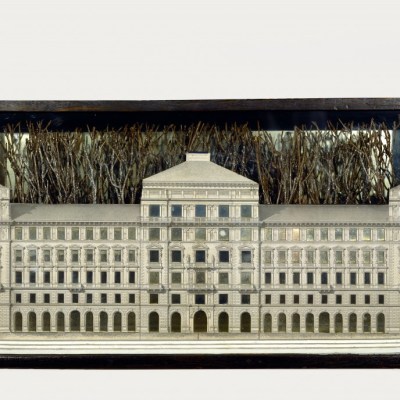
Brutalism is big news. After three decades out of favour, the style is winning people round. If you’re with me on this, go and see Yana Naidenov’s show at the Josh Lilley gallery (until 8 October). Naidenov’s pulp paper sculptures are instantly deceptive, mimicking the béton brut of the National Theatre or the Thamesmead Estate with confrontational frankness.
Isolated shafts of concrete – sorry, paper – are placed around the gallery like the ruined foundations of a Soviet bloc government building, and the effect is terrifying, striking a cold wave through the heart. In less capable hands, the work would be suffocated by its pomposity, but Naidenov convinces. This is the language of authority in its purest form; chilly, stark and not a bit funny. Her reliefs are less successful, but not without merit – the trouble is, they are just a bit too slight to get away with their own humourlessness.
◎
One last thought, if you’ll indulge me. I’ll withhold wider comment on recently-elected Labour Party leader Jeremy Corbyn, but I thought his view on the arts, unveiled in a speech last week, stunk even worse than such manifestoes normally do. It reads like an afterthought, thrown into the leadership race as a sweetener for anyone who cares about these things. It was big on grand gestures, but weak on detail – a sure sign that, as ever, the culture budget is only as stable as an idealist’s whim.
While the idea of forcing developers to commission artists to gild the lobbies of new construction projects is noble, it is not satisfactory. If Corbyn were a follower of the London Diary, he would know that developers do commission artists. They just tend to choose the wrong ones. If the consensus that Corbyn is ‘unelectable’ fails to hold true, we may be in for some very dodgy public sculpture indeed.