
Eduardo Paolozzi (1924–2005) was born in the tough Edinburgh port of Leith, the son of Italian immigrants who ran an ice-cream parlour. The dichotomy in this background, of gritty harbourside industry and the cheerful populism of confectionary, could in retrospect be seen as prophetic of an artist who would bounce between a spikily abrasive Surrealism and an exuberantly democratic sensibility. A core quality established from the earliest work in this major retrospective is Paolozzi’s willingness to embrace ugliness and discordance; it would remain a keynote throughout a varied and extremely productive career. Whether it is through his ungainly humanoids made up of a fusion of industrial clutter, fabric patterns suggestive of scruffy art brut daubing, gaudy screenprints with clashing trippy patterns, or revoltingly sinuous chrome-plated sculptures, Paolozzi emerges as an artist who rejected the genteel or the pretty. The result is a modernism as far removed from the elegant smoothness of Henry Moore as it is possible to imagine.
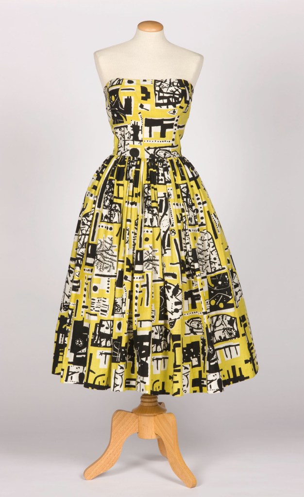
Cocktail dress for Horrockses Fashions (1953), print designed by Eduardo Paolozzi; dress designed by John Tullis. Harris Museum and Art Gallery, Preston; © photo: Norwyn Ltd; © Trustees of the Paolozzi Foundation, DACS 2017
Paolozzi emerged as an artist with a 1947 exhibition at the Mayor Gallery in London, displaying a preternatural assurance. These youthful works are heavily indebted to Picassoesque primitivism, but have their own agitated energy. The concrete sculpture Seagull and Fish (1946) is indicative of the raw contorted clout of sculptures from this period. Here from the start is an aggressive intensity that is particularly notable when set besides the polite and romantic tenor that had characterised most British modernism up to this date. The subject matter is taken from the natural world (especially the sea), a theme absent from later works that are more concerned with machines and robots, art history, and junk.
The 1947 exhibition inaugurated a decade or so of prolific and exhilarating creativity. At the Whitechapel this first phase of Paolozzi’s career is stuffed into the opening room, which contains an immensely rewarding collection of prints, collages, fabrics, and sculpture. The jumble of objects may mirror, in a minor way, Paolozzi’s own aesthetic when it came to exhibiting his works, but it takes some separating out to appreciate how many important things he was doing at once.
There are the many collages mixing classical statuary, industrial machinery, and American Pop imagery from cinema, advertising, and science fiction. These lead up to the Bunk! lecture at the ICA in 1952, a seminal precursor of Pop, the effect of which must have been extraordinary in the context of austerity London. There are also the Hammer Prints fabrics designed with Nigel Henderson – which somehow manage to be glamorous despite their ferocity. During this period Paolozzi became a founder member of the Independent Group, and was a key figure in the landmark exhibitions ‘Parallel of Life and Art’ and ‘This is Tomorrow’. Prominent in the room are many bronze semi-figurative statues, in a variety of scales, made through a process Paolozzi described as ‘the metamorphoses of rubbish’. It is wonderful seeing so many together, and there is an immense childlike charm to their gawky weirdness, and an enchantment in the way figures emerge out of a thick texture of junk.
All of these objects are evocative of a particular moment: of Cold War angst, of living among the rubble of the blitz, and of being conscious, if equivocal, about an American world of glamour and automation on the horizon. What saves Paolozzi from the rather pseudish existentialism of much 1950s culture, however, is the terrific dynamism with which his pieces are crafted and seemingly thrown together.

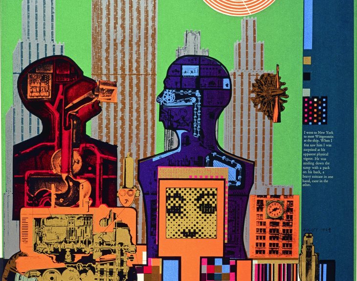
Wittgenstein in New York (from the ‘As is When’ portfolio) (1965), Eduardo Paolozzi. Scottish National Gallery of Modern Art, Edinburgh; © Trustees of the Paolozzi Foundation, DACS 2017
Nothing in the rest of the exhibition can compete with the excitement of Paolozzi’s 1950s zenith. The ’60s saw a rush of trendy psychedelic colour, notably in the Wittgenstein series of screenprints (1965) and in the Whitworth Tapestry (1967). These are at least tautly composed and technically brilliant. The same cannot be said of much in his flabby and over-represented Pop art phase. Despite Paolozzi’s remarkably early interest in Pop imagery, he has none of the panache brought to the style by its best purveyors.
One of the most depressing things about this period is that Paolozzi abandoned the hand-made quality that gave his early sculptures much of their excitement, and instead aimed at negating the artist’s craft by employing industrial fabricators to achieve a bland machine-aesthetic. This resulted, for example, in the vacuous slickness of his aluminium and chrome-plated sculptures of the mid to late ’60s. A nadir is reached with objects from the 1971 Tate show, a sarcastic and heavy-handed attempt to satirise Pop art conventions, which only highlights Paolozzi’s relative awkwardness with, and lack of ideas about this material.
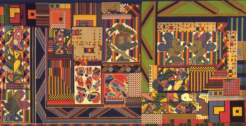
The Whitworth Tapestry (1967), Eduardo Paolozzi. The Whitworth, University of Manchester; © Trustees of the Paolozzi Foundation, DACS 2017
Paolozzi’s next development involved a change of perspective, away from brash American Pop and back to a distinctly European avant-garde aesthetic. From the mid 1970s he turned to dense abstract pattern-making, experimenting with different natural materials: wood, bronze, embossed paper, porcelain, and ceramic. This is often stimulating and energetically composed work, but one gets the sense of an artist increasingly aware that his place in history was secure, and no longer feeling the need to be provocative. He was becoming an establishment figure, and his last decades were dominated by many large-scale public commissions, in Britain and in Germany.
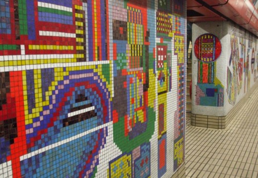
The Tottenham Court Road murals (1980–84) are perhaps his best-known work, and have thankfully been largely saved after the recent modernisation of the station. These years also saw a return to figurative sculpture, most prominently in the crouching sculpture Newton, after William Blake (1995) for Colin St John Wilson’s British Library forecourt. I cannot unequivocally say that I actually like either of these, but they indicate the highly unusual ability to work assertively on an architectural scale. It is a quality the exhibition singularly fails to capture in the final room devoted to the public works. Models of various projects are shown divorced of their context, thus stripped of their power, which is bound up in their monumental presence within an urban setting.
Paolozzi’s place as a major figure in British post-war art is assured thanks to his 1950s heyday, and to a lesser extent by the prominence of his civic work of the 1980s and 1990s. This exhibition does Paolozzi’s reputation no favours by presenting such a comprehensive overview, or by trying to reappraise him as an underappreciated Pop artist.
‘Eduardo Paolozzi’ is at the Whitechapel Gallery, London, until 14 May.
From the May 2017 issue of Apollo: preview and subscribe here.
Unlimited access from just $16 every 3 months
Subscribe to get unlimited and exclusive access to the top art stories, interviews and exhibition reviews.


![Masterpiece [Re]discovery 2022. Photo: Ben Fisher Photography, courtesy of Masterpiece London](http://www.apollo-magazine.com/wp-content/uploads/2022/07/MPL2022_4263.jpg)
It’s time for the government of London to return to its rightful home