From the March 2021 issue of Apollo. Preview and subscribe here.
‘Let’s be superficial,’ declares the divorcé Elyot in Noël Coward’s play Private Lives (1930). ‘Let’s savour the delight of the moment. Come and kiss me, darling, before your body rots and worms pop in and out of your eye sockets.’ In this macabre credo – one which takes the idea of carpe diem and runs with it to dark places – he encapsulates the mood of his time: a hedonistic delight in surface glamour that served to mask untold depths of trauma. This new mood demanded a new mode of expression, and it readily found one as the trends that had been simmering away for some time in art, architecture and fashion boiled over into the mainstream.
Coward and his contemporaries were the century’s children: their adolescence spent against a backdrop of mechanised warfare, coming of age in a profoundly scarred world. This is keenly evoked in Cavalcade (1931), an upstairs-downstairs drama depicting the impact of three decades of national events on a well-to-do family and their working-class ‘help’, in which the war becomes a manic roundelay of popular song. It is just one example of how his theatrical innovations not only chronicled his times, but also helped to define our perceptions of them. ‘Coward’s brilliant staging of World War I as an increasingly sinister music-hall number would affect Hollywood war montages for the rest of the decade, and would still seem avant-garde 30 years later when it became the whole idiom for Oh! What a Lovely War,’ observes Brad Rosenstein, who curated the exhibition ‘Noël Coward: Art and Style’ at the Guildhall Art Gallery in London (due to open when restrictions are lifted).
Sonnie Hale and chorus in ‘Dance, Little Lady’ (with masks designed by Oliver Messel) from This Year of Grace (1928), photographed by Lenare. University of Bristol Theatre Collection/ArenaPAL

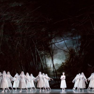
With the comfortable certainties of Edwardian England gone, Coward’s generation were acutely aware not only that they lived in a post-war era, but very probably a pre-war one, too. This was characterised by the almost hysterical party lifestyle of the flappers, a sybaritic breed who lived in a whirl of cocktails, cigarettes and gramophone records. Contrasted with the frumpy, archaic fashions of the previous decade, it is tempting to see in their ascending hemlines the curtain rising on modernity. It was a generation documented and satirised by Coward in songs such as ‘I Went to a Marvellous Party’ or the sinister staging of ‘Dance, Little Lady’ in the revue This Year of Grace (1928), in which the dancers were kitted out in papier-mâché masks (designed by Oliver Messel) that took the idea of ‘putting on a happy face’ to surreal extremes. The routine presented a stark visual that was almost Dadaist in tone, bringing something of the alienation of a performance at the Cabaret Voltaire to a mainstream if sophisticated West End audience. In Cavalcade, the chorus of war is similarly followed by a descent into chaos and confusion, with the realist style of earlier scenes displaced by an angular modernism more in tune with the raucous Jazz Age. As the blaring brass bounced off the chromium steel of Bauhaus-influenced furniture, with a prismatic backdrop that owed much to De Stijl, the actress Binnie Barnes performed ‘Twentieth Century Blues’, another song that touches on the world-weary sense of anomie that lies behind the partying facade. (‘What is there to strive for, / Love or keep alive for / Say Hey, hey! / Call it a day?’)
The collapse of societal norms is a central motif in Coward’s early dramas, which strike the middle ground between Oscar Wilde and Harold Pinter: elegant drawing-room comedies, but with dark undercurrents. In addressing taboos such as divorce, cocaine addiction, adulterous promiscuity and ménages à trois, these plays regularly incurred the displeasure of the theatre censors at the Lord Chamberlain’s office. (The Oedipal overtones of his 1924 sensation The Vortex led one censor to comment, ‘If we ban this, we shall have to ban Hamlet!’.) Coward’s characters rarely express their true feelings, instead resorting to a sort of flippant sangfroid that subverts the wartime notion of the ‘stiff upper lip’. The ornate epigrams of Wilde’s day are replaced by a taut, slangy language derived from the telegram and the phone call, drawing on Coward’s own distinctive clipped diction (developed to overcome a childhood stutter). Many such roles were performed – and defined – by Coward himself, who also took any opportunity to write his signature dressing gown into the script, much as the screenwriters of Bond films continually contrive to get their hero into black tie.
It is commonplace to say that Coward’s flamboyant, suave persona was itself a mask of sorts. Born in mundane Teddington, he was a lowly suburbanite acting the part of a member of the aristocracy (quite literally the case for his role as captain of a destroyer in the film In Which We Serve (1942) – co-directed by Coward and David Lean – a performance that was explicitly modelled on Lord Mountbatten). All of this was undoubtedly a shrewd act of brand creation, an essential component of the art of celebrity. But, more importantly, it also reflects Coward’s preoccupation with surface, his understanding that if one is to pursue the superficial then it is imperative to be glittering and elegant. Accordingly, art and style were integral to his work. ‘Coward immediately began to appreciate the enormous impact that working with some of the finest artists and designers could have on his work, not just visually but theatrically and emotionally,’ explains Rosenstein.
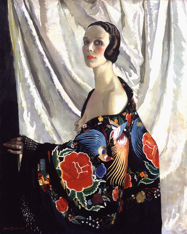
Although his reputation rests on words and music, Coward had taken a keen interest in the visual arts from an early age, and was an accomplished amateur painter. An early sketch of costume designs, drawn as a young teenager, depicts a rather camp Struwwelpeter-like figure in striped pantaloons – testament to his understanding of the power of fashion to reveal or create a character. As he was at the centre of a sparkling social set, Coward’s stage shows were able to draw upon the talents of some of the most influential artists and designers of his time. For his costumes he turned to couturiers such as Victor Stiebel and Norman Hartnell, who trod a careful line between tasteful elegance and chic severity and whose clients were precisely the kind of moneyed ladies-about-town that Coward wrote about. Characters are frequently described in his scripts’ stage directions as ‘exquisitely dressed’. Moreover, the clothes worn in his revues and dramas not only reflected the latest modes: all too often they set them, too. Edward Molyneux’s bias-cut satin gown for Gertrude Lawrence to wear in Private Lives was a slinky sensation, both on the fashion pages and the silver screen. (‘It’s hard to imagine a subsequent MGM film from the Thirties that doesn’t feature a white satin dress à la Molyneux,’ comments Rosenstein.) Coward’s most frequent collaborator, Gladys Calthrop, a Slade-educated painter with a penchant for ‘barbaric’ jewellery, engendered a brief fad for Regency-inspired clothing and décor with her contemporary-inflected evocation of Georgian Brighton in the musical Conversation Piece (1934). Similarly, Doris Zinkeisen’s costume designs for the number ‘Teach Me to Dance Like Grandma’ in This Year of Grace can be seen as an early permutation of retro chic, taking the silhouettes of the Victorian period and distilling their essence for the stage. Zinkeisen, too, was a professional painter, responsible for frescoes of jazz musicians aboard the RMS Queen Mary, and later became an official war artist. A self-portrait from 1929 reveals her as a society beauty, with marcel-waved hair and an elaborate Chinese silk shawl slipping from her bare shoulder.
Self-portrait (1929), Doris Zinkeisen. National Portrait Gallery, London; © Estate of Doris Zinkeisen
The Master himself was also something of a fashion influencer – reading the newspaper one day, he was surprised to be informed that his taste for coloured turtlenecks had set a minor trend. Cecil Beaton later observed that ‘all sorts of men suddenly wanted to look like Noël Coward – sleek and satiny, clipped and well groomed, with a cigarette, a telephone or a cocktail at hand… Coward’s influence spread even to the outposts of Rickmansworth and Poona.’
Set design by Cecil Beaton for Act I of Look After Lulu! (1959). © National Portrait Gallery, London
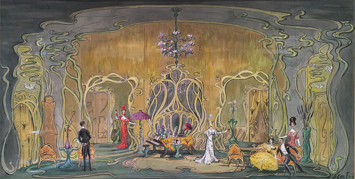
The catty undertone to those remarks was entirely typical. ‘Beaton had an irrational hatred of Coward, prompted probably by jealousy at the latter’s easy success at an early age,’ explains Robin Muir, curator of last year’s exhibition ‘Cecil Beaton’s Bright Young Things’ at the National Portrait Gallery (which transfers to the Millennium Gallery in Sheffield this spring). ‘He could also slightly see through the pose, as their backgrounds were broadly similar: both wanting to be something they weren’t born to, both hiding their sexuality to a large extent too.’ (In 1925, after watching a performance of Fallen Angels, Beaton said: ‘I do think the play will help to ruin old Coward. It is quite definite that he won’t live long.’ Coward was 26 at the time.) After the Second World War, however, the pair met by chance on a sea cruise, and all hostilities dissipated. Beaton went on to collaborate with Coward on the sets and costumes for the Victorian-set comedy Quadrille (1952) and the stage farce Look After Lulu! (1959). His set designs for the latter are remarkable: they offer a highly stylised, almost parodic take on art nouveau in the manner of Victor Horta, with whiplash curves that dissolve into wispy tendrils at the edges. It is a room that nobody in 1908 – the year in which the play is set – would ever have inhabited, but which comically reimagines the style in its purest essence. A similarly heightened version of the past can be found in other Coward plays with a period setting; of particular note is William Nicholson’s octagonal red room for his musical The Marquise in 1927 – for which he also designed costumes – which evokes the ostensible setting of ancien régime France but, like the dialogue, remains crisply modern in feel. ‘The artists he worked with understood period,’ notes Rosenstein, ‘but relied more on Coward’s tone to interpret and filter their theatrical evocations of past eras, while also stylishly embracing the present when called for.’
Costume design by William Nicholson for Esteban in Act III of The Marquise (1927). © Desmond Banks

With their contemporary settings, Coward’s drawing-room comedies regularly exhibit an acute awareness of the dominant artistic trends. The title of The Vortex calls to mind Wyndham Lewis and his avant-garde Vorticists, a movement that also inspired Calthrop’s zingy backdrops for the ballet ‘Crescendo’ in the revue On with the Dance the following year. Elsewhere, Design for Living (1932) is redolent of Le Corbusier’s modernist maxim that ‘a house is a machine for living in’ and the stark architecture that went with it. The character of Otto, the Montmartre bohemian turned society portraitist, also demonstrates a passing familiarity with the tenets of cubism: ‘I don’t paint their faces, Gilda. Fourth dimensional, that’s what I am. I paint their souls.’ (‘You’d have to be eighth dimensional and clairvoyant to find them,’ comes the acerbic response.) Calthrop’s set design for Gilda’s Manhattan penthouse offers an approach to the moderne style that is, in its own way, as heightened as any of Coward’s period settings. Dominated by the sweeping arc of a staircase with low, metal-frame armchairs, it has an austere chic that is closer to a cinema lobby or a West End nightclub than a home.
Noél Coward (far left), Ethel Borden, Alfred Lunt, Gladys Henson, Alan Campbell and Lynn Fontanne in the original Broadway production of Design for Living in 1953, with sets designed by Gladys Calthrop. Photo: Vandamm Studio; © The New York Public Library for the Performing Arts

Coward’s own home, furnished by the fashionable decorator Syrie Maugham, was less overtly deco in tone. It brought together choice antique pieces, including a baroque carving by Grinling Gibbons and a 17th-century Winged Time allegory in Cornish tin, with a restrained modernist palette and some frightfully au courant abstract rugs. (It is possible that the loud geometry of these rugs inspired the lines ‘You’re weaving love into a mad jazz pattern… don’t drop a stitch too soon,’ from his 1925 song ‘Poor Little Rich Girl’.) A suspiciously similar domestic set-up is visible in Calthrop’s set designs for Present Laughter (1942), in which Coward portrayed Garry Essendine, an ageing thespian with a penchant for dressing gowns who is regularly accused of being unable to stop acting even when off-stage.
In a sense, what we now think of as art deco was more emblematic of its period than it was typical of it. That is to say, it was an aesthetic that found its fullest expression in artificial environments, such as ocean liners, hotels and stage musicals, all settings with which Coward was amply familiar; the idea that everything was suddenly all about clean lines and harsh martini-glass angles would not have been familiar to, say, the Jarrow Marchers. (Although Coward was obsessed with class, his portrayals of the lower orders in works such as Cavalcade and its spiritual heir, This Happy Breed [1939], are no less mannered than those of his other characters; the principal difference is that their speech is peppered with vocabulary such as and no mistake rather than terribly and divine.)
Deco’s artificiality, the manner in which austere modernism is tempered with opulent chic, makes it an inherently Cowardian style. The same combination of artful restraint and surface luxury can be found in his dialogue, his characters’ costumes and his public persona. It is the veneer that covers the hollow dread of the inter-war years – yet, the best part of a century on, it retains an irresistible glamour.
‘Noël Coward: Art & Style’ will run at the Guildhall Art Gallery, London; dates to be announced.
From the March 2021 issue of Apollo. Preview and subscribe here.