Introducing Rakewell, Apollo’s wandering eye on the art world. Look out for regular posts taking a rakish perspective on art and museum stories.
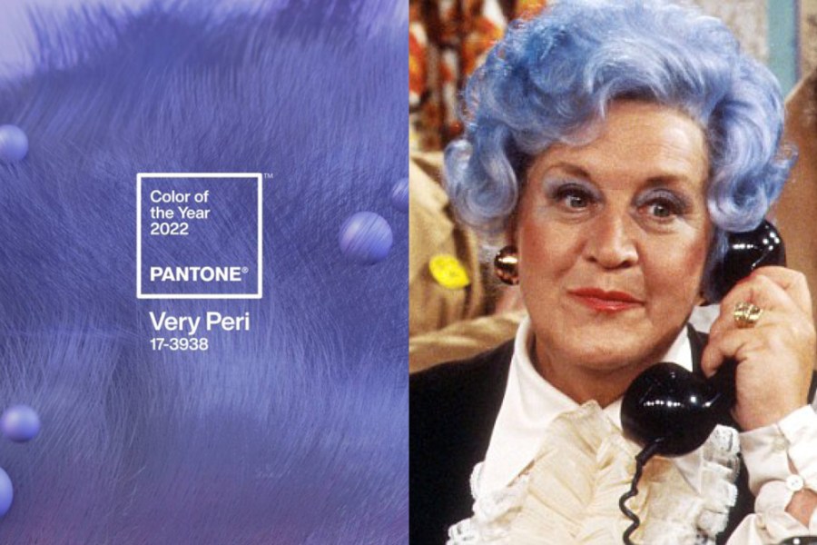
Rakewell remembers when a new colour for a season promised bright delights and wonderful things. We remember when critics discussed the colours in a painting with consideration and care. We remember when the announcement from Pantone of its colour of the year promised a reinvigoration of a home. So Rakewell was a little surprised when the colour that Pantone selected for its colour of 2022 was Very Peri.
We have no doubt that Very Peri sounds very on trend. Peri peri chicken has been a runaway restaurant success for some years: witness the growth of Nandos. Yet this shade is not the hot tone of exotic pleasure but a tincture of lilac that seems to come from one of Dame Edna’s wigs.
Pantone assures us that Very Peri ‘places the future in a new light’. We could not agree more. This is not the delicate lilac of a Mary Cassatt painting but a colour of such strong hue that it could do nothing but place everything in a new light.
There are certainly big hopes for Very Peri. Apparently it ‘illustrates the fusion of modern life and how colour trends in the digital world are being manifested in the physical world and vice versa.’ Rakewell is particularly fond of that ‘vice versa’. Just imagine if the manifestation was a one-way street.
Yet for all its proclaimed modernity, Rakewell cannot help but feel that the thing this colour brings to mind most strongly is the indomitable image of Are You Being Served?’s Mrs Slocombe. The colour of a flirtatious lush who loves to serve – what could be more 2022 than that?
Got a story for Rakewell? Get in touch at rakewell@apollomag.com or via @Rakewelltweets.
Unlimited access from just $16 every 3 months
Subscribe to get unlimited and exclusive access to the top art stories, interviews and exhibition reviews.


![Masterpiece [Re]discovery 2022. Photo: Ben Fisher Photography, courtesy of Masterpiece London](http://www.apollo-magazine.com/wp-content/uploads/2022/07/MPL2022_4263.jpg)
It’s time for the government of London to return to its rightful home