
Tom Eckersley (1914–97) is generally regarded as one of the best of the mid-century graphic designers in Britain. He sits alongside F.H.K. Henrion, Abram Games and Hans Schleger as one of the designers who created posters that defined the aesthetic of the Home Front during the Second World War.
 Paul Rennie’s book, Tom Eckersley: A Mid-century Modern Master, examines Eckersley’s career and, unusually, pays particular attention to the designer’s clients. In monographs on graphic design the client is often overlooked in favour of the designer, who can be painted as a creative mind, forging a path purely through their visual genius. But no matter how much of a trailblazer the designer might be, it’s hard to imagine many of their careers existing without a supportive client prepared either to trust or indulge them.
Eckersley started out at a time when the graphic design industry was in its infancy and when the link between designer and client was also slowly developing. In 1934 he moved to London with a friend from the Salford School of Art, Eric Lombers. They aimed to pursue a career as poster designers and, through an introduction from their principal at Salford, began by meeting just about the best person two young designers looking for work could have met: Frank Pick, Chief Executive at the London Passenger Transport Board.
Rennie describes Pick as ‘one of the most important personalities in the history of design in Britain’ and someone without whom Eckersley’s career might have never got going. Shortly after their meeting with Pick, his colleague Christian Barman at London Transport gave Eckersley and Lombers their first commissions. Barman sounds like the perfect patron: he didn’t ask for much contact with the designers he employed, leaving them to solve the brief in their own way, and hardly ever rejected the proposed designs outright.
Pick saw the aesthetics of the Underground as key to making the service successful. Passengers had to be made comfortable travelling in the alien environment of noise and tunnels, so plenty of information was important, and it was vital that it was presented not just clearly, but also in an aesthetically appealing way. It was Pick who commissioned Edward Johnston to create the typeface Johnston Sans for use across the London Transport. It survives largely unchanged to this day, providing clear information as well as creating a strong visual identity across TfL.
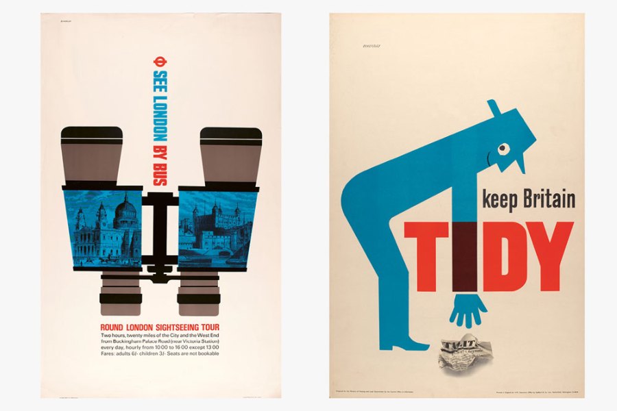
Pick described London Transport as being ‘a conception of the metropolis as a centre of life […] more intense, more eager, more vitalising than has ever so far been obtained’. The posters of Eckersley and Lombers are an effective visualisation of this. The images on their posters are often tight crops of scenes, focusing on a dynamic detail; their poster telling Londoners the dates for the Wimbledon Championships has a ball flying in at an angle with a racket about to hit it back out of the frame.
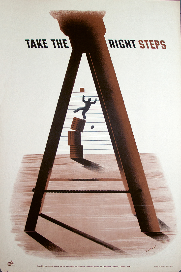
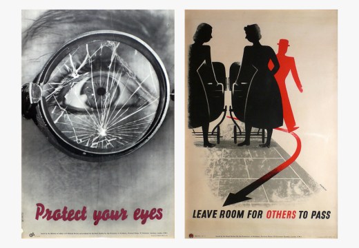
‘Take the Right Steps’ (1943), designed by Tom Eckersley for the Royal Society for the Prevention of Accidents (RoSPA). Paul and Karen Rennie Collection
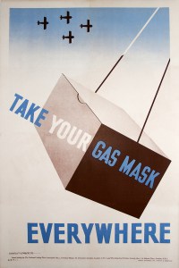
‘Take Your Gas Mask Everywhere’ (1939), designed by Tom Eckersley for RoSPA. Paul and Karen Rennie Collection
After his working relationship with Lombers ended around the start of the Second World War Eckersley applied this dynamic visual language to his work for The Royal Society for the Prevention of Accidents (RoSPA). His relationship with RoSPA had begun before the war when he and Lombers had entered a competition to design a poster for the organisation. Their entry wasn’t successful, but the director got in touch with Eckersley and Lombers to say he thought their entry was better than the winner. This relationship was re-established as RoSPA started to produce posters to try to reduce accidents in factories creating munitions and other products vital to the war effort.
The direction of RoSPA’s posters was at first haphazard, Rennie explains, but benefitted from the designers Ashley Havinden and Francis Meynell joining the board. Havinden had worked in advertising in Berlin and had been exposed to the Bauhaus aim of uniting art with practical uses in industry, while Meynell was able to make the printing of posters both more economical and effective. Eckersley’s designs for RoSPA are as dynamic as his Underground posters, using the angles and crops of scenes to create drama: a man falling from a pile of boxes, for example, is framed by the ladder he should have used.
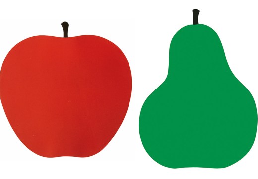
Eckersley’s career continued long after the war as he carried on creating posters for RoSPA into the ’60s and for clients such as the Imperial War Museum and the World Wildlife Fund until the mid ’90s. Later his style became more graphic; the dynamic shapes of his early work moved from being shaded to give them volume to being flat blocks of colour, and thus even simpler and more direct. Nevertheless, as the images in this book prove, the designer’s work was remarkably consistent over such a long career, a career which, no matter how talented Eckersley was, would not have flourished without supportive clients.
Tom Eckersley: A Mid-century Modern Master by Paul Rennie is published by Batsford.
Unlimited access from just $16 every 3 months
Subscribe to get unlimited and exclusive access to the top art stories, interviews and exhibition reviews.

![Masterpiece [Re]discovery 2022. Photo: Ben Fisher Photography, courtesy of Masterpiece London](http://www.apollo-magazine.com/wp-content/uploads/2022/07/MPL2022_4263.jpg)
Has the Fitzwilliam lost the hang of things?